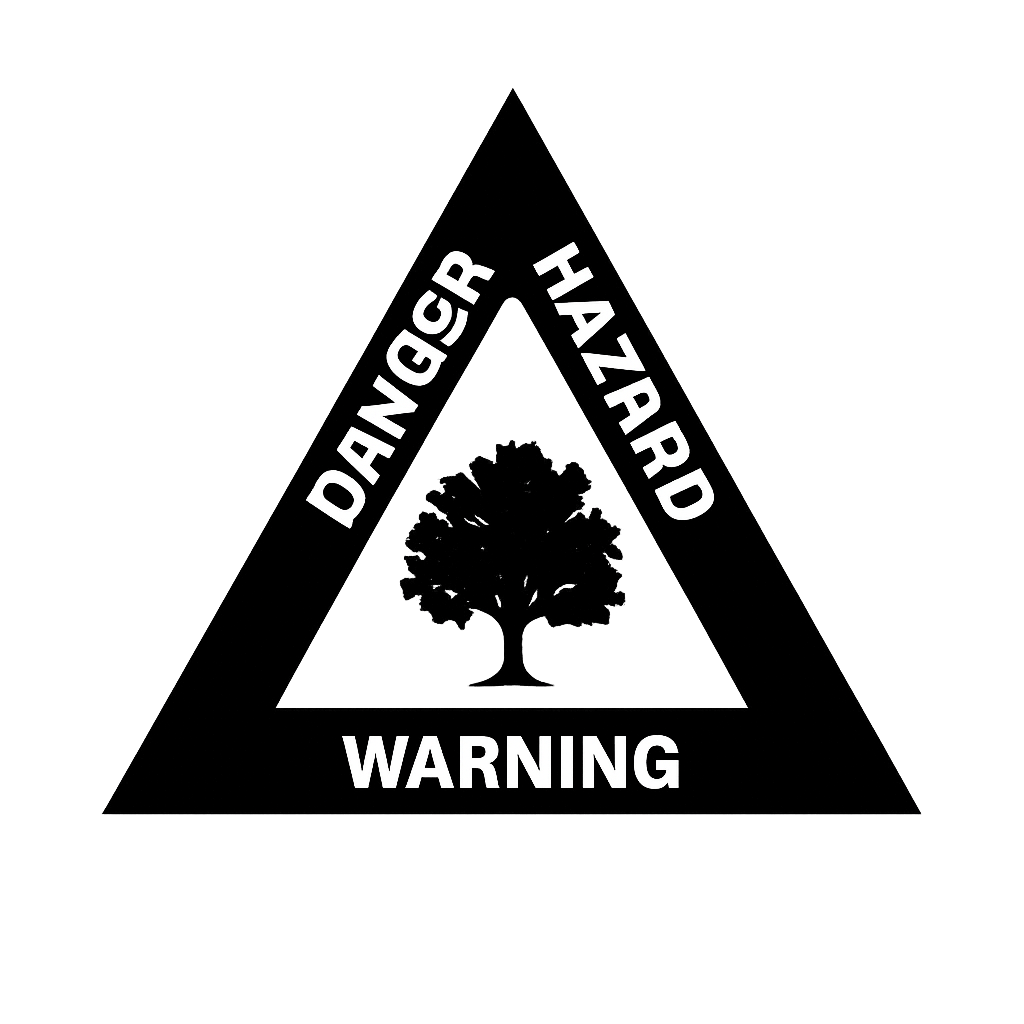
Generate Professional Stamps Instantly with Artificial Intelligence
Transform your ideas into professional stamps using our advanced AI technology. Simply describe what you want, and our AI will create a custom stamp design for you.
An AI Stamp Creator is a modern, browser-based design assistant that helps you imagine, shape, and export professional-quality stamps without traditional design friction. Instead of starting from a blank canvas or outsourcing a concept to a designer, you can describe your goal in plain English, tweak a few options, and let intelligent automation handle the heavy lifting. You remain in control of the final look, while AI accelerates ideation, layout, and refinement.
In practical terms, this means you can generate company seals, personal logos, signature stamps, departmental marks, notary-style layouts, or wedding monograms in minutes. The system understands structure and symmetry, offers sensible typography defaults, and suggests compositions that feel balanced on the very first try. From there, you can fine-tune every detail—text content, alignment, shapes, borders, spacing, colors, and export formats—until the result fits your exact needs.
Whereas traditional tooling forces you to learn complex interfaces, the AI approach focuses on outcomes. You describe, the system proposes, and you approve. That simple loop of intent → suggestion → refinement is what makes this experience so productive and so easy to recommend to non-designers and professionals alike.
The AI Stamp Creator serves a wide spectrum of people and teams:
If you’ve ever opened a complex design program for “just a simple stamp,” this tool was built to save you time. If you’re already advanced with design, the AI still reduces repetitive steps so you can move faster from approval to delivery.
You shouldn’t have to wrestle with a canvas to accomplish a routine layout. Modern work is fast, approvals are frequent, and brand consistency is expected. With an AI Stamp Creator, you translate intent into results in a straight line. The system provides thoughtful defaults and repeatable quality, so you spend less time adjusting and more time finishing.
The end result is practical: sharper outputs, predictable spacing, reliable typography choices, balanced borders, and instantly exportable files that “just work” in Word, PDF editors, printer workflows, and digital sign-off tools. The barrier to entry is virtually zero—open the page, describe what you need, and produce something you’re proud to share.
That’s the core loop. It’s deliberately short, so you can finish before your next meeting. And if inspiration strikes, you can save different variations—formal, condensed, minimal, or decorative—and choose what fits the moment.
Beautiful stamps are rarely complicated; they are clear, balanced, and functionally readable. The AI Stamp Creator bakes in foundational design principles so your first draft already feels “finished.” Those principles include:
These choices minimize rework. You still retain complete control, but you start from a place where the fundamentals are already solved.
The AI Stamp Creator is flexible by design. Here are common scenarios where it shines, along with practical guidance:
For contracts, invoices, and internal approvals, a round or square company seal communicates consistency and authority. Keep the outer ring for company name and location, reserve the inner area for a logo or registration number, and choose a typeface with strong counters for clarity under ink. If your logo has thin strokes, consider a simplified version for print.
“RECEIVED,” “PAID,” “APPROVED,” and “CONFIDENTIAL” stamps benefit from bold letterforms and generous spacing. Use contrast thoughtfully: a darker stamp color or heavier stroke makes the status unmistakable at a glance, even on a copy.
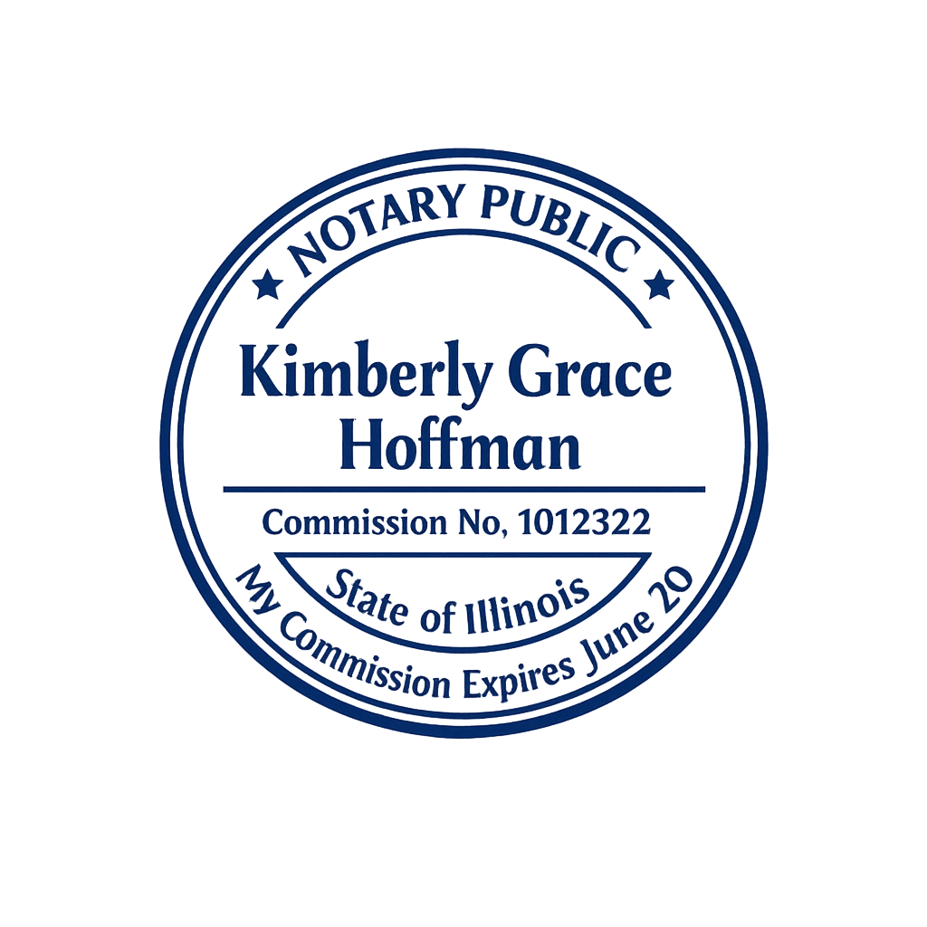
Prioritize legibility and symmetry. Include the jurisdiction, license number, and name with clean separation. If local regulations specify dimensions or elements, follow them precisely. The AI can help align these requirements into a cohesive look.
Pair monogram letters with a restrained border and a considered type pairing. Elegant stamps carry a sense of occasion without over-decoration. If you love a vintage look, apply a subtle aging effect to suggest handcrafted character.
Teachers, creators, and studios often need quick, repeatable marks for worksheets, feedback, packaging, and kit assembly. The AI Stamp Creator makes it easy to standardize across different sizes—no more rebuilding layouts by hand.
Most stamps live at small sizes, so clarity is everything. Sans‑serif faces with open counters tend to perform best in ink and laser prints. Serif faces can be beautiful for monograms and formal seals—just avoid ultra‑thin cuts.
For shapes, round and square are the classics. Rectangular stamps suit labels and addresses; oval and hexagon shapes can add personality when used intentionally. The AI won’t lock you in—you can switch instantly and compare.
Real stamps age. Ink fades, paper absorbs, edges soften. If you love that look but need the control of digital exports, the aging effects let you dial in just enough character. Preview the result in real time and remove it with one click if you prefer a brand‑new finish.
When you’re done, choose the formats that match your workflow:
You can keep as many versions as you like—formal and casual, branded and neutral—so you never need to reinvent a layout.
Your content is yours. The AI’s job is to accelerate production, not to claim authorship. Exports are watermark‑free when you finalize your design, and files are ready to use across your stack. If a job requires vendor handoff—like laser engraving—SVG and PDF ensure your intent survives the pipeline.
The goal isn’t to “design like a designer.” It’s to deliver a result that looks trustworthy and reads perfectly, without getting stuck in tools. When the work looks clean and consistent, the stamp does its job: it signifies.
The biggest change you’ll notice after adopting an AI Stamp Creator is velocity. You’ll stop postponing small tasks because they feel big. You’ll stop opening heavy software for lightweight jobs. And you’ll develop a library of dependable layouts you can reach for any time the business needs a mark, a seal, or a professional sign‑off.
That’s the quiet superpower here: momentum. A clear description, a balanced proposal, and a few refinements—that’s all it takes.
If you have never designed a stamp before, it is easy to assume that the job is purely visual: pick a shape, add some text, and call it done. In practice, great stamps are about consistency, clarity, and repeatability. They need to look good on different kinds of paper, scan clearly, print reliably at small sizes, and still carry the authority or personality you intended from day one. The purpose of this guide is to help you get there quickly with a workflow that respects your time and gives you full control over the final result.
What follows isn’t a list of tricks. It’s a clear, practical way to think about stamp design with the help of an AI Stamp Creator. You will see how to translate a plain‑language idea into a professional layout, how to avoid common pitfalls, how to export files that behave, and how to reuse patterns so you never start from scratch again. Whether your goal is a crisp company seal, a formal approval mark, a notary‑style layout, a wedding monogram, or a simple signature stamp, the same approach applies.
The smartest way to approach AI‑assisted design is to stay focused on outcomes. Instead of micro‑managing every detail in your first draft, write a short description that captures the shape, intent, and hierarchy. For example: “Round company seal, 38mm, bold outer ring with company name and city, inner ring with small separators, centered registration number, modern sans‑serif, slightly condensed.” The AI translates this into a meaningful starting point: balanced spacing, sensible fonts, and a composition that respects your hierarchy. From there, you adjust: do you need a heavier border? A lighter weight for small text? More space between letters on the outer ring? This refinement loop keeps you moving.
You can think of it like having a fast assistant who understands layout rules, typographic balance, and print constraints. You set the direction; the system proposes a clean version; you confirm and improve. By the time you export, the stamp looks intentional and ready for real‑world use.
Eye‑catching flourishes are tempting—ornaments, decorative borders, intricate icons—but the foundation of a stamp is clarity. Start with a clean, readable layout. Confirm that the hierarchy makes sense and that text will remain legible at print size. Only then add flourish where it truly contributes: small separators in the outer ring, a restrained icon, or a subtle shape variation to set the tone. Minimalism isn’t a trend here; it’s a way to guarantee your mark communicates under varied conditions (ink absorption, photocopies, different printers, scans, and even smartphone photos).
Scenario: An operations manager wants a bold “APPROVED” stamp to standardize paperwork. It should be unmistakable, printable at small sizes, and still look clean in photocopies. The department name should appear in a secondary position.
Approach: In the AI Stamp Creator, describe the intent: “Rectangular stamp, bold APPROVED in the center, department name in small caps below, heavy border, high contrast, neutral typeface.” The system proposes a layout with strong legibility. Tweak letter spacing to avoid ink bleed, set a slightly heavier stroke for the outer border, and keep the department line compact. Export as PNG for quick office docs and as PDF for official print runs. The result is legible, standard across teams, and requires no training to recognize.
Scenario: A creative studio ships small runs of physical goods and wants a compact circular mark that includes a monogram and website URL. It should be elegant, clear, and memorable—but not fussy.
Approach: Start with: “Small round stamp, 28–32mm, monogram in center, website around outer ring, refined sans‑serif for the URL, slightly lighter border for a modern feel.” The AI returns a balanced circle with readable type and the monogram sized for impact. Check legibility at print scale; slightly increase letter spacing around the website if necessary. Keep a transparent PNG for packaging and an SVG for vendor handoff when a laser engraving run is planned.
Scenario: A professional needs a notary‑style layout with jurisdiction, license number, and full name. The result must be symmetrical, print cleanly, and respect specific dimensions.
Approach: Provide a precise description: “Round notary‑style seal, 40mm, outer ring with jurisdiction and full name, inner ring with separators, centered license number, classic but readable serif, high contrast.” The AI proposes a compliant base. Verify the measured diameter, confirm line weights against your printer, and test a PDF export for clarity. If regulations require exact wording or placement, update the text content directly and use the live preview to validate spacing.
Scenario: A couple wants a timeless wedding monogram that prints beautifully on textured paper and can optionally include a vintage look on keepsakes.
Approach: Describe the tone: “Round monogram, intertwined initials in the center, date below, minimal outer ring, soft contrast, clean serif, optional aging effect for keepsakes.” Start with the clean version for invitations and formal materials. For keepsake items (guest book pages, gift tags), apply a light aging effect for warmth. Keep vectors in SVG for vendor uploads and high‑res PNGs for DIY prints.
PNG is a pixel‑based format that supports transparency and looks great in office tools and quick previews. If you routinely paste stamps into Word files or email attachments, PNG is the most convenient path. Choose a resolution that matches your print size to avoid scaling artifacts.
SVG is a vector format. It scales infinitely without losing sharpness. If you ever hand off to a print shop or engraver—or if you expect to reuse the layout at many sizes—keep an SVG version. You can open it in vector editors for customization.
PDF is the modern standard for printable documents. Exports are self‑contained, so what you see tends to match what you get, both on screen and on paper. For formal documents and approval workflows, PDF is the safest choice.
Accessibility doesn’t stop at websites. A stamp that is easy to read is inclusive by nature. Favor clear text, distinct shapes, and adequate spacing. Avoid low‑contrast combinations. If your stamp signals a critical status—like APPROVED or CONFIDENTIAL—clarity is a matter of workflow safety.
If your organization already has a visual language, lean on it. Use approved typefaces, align with your color palette, and keep stamp tone consistent with other brand marks. The AI Stamp Creator helps you commit those choices to reusable patterns so future variants inherit the same structure automatically.
In many teams, stamps touch multiple roles: design proposes, ops reviews, legal signs off. Keep your loop small: generate a proposal, label versions clearly (e.g., “Seal_v1_Formal,” “Seal_v2_Compact”), and attach exports directly to the discussion thread. With clear naming and consistent visual structure, approvals arrive faster.
A traditional stamp request might require a designer, a few email rounds, and a one‑off file buried in someone’s inbox. With an AI Stamp Creator, you move from intent to export in one sitting. That time goes back to the real work: the legal review, the operations process, the client call, or the event you are about to host.
Think of the AI Stamp Creator as the “fast lane” for layouts that don’t deserve a multi‑day saga. It won’t replace an art director for brand‑defining projects, and it doesn’t pretend to—but it will help you ship stamps, seals, and marks that are clean, consistent, and credible in a fraction of the time. That’s the point.
Good stamps are quiet workhorses. They certify. They approve. They commemorate. They make paperwork easier to trust. With a simple description and a short feedback loop, you can produce stamps that look great and behave well in the real world. The combination of sensible defaults and your intent is more than enough to reach a professional result—without detours.
Think of this section as your advanced, no-nonsense field guide. It is written for people who care about dependable outcomes and repeatable quality. You will learn how to translate ambiguous requests into clear prompts, how to keep typography readable on paper, how to build stamp systems that scale across teams, and how to avoid the hidden traps that waste print budgets. This is not theory for theory’s sake—it is a set of habits you can apply today and reuse forever.
A prompt is not a magical incantation; it is a design brief in one sentence. The most effective prompts include:
Example: “Round seal 38mm, outer ring company name + city, center registration number, modern sans‑serif, high contrast, clean spacing, no ornament.” That is enough to generate a reliable proposal you can refine within seconds.
Stamps live small. That means the letterforms must survive ink spread, copier reductions, phone photos, and cheap paper. Use typefaces with generous counters and sturdy stems. Avoid ultra‑thin hairlines. If you need elegance, pick a medium weight serif with clear apertures, not a hairline display cut. For outer rings, add a touch of tracking to prevent crowding.
Borders do more than frame content—they set tone. A single crisp ring feels modern and restrained. Double rings suggest formality or tradition. Thicker strokes convey authority; thinner strokes feel lightweight and airy. Pick a strategy that fits the role, then keep it consistent across your system. Consistency is how your documents start looking “official.”
If an icon is part of your stamp, test its silhouette first. Shrink it to stamp size and check if the shape still reads. Thin internal details tend to vanish in ink. Favor bold silhouettes with clear negative space. If your brand icon is delicate, consider a simplified stamp‑grade variant you only use at small sizes or for engraving.
Nothing telegraphs “rushed” like cramped text or lopsided spacing. Professional layouts breathe. Mind the distance between ring text and borders, the gap around a center monogram, and the air between stacked lines. The AI Stamp Creator gives you balanced defaults—use them, then tune deliberately, not randomly. A little restraint goes a long way.
What looks perfect on a bright display might not translate to paper. Dark, saturated hues handle photocopies and scans better. If the stamp must be seen on rough or recycled paper, bump contrast. For brand‑critical color, run a quick proof on the target printer; adjust before full production. This two‑minute check saves hours of reprints.
Aging is tasteful when it complements the message (keepsakes, commemorative seals, or themed events). It is noise when it undermines clarity in workflows that demand precision. As a rule: functional marks (legal, finance, logistics) should be clean and high contrast. Decorative pieces (weddings, anniversaries, heritage projects) can carry character without harming legibility.
Mature organizations rarely stop at one stamp. They need a family: company seal, departmental marks, status stamps, and event‑specific variants. Design them as a system—shared spacing logic, unified type, consistent border styles, and predictable sizes. When different teams use matching visual rules, documents feel coherent even when produced by multiple hands.
Some workflows have rules—what must be included, the order of fields, even the exact size of the seal. Treat those as constraints for creativity, not blockers. The AI can lay out mandatory content cleanly, leaving you to choose type, spacing, and border rhythm that both comply and look polished. Keep a “compliance checklist” next to your prompt so nothing is missed.
You do not need every format for every task. Use PNG for emails, office docs, and quick previews. Use SVG when you plan to scale or hand off to vendors. Use PDF for formal documents and print runs. Keep a small library of exports so teammates can grab and go without re‑exporting each time.
Vendors love clean vectors. If the final artifact will be engraved, embossed, foiled, or die‑cut, export SVG or a vector‑backed PDF. Simplify shapes, unify strokes where possible, and avoid nested, fragile details. Add a short note about desired size and material; a two‑line brief prevents expensive misunderstandings.
Clear naming is a force multiplier. Include role, version, and tone in the filename: “Seal_v1_Formal_38mm.svg,” “Approval_v2_Compact.pdf.” Store exports in a shared folder with a short readme so new teammates can onboard themselves. The AI Stamp Creator makes generation easy; good housekeeping keeps your wins compounding.
Favor symmetry, clear hierarchy, and sturdy type. Keep contrast high and avoid decorative flourishes that can be mistaken for artifacts in scans. Test PDF exports on your document management system to ensure text remains selectable where needed.
Status stamps should shout clarity: APPROVED, RECEIVED, PAID. Use bold faces, generous tracking, and decisive borders. In a fast workflow, a single glance should convey the status with zero ambiguity.
Keep marks friendly and legible. A minimal monogram with a compact label often does the job—clean, warm, and easy to apply across worksheets, kits, and mailers. If you photocopy frequently, test a draft on the office copier before finalizing.
Put elegance on a solid foundation: readable type, balanced spacing, restraint in ornament. Then add a subtle aging effect or a soft border for warmth. Save two versions: clean for invitations, gently aged for keepsakes.
When you find a layout that behaves well across paper types and devices, save it as a template and name it clearly. Treat it as an internal standard—future stamps inherit its spacing, type, and border logic. This is how large teams maintain consistency without creating bureaucracy.
The real benefit of an AI Stamp Creator is not just speed; it is the habit of finishing. When a clear prompt becomes a clean proposal and a clean proposal becomes a print‑ready export in one sitting, the team learns to trust the process. That trust becomes momentum. And momentum, more than anything, is what keeps work moving forward without needless friction.
Skip complex tools. Describe what you need, preview balanced results, and export in minutes. Perfect for company seals, approvals, personal monograms, and clean digital workflows.
Traditional tools expect you to build layouts from scratch. The AI Stamp Creator starts with your intent and proposes balanced compositions, smart typography defaults, and print-aware spacing. You refine instead of wrestling with the basics.
Yes. Upload a simplified or full logo, depending on print needs. The editor helps keep proportions consistent, and you can save multiple variants (formal, compact, monochrome) for different contexts.
You can export to PNG (fast sharing, transparent background), SVG (infinite scalability), and PDF (print-ready and ideal for digital documents and signatures).
Yes. The AI helps maintain symmetry, clear hierarchy, and legibility. If your jurisdiction requires specific dimensions or fields, follow those precisely and use the tool to align them into a cohesive, compliant layout.
Absolutely. Because you start from a description, it’s easy to spin up several directions—minimal, formal, decorative—and compare. Keep what you like, refine the rest, and export when ready.
Yes. You can review, tweak, and export on mobile. For fine-grained alignment and print-scale checks, a desktop display is preferable, but you can move quickly on any device.
Aging effects simulate vintage ink and paper behavior without degrading the core vector quality. Preview in real time and remove with one click if you want a modern, clean finish instead.
Yes. Your content is yours. The AI assists layout and styling; it does not claim authorship. Exports are watermark-free when you finalize your design.
Use readable fonts with open counters, avoid ultra-thin strokes, and verify letter spacing at final print size. If you photocopy often, increase stroke weight to preserve contrast.
Yes. Export SVG or PDF for professional workflows. These formats preserve vector paths so your intent survives laser engraving, die-making, or high-resolution printing.
Join thousands of users who are already creating professional stamps with our AI technology.