If you have never designed a stamp before, it is easy to assume that the job is purely visual: pick a shape, add some text, and call it done. In practice, great stamps are about consistency, clarity, and repeatability. They need to look good on different kinds of paper, scan clearly, print reliably at small sizes, and still carry the authority or personality you intended from day one. The purpose of this guide is to help you get there quickly with a workflow that respects your time and gives you full control over the final result.
What follows isn’t a list of tricks. It’s a clear, practical way to think about stamp design with the help of an AI Stamp Creator. You will see how to translate a plain‑language idea into a professional layout, how to avoid common pitfalls, how to export files that behave, and how to reuse patterns so you never start from scratch again. Whether your goal is a crisp company seal, a formal approval mark, a notary‑style layout, a wedding monogram, or a simple signature stamp, the same approach applies.
The Core Idea: Say What You Need, Refine What You See
The smartest way to approach AI‑assisted design is to stay focused on outcomes. Instead of micro‑managing every detail in your first draft, write a short description that captures the shape, intent, and hierarchy. For example: “Round company seal, 38mm, bold outer ring with company name and city, inner ring with small separators, centered registration number, modern sans‑serif, slightly condensed.” The AI translates this into a meaningful starting point: balanced spacing, sensible fonts, and a composition that respects your hierarchy. From there, you adjust: do you need a heavier border? A lighter weight for small text? More space between letters on the outer ring? This refinement loop keeps you moving.
You can think of it like having a fast assistant who understands layout rules, typographic balance, and print constraints. You set the direction; the system proposes a clean version; you confirm and improve. By the time you export, the stamp looks intentional and ready for real‑world use.
Foundation Before Flourish
Eye‑catching flourishes are tempting—ornaments, decorative borders, intricate icons—but the foundation of a stamp is clarity. Start with a clean, readable layout. Confirm that the hierarchy makes sense and that text will remain legible at print size. Only then add flourish where it truly contributes: small separators in the outer ring, a restrained icon, or a subtle shape variation to set the tone. Minimalism isn’t a trend here; it’s a way to guarantee your mark communicates under varied conditions (ink absorption, photocopies, different printers, scans, and even smartphone photos).
Case Study 1: Operations Team Needs a Fast Approval Stamp
Scenario: An operations manager wants a bold “APPROVED” stamp to standardize paperwork. It should be unmistakable, printable at small sizes, and still look clean in photocopies. The department name should appear in a secondary position.
Approach: In the AI Stamp Creator, describe the intent: “Rectangular stamp, bold APPROVED in the center, department name in small caps below, heavy border, high contrast, neutral typeface.” The system proposes a layout with strong legibility. Tweak letter spacing to avoid ink bleed, set a slightly heavier stroke for the outer border, and keep the department line compact. Export as PNG for quick office docs and as PDF for official print runs. The result is legible, standard across teams, and requires no training to recognize.
Case Study 2: A Small Studio Needs a Signature Mark
Scenario: A creative studio ships small runs of physical goods and wants a compact circular mark that includes a monogram and website URL. It should be elegant, clear, and memorable—but not fussy.
Approach: Start with: “Small round stamp, 28–32mm, monogram in center, website around outer ring, refined sans‑serif for the URL, slightly lighter border for a modern feel.” The AI returns a balanced circle with readable type and the monogram sized for impact. Check legibility at print scale; slightly increase letter spacing around the website if necessary. Keep a transparent PNG for packaging and an SVG for vendor handoff when a laser engraving run is planned.
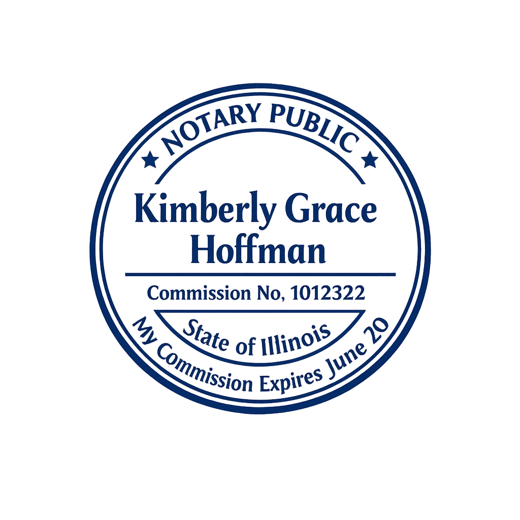
Case Study 3: Notary‑Style Precision Without the Headache
Scenario: A professional needs a notary‑style layout with jurisdiction, license number, and full name. The result must be symmetrical, print cleanly, and respect specific dimensions.
Approach: Provide a precise description: “Round notary‑style seal, 40mm, outer ring with jurisdiction and full name, inner ring with separators, centered license number, classic but readable serif, high contrast.” The AI proposes a compliant base. Verify the measured diameter, confirm line weights against your printer, and test a PDF export for clarity. If regulations require exact wording or placement, update the text content directly and use the live preview to validate spacing.
Case Study 4: A Wedding Monogram That Ages Gracefully
Scenario: A couple wants a timeless wedding monogram that prints beautifully on textured paper and can optionally include a vintage look on keepsakes.
Approach: Describe the tone: “Round monogram, intertwined initials in the center, date below, minimal outer ring, soft contrast, clean serif, optional aging effect for keepsakes.” Start with the clean version for invitations and formal materials. For keepsake items (guest book pages, gift tags), apply a light aging effect for warmth. Keep vectors in SVG for vendor uploads and high‑res PNGs for DIY prints.
From Prompt to Print: The Practical Checklist
- Write one sentence describing the shape, size, hierarchy, and tone.
- Generate a proposal and check the big picture: hierarchy, spacing, contrast.
- Adjust letter spacing and stroke weights with print scale in mind.
- Keep iconography simple; prefer bold, readable forms over intricate detail.
- Export PNG for office work, SVG for vendors, and PDF for print workflows.
- Save a few variants for different contexts (formal, compact, decorative).
Common Mistakes (and How to Fix Them)
- Overly thin typefaces: If small text looks fragile in print, pick a sturdier weight or a face with open counters. Increase letter spacing slightly and re‑export.
- Busy borders: Decorative frames can overwhelm small layouts. Reduce the number of rings or simplify shapes, then restore a single subtle flourish if you still want character.
- Crowded rings: If your outer ring text feels tight, increase the ring radius or adjust type size and tracking. Visual breathing room is critical for clarity.
- Low contrast: Pale inks, textured paper, or frequent photocopies require sturdier contrast. Increase stroke weight and use darker ink colors.
- Vector surprises at vendors: Always keep an SVG copy. It preserves shape fidelity for engraving, die cutting, and high‑resolution output.
Deep Dive: File Formats Without the Jargon
PNG is a pixel‑based format that supports transparency and looks great in office tools and quick previews. If you routinely paste stamps into Word files or email attachments, PNG is the most convenient path. Choose a resolution that matches your print size to avoid scaling artifacts.
SVG is a vector format. It scales infinitely without losing sharpness. If you ever hand off to a print shop or engraver—or if you expect to reuse the layout at many sizes—keep an SVG version. You can open it in vector editors for customization.
PDF is the modern standard for printable documents. Exports are self‑contained, so what you see tends to match what you get, both on screen and on paper. For formal documents and approval workflows, PDF is the safest choice.
Inclusive Stamp Design
Accessibility doesn’t stop at websites. A stamp that is easy to read is inclusive by nature. Favor clear text, distinct shapes, and adequate spacing. Avoid low‑contrast combinations. If your stamp signals a critical status—like APPROVED or CONFIDENTIAL—clarity is a matter of workflow safety.
Brand Consistency Without the Pain
If your organization already has a visual language, lean on it. Use approved typefaces, align with your color palette, and keep stamp tone consistent with other brand marks. The AI Stamp Creator helps you commit those choices to reusable patterns so future variants inherit the same structure automatically.
Team Workflows (Design, Review, Approve)
In many teams, stamps touch multiple roles: design proposes, ops reviews, legal signs off. Keep your loop small: generate a proposal, label versions clearly (e.g., “Seal_v1_Formal,” “Seal_v2_Compact”), and attach exports directly to the discussion thread. With clear naming and consistent visual structure, approvals arrive faster.
Practical ROI: Time You Get Back
A traditional stamp request might require a designer, a few email rounds, and a one‑off file buried in someone’s inbox. With an AI Stamp Creator, you move from intent to export in one sitting. That time goes back to the real work: the legal review, the operations process, the client call, or the event you are about to host.
Troubleshooting: When Something Looks Off
- Edges look fuzzy in print: Increase border stroke weight one step and re‑export PDF. Double‑check your printer’s quality settings—some drivers downscale by default.
- Text looks cramped: Add letter spacing for small caps, or reduce the number of characters around tight rings.
- Colors don’t match expectations: For critical jobs, run a quick test print and adjust—on‑screen previews can mislead.
- The icon feels too detailed: Simplify the path or switch to a bolder silhouette. Fine strokes tend to vanish in ink.
A Quick Glossary (Useful Terms You’ll See)
- Outer ring: The outermost circular text path, best for names and locations.
- Inner ring: A secondary circle used for separators or supportive text.
- Monogram: Central letters, often initials, used for identity or ceremony.
- Counter: The inner voids of letters (e.g., inside “O,” “A,” “P”), important for readability.
- Stroke weight: The thickness of lines in shapes and letterforms.
- Tracking: Overall letter spacing across a word or line of text.
Your First Ten Minutes (A Suggested Path)
- Open the editor and write a one‑sentence description of your goal.
- Pick a shape that matches the use case (round for seals, rectangular for labels).
- Let the AI propose a layout; check balance and spacing at a glance.
- Replace placeholder text, adjust letter spacing, and confirm line weights.
- Preview at print scale; test a small PDF on your office printer if needed.
- Export PNG/SVG/PDF and save a variant for future edits.
Where This Fits in Your Toolbelt
Think of the AI Stamp Creator as the “fast lane” for layouts that don’t deserve a multi‑day saga. It won’t replace an art director for brand‑defining projects, and it doesn’t pretend to—but it will help you ship stamps, seals, and marks that are clean, consistent, and credible in a fraction of the time. That’s the point.
Final Thoughts
Good stamps are quiet workhorses. They certify. They approve. They commemorate. They make paperwork easier to trust. With a simple description and a short feedback loop, you can produce stamps that look great and behave well in the real world. The combination of sensible defaults and your intent is more than enough to reach a professional result—without detours.