Create an Address Stamp with a Stamp Maker Online
A custom address stamp saves repeated typing or handwriting, but the design still has to work at a small physical size. A stamp maker online can help you arrange the name, street, city, region, and postal code before you commit to a physical stamp or place the mark in a document. The important work is not adding decoration. It is deciding what information belongs in the impression, establishing a readable hierarchy, and checking the result at the size where people will actually see it.
This guide keeps the existing address-stamp topic and turns it into a practical workflow. It covers the choices you can verify in the editor, the checks to make before downloading, and the information a physical stamp vendor may need. If you first need a broader introduction to digital stamp formats and uses, start with the online stamp overview. You can then return to the Stampdy online stamp workspace when you are ready to compare the available creation paths. No single layout, font, or file type will suit every production method.
Decide What the Address Stamp Must Do
Start with the real use case. A personal return-address stamp for occasional envelopes has different constraints from a business mark used on packing slips. Write down the surfaces you expect to stamp, the available space, and whether the impression needs a name, a department, or only a mailing address.
For a typical personal address stamp, the minimum content is:
- recipient or household name;
- street address or post-office box;
- city, region, and postal code;
- country, when the stamp will be used on international mail.
A business version may also need a trading name or department. Avoid adding a phone number, email address, slogan, and logo simply because space is available. Every extra element reduces the room for the address itself. If the mark will be used on public-facing mail, consider whether publishing a home address is appropriate before placing it in a reusable design.
The address stamp template collection is useful for comparing common structures before starting. Treat a template as a layout reference, then replace every sample field and verify the final text yourself.
Choose a Shape and Reading Order
Rectangular layouts usually provide the most natural reading order for postal information. They allow the street, city, and postal code to remain on separate lines without forcing the text around a curve. A round address stamp can work when the name sits on an arc and the address remains large enough in the center, but it needs more testing at small sizes.
Build the hierarchy before styling:
- Put the name or organization on the first line.
- Keep the street information together.
- Keep the city, region, and postal code together.
- Use consistent alignment across all address lines.
The longest line should guide the width of the design. Do not solve an overlong line by shrinking only that line until it becomes difficult to read. Shorten an optional label, use a recognized postal abbreviation where appropriate, or choose a wider layout. Keep enough clear space between the text and border so small alignment differences during physical production do not make the design feel crowded.
Build the Layout in a Stamp Maker Online
Open the Stampdy stamp maker and select a rectangular or round starting layout. Replace the sample text one field at a time. This reduces the chance of leaving a template address in the finished design.
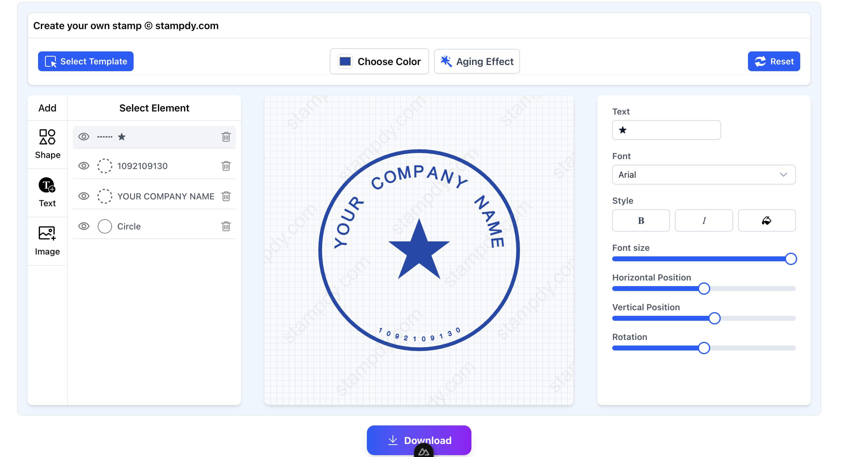
Use the following order while editing:
- Enter final text first. Spacing decisions are unreliable when the design still contains short placeholder words.
- Set the outer shape. Choose a width and height that fit the intended envelope, label, or package area.
- Choose one readable type family. A second style can distinguish the name, but multiple decorative fonts make a small mark harder to scan.
- Adjust size and spacing. Check that letters do not touch the border and that lines do not collide.
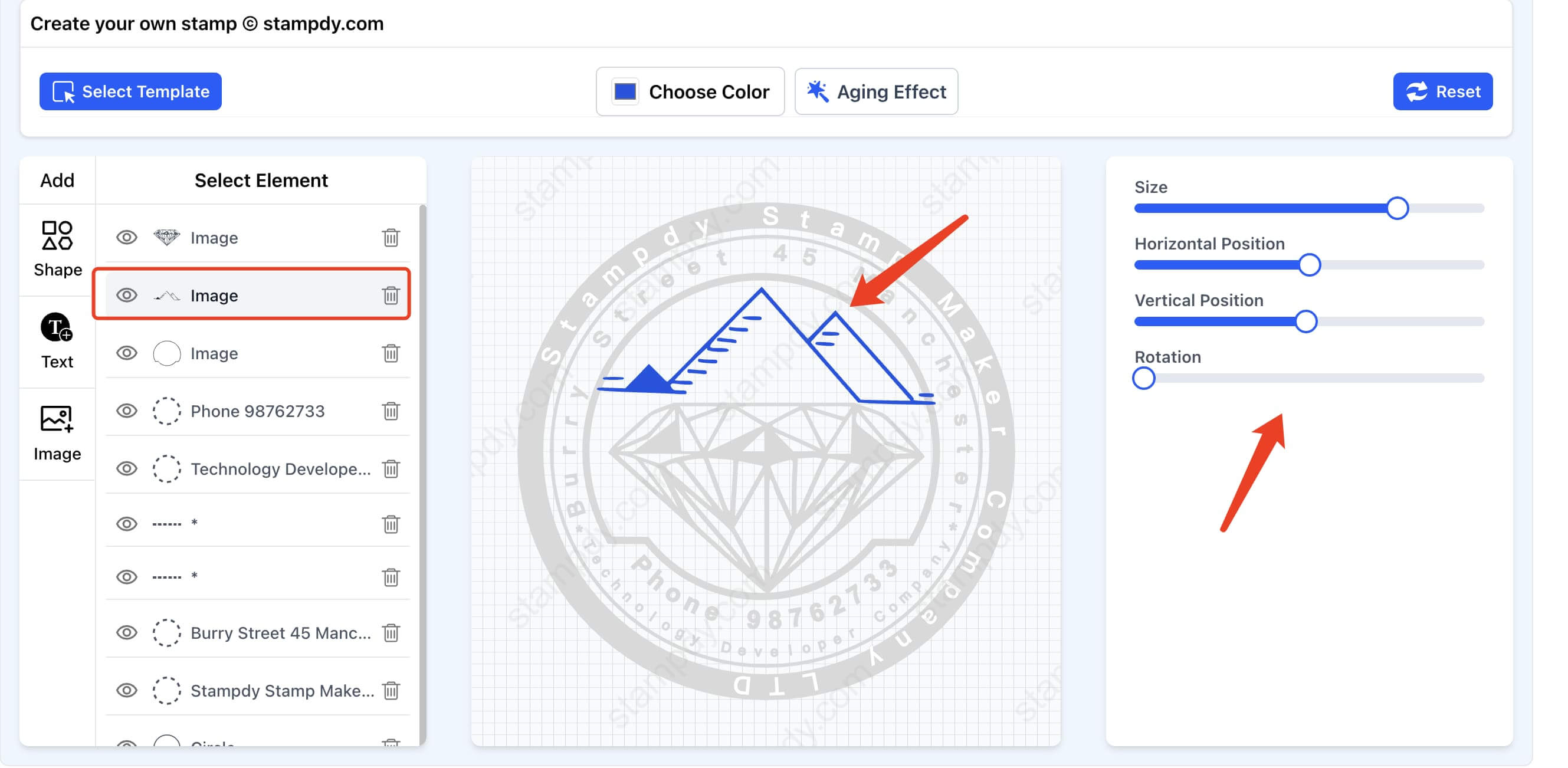
- Add a logo only when it survives reduction. Use a simplified, high-contrast version rather than detailed brand artwork.
- Review every character. Postal codes, unit numbers, and similar street names are easy to overlook because the layout still looks balanced when one character is wrong.
The live preview is a design aid, not a substitute for a size test. Zooming in on screen can make thin lines and small text appear safer than they will be in print.
Test the Address at Its Intended Size
Before downloading, decide the approximate physical width of the final impression. Ask the physical stamp vendor for its minimum text size and line-thickness guidance if you plan to order a rubber or self-inking stamp. Production methods differ, so a universal minimum would be misleading.
Make a simple test sheet with the design at 100%, slightly smaller, and slightly larger. Print it without “fit to page” scaling. Then check:
- whether every address line can be read at arm's length;
- whether counters inside letters such as “a,” “e,” and “o” remain open;
- whether punctuation and apartment numbers remain visible;
- whether the border looks separate from the text;
- whether a grayscale print preserves enough contrast.
If a test fails, simplify the design before enlarging the entire mark. Removing a decorative line or reducing the logo may restore more readability than making every element larger.
Select and Check the Downloaded File
Choose the export that matches the next step in your workflow. A transparent PNG is convenient for documents and quick visual review. A vector format may be useful when a vendor needs scalable artwork. Confirm the formats available in the selected Stampdy export option rather than assuming that every tool or plan provides the same files.
After downloading, open the actual file and inspect it independently from the editor preview. Check the canvas edges, background, spelling, line breaks, and color. If the design will be placed in a PDF or document, insert a copy and confirm that the application does not stretch it. The digital stamping guide explains how an image-based mark fits into a document workflow, while the stamp image resize tool can prepare a separate delivery copy without changing the original export.
For physical production, send the vendor the original file and the intended impression dimensions. Ask for a proof when the design contains small text or a logo. If you are still deciding between manual production and an online workflow, the comparison of hand-carved and digital stamp tools provides additional context. A digital preview cannot predict every material, ink, paper, and pressure combination.
Practical Layout Examples
A personal return address
Use the household name as the first line and keep the remaining address in two or three plain lines. A small icon can sit to the side only if it does not force the postal information to shrink. For holiday cards, change decorative elements in a separate copy rather than editing the verified everyday version.
A small-business shipping address
Give the business name slightly more weight, then keep the return address compact. A department label can prevent returned items from reaching the wrong team. Keep the return-address function separate from approval or financial workflow marks; the bank stamps guide covers those more controlled use cases. If the business operates from a home address, decide who is authorized to publish and reuse that information before creating a shared asset.
An event reply address
For wedding or event mail, a restrained serif or script can distinguish the names, but the delivery address should remain plain. Test the smallest characters. Decorative flourishes that look attractive on screen may fill in when reproduced as a physical impression.
These examples are starting points, not postal rules. Always use the address format expected by the carrier and country involved.
Common Address Stamp Problems to Fix
The design contains the wrong address. Compare the finished artwork with a trusted source, not with memory. Verify postal code, unit number, and spelling separately.
The address is centered but hard to scan. Try left alignment for multi-line postal information. Visual symmetry is less important than a predictable reading order.
The logo dominates the stamp. Reduce it or use a one-color simplified mark. The address is the functional content. When the logo itself needs a dedicated stamp treatment, follow the separate logo stamp design guide instead of forcing both purposes into one crowded layout.
The physical proof looks filled in. Increase gaps, remove very thin details, and ask the vendor about the selected production method. Do not promise that a screen-perfect file will reproduce identically on every material.
The image looks blurry in a document. Return to the original export and create a correctly sized copy rather than repeatedly resizing a previously compressed image. For broader preparation advice, see the online stamp creation workflow.
Frequently Asked Questions
Should an address stamp be round or rectangular?
A rectangular stamp is usually easier for conventional multi-line postal information. A round design can work when the name or decoration follows the border and the central address remains readable. Test either shape at its intended size.
Can I include a logo with my return address?
Yes, when you have permission to use the logo and it remains clear at the final size. Prefer a simplified one-color version, keep it separate from the postal lines, and review a physical proof before ordering in quantity.
Which file should I send to a physical stamp vendor?
Ask the vendor which format, color mode, dimensions, and line specifications it accepts. Send the original export rather than a screenshot. Include the intended impression size and request a proof if the design contains small text.
Is it safe to place a home address in an online design?
An address is personal information. Decide whether it should appear in a reusable asset, who can access the file, and where downloads are stored. Use a business or mailing address when that better fits your privacy needs.
Conclusion
A stamp maker online is most useful when it supports a disciplined review process: enter final address data, choose a readable structure, test the design at real size, inspect the downloaded file, and confirm production requirements with the vendor. The result does not need extra decoration to be effective. It needs accurate information, clear text, enough spacing, and a file prepared for the way you intend to use it.