JPG Stamp Downloads Are Now Available: When a White Background Helps
JPG Stamp Downloads Are Now Available: When a White Background Helps
Stampdy now supports JPG stamp downloads. When you download the full export package from the editor, it can include a white-background JPG alongside the other available formats. It is a small addition to the download folder, but it solves a surprisingly common problem: sometimes you do not want a transparent stamp file or a specialist vector file. You just want an ordinary image that opens everywhere, previews correctly, and can be passed to someone without an explanation.
The JPG is made from the same design you see in the editor. Stampdy places the finished artwork on a white background and exports it as a familiar image file. Your original layout, colors, proportions, and aged-ink effects remain visible; the important difference is that the empty area around the stamp is white rather than transparent.
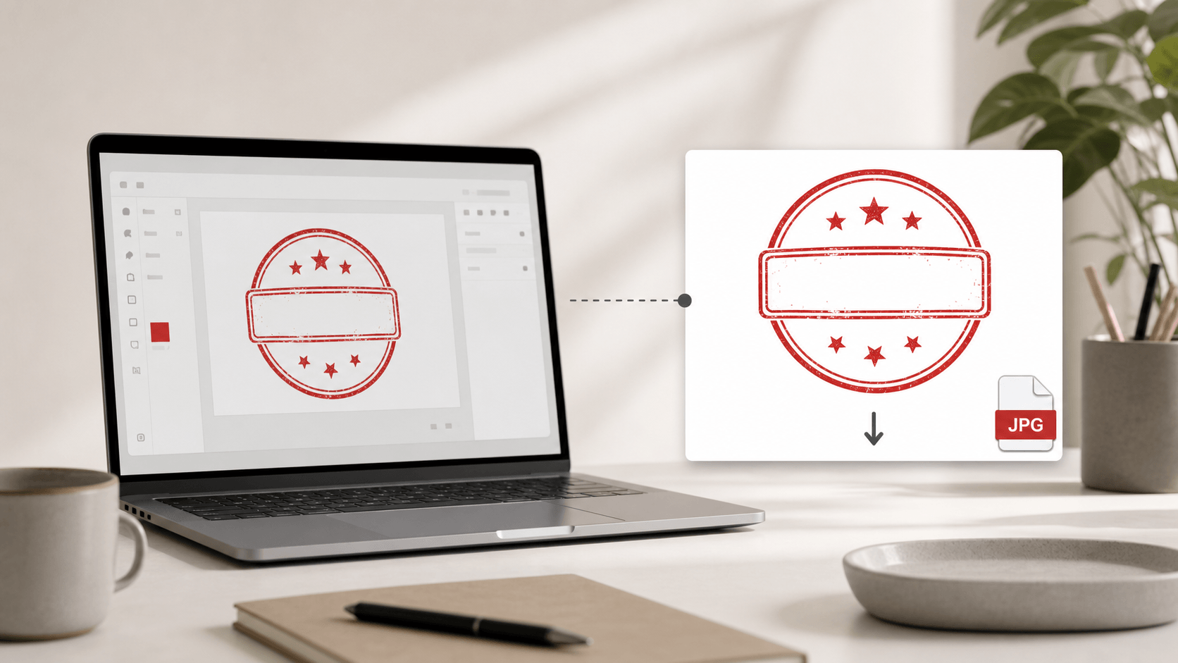
That distinction matters because PNG, JPG, SVG, EPS, PDF, and DOCX are not competing versions of the same thing. Each one is useful at a different point in a document or production workflow. JPG fills the everyday-image role particularly well.
What changed in the download package
Before this update, a person who needed a standard white-background image might download a transparent PNG and convert it manually. That sounds easy until it becomes one more task between approving a design and sending it to a colleague. The conversion can also introduce avoidable problems: a gray background instead of pure white, an unexpectedly small image, a changed crop, or a low-quality screenshot used in place of the original export.
The editor now handles that step. A full-format download can contain the white-background JPG with the same base filename as the related PNG. There is no need to open an image editor, flatten transparency, take a screenshot, or use a third-party converter. You create the stamp once and keep the formats that fit the work ahead.
This is part of the normal Stampdy stamp maker export flow. The editor still lets you build the design from text, shapes, icons, uploaded graphics, and visual effects. JPG support changes the output options, not the way the stamp is designed.
JPG in plain language
JPG, also written as JPEG, is one of the most widely recognized image formats. Phones, browsers, office applications, email clients, content-management systems, and basic file viewers all know how to open it. It uses pixels rather than editable vector paths, and it does not support transparent backgrounds.
For a stamp export, the lack of transparency is intentional. The artwork sits on a solid white rectangle. If you open the file by itself, place it on a white document, or attach it to an email, what you see is predictable. There is no checkerboard preview, black transparency fallback, or colored page showing through the empty parts of the design.
JPG also uses compression to keep files manageable. That makes it convenient for previews, email attachments, web uploads, and office records. It is not the best master format for repeated editing or unlimited enlargement, but most people asking for a JPG are not trying to rebuild the stamp. They need a dependable visual copy.
Why a white background is sometimes better
Transparency is valuable when a stamp must sit naturally over another element. A transparent PNG can be placed on a colored page, product image, certificate, or presentation without carrying a visible rectangular background. But transparency can become a source of confusion when the receiving application handles it badly.
Some document tools display transparent areas as black in thumbnails. Some internal systems generate previews against dark gray. A few older upload forms accept JPG but reject PNG files. Messaging apps may compress or transform an image after it is sent. Even when the final file is technically correct, the recipient may see a preview that makes it look broken.
A white-background JPG removes that uncertainty. It behaves like a small scanned image or ordinary photograph. If the intended destination is already white—such as a typical invoice, letter, approval sheet, or internal form—the rectangular background blends into the page. The result is simple, which is often exactly what an administrative workflow needs.
Common situations where JPG is useful
Consider a small business that has approved a stamp design and needs to share it with an office administrator. The administrator is not going to edit vectors or arrange a print-production file. They may only need to add the image to a Word document, keep a copy in a shared folder, or attach it to an internal request. A JPG is immediately understandable.
The same applies to a sales team preparing a draft proposal. They might place a visual stamp near an approval note to show where the final mark belongs. A white-background image drops cleanly onto a white proposal page and travels with the document when it is emailed for review.
Operations teams often keep reference sheets that show approved marks, labels, or branch details. A JPG can be inserted into a spreadsheet cell, knowledge-base page, or ticket without requiring special handling. It is also convenient when a vendor asks for “a picture of the stamp” rather than production artwork.
JPG can help with:
- email attachments and quick visual approvals;
- Word documents, spreadsheets, and simple presentations;
- systems that accept JPG but not transparent PNG or vector files;
- white-page mockups and internal process guides;
- content-management systems that automatically create image previews;
- lightweight reference copies stored beside other office records.
These are ordinary tasks, but ordinary tasks are where file-format friction tends to be most noticeable. The person receiving the file should not need design software or a short lesson about transparency before they can use it.
JPG and PNG are useful for different reasons
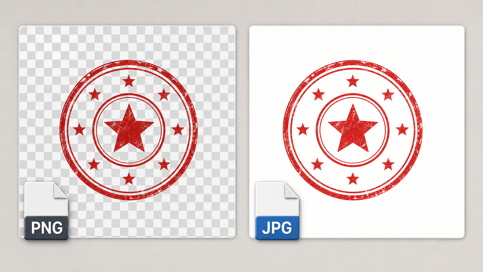
The easiest distinction is background behavior. Stampdy’s JPG export uses a white background. A PNG can preserve transparency, allowing only the visible stamp artwork to cover what is underneath. If you are placing a stamp over a colored certificate, a photograph, or an existing PDF page, transparent PNG is usually the more flexible choice.
If you are placing the stamp on a white page, sending a preview, or uploading it to a JPG-only system, the white-background JPG may be simpler. Neither format is universally better. The right choice depends on what the next application expects.
Compression is another difference. PNG is well suited to crisp graphics, flat colors, sharp edges, and transparent pixels. JPG is designed around efficient photographic-style compression. At normal viewing sizes, a well-exported JPG stamp remains clear, but repeatedly opening, editing, and resaving it can gradually introduce artifacts. Keep the original Stampdy project or another master format if future revisions are likely.
There is also a practical visual difference. With transparent PNG, the apparent background depends on the program displaying the file. With JPG, the white background is part of the image itself. That makes the preview more consistent from one device to another.
When to choose SVG or EPS instead
JPG is easy to share, but it is still a pixel image. If a rubber-stamp manufacturer, print shop, engraver, or graphic designer asks for scalable artwork, send a vector format when possible. SVG and EPS describe shapes and paths in a way that can be enlarged without turning edges into visible pixels.
A production partner may need to adjust line weights, separate colors, inspect curves, or fit the design to a physical stamp size. JPG is a useful reference in that conversation, but it may not be the working file they need. Ask the vendor which format their equipment and software prefer.
This is why a multi-format export is practical. You do not have to predict every downstream request while designing the stamp. Keep the JPG for easy viewing, the PNG for transparent placement, and the vector file for production. If a supplier replies two days later asking for EPS, you already have it rather than trying to reconstruct a vector from a compressed image.
Where PDF and DOCX fit
PDF is helpful when the stamp needs to be reviewed at a consistent page size or shared as a print-oriented document. It is familiar across platforms and is less dependent on the recipient’s office software. For proofing and fixed-layout handoffs, it often makes more sense than a loose image.
DOCX serves a different purpose. It belongs naturally in Microsoft Word workflows where the stamp is part of an editable office document. A team preparing letters, certificates, or internal forms may prefer to start from a Word file rather than insert an image manually.
JPG remains the uncomplicated visual asset among those choices. It does not try to preserve an editable page structure. It is simply the finished design on white, ready to view and place.
A straightforward export workflow
Start by finishing the stamp in the editor. Check the wording, spacing, border thickness, colors, and any uploaded logo. Look at the design at both normal size and a smaller preview size. Fine details that look attractive while zoomed in may become too delicate when the stamp is placed in a document.
When the design is ready, use the full-format download option. The exported package groups the related files so you do not have to generate each one separately. The JPG uses the stamp artwork on white; other files retain the behavior appropriate to their formats.
After downloading, open the JPG once before sending it. Confirm that the white background is what your workflow expects and that the artwork has enough space around it. If the destination is a white document, test it in a copy of that document. If the result needs to overlap existing content, switch to transparent PNG rather than trying to erase the JPG background.
For teams that also work with PDFs, the Stampdy PDF tool provides a separate document-oriented path. A loose JPG file is ideal for many office uses, while a PDF workflow is better when placement within a particular document matters.
What the JPG should not be used for
The most important limitation is enlargement. A JPG has a fixed number of pixels. Making it much larger than its exported dimensions can soften curves and reveal compression around small text or thin borders. It may look fine in an email but less convincing on a large poster.
It is also not the right file for transparent overlays. A white rectangle will remain visible on colored or textured backgrounds. You can sometimes remove white in graphics software, but doing so after export is unnecessary when a transparent PNG is already available.
Avoid using JPG as the only archival copy if the design may change. Keep access to the original design and retain the other exported formats. A final JPG is good evidence of how the stamp looked at one moment; it is not an editable source file.
Finally, do not assume that a JPG is automatically accepted for physical production. Different suppliers use different processes. Some accept high-resolution raster images, while others require vectors. A quick question before ordering can prevent a round of back-and-forth.
A few checks before sharing the file
Read the stamp text one final time. Names, registration numbers, addresses, department labels, and dates can be hard to notice when they curve around a border. Exporting into more formats does not correct a typo in the source design.
Check contrast as well. A light gray stamp on white may be elegant on screen but difficult to read after printing or office-document compression. Aged and distressed effects should still leave enough of each character visible. If the JPG is going into a small space, test it at that actual size rather than relying on a large editor preview.
Use a clear filename when sharing it outside the download folder. A name such as north-branch-approved-stamp.jpg says more than image-final-2.jpg. If several versions exist, include a date or revision number. File naming is mundane, but it reduces the chance that an earlier design is reused later.
Using JPG in Word and similar tools
Most office tools insert JPG without special settings. Add the image, preserve its aspect ratio, and resize it from a corner rather than stretching one edge. If the document background is white, the image boundary should visually disappear.
Be cautious with aggressive document compression. Word processors and slide tools sometimes reduce image quality when saving or exporting. If small stamp text becomes soft, review the application’s image-compression settings or use a higher-fidelity format for the final document.
Also decide whether the image is a working placeholder or a final mark. In a draft, a JPG may show reviewers what will appear. In a controlled approval process, the team may need a separate record of who approved placement and which design version was used. The file format does not replace those process decisions.
Sending a JPG by email or chat
Email is one of the clearest reasons to offer JPG. Recipients can preview it without downloading specialist software, and the white background tends to display consistently. Attach the original file rather than pasting only a screenshot into the message. A screenshot may add browser controls, change resolution, or crop the design unevenly.
Some chat applications process uploaded images differently from files. If maintaining the original quality matters, use the application’s “send as file” option rather than its photo-sharing mode. The recipient still gets a JPG, but the service is less likely to resize it.
Include a short note about purpose: “JPG preview for the white letterhead” or “reference only; use the EPS for manufacturing.” That sentence prevents the convenient file from being mistaken for the production master.
Uploading JPG to websites and internal systems
Many website forms and internal portals were designed around ordinary image uploads. They may list JPG first, generate a thumbnail automatically, and reject less familiar vector formats. In that setting, the new export avoids a detour through conversion software. Upload the original JPG file, then inspect the system's preview before completing the record.
Pay attention to automatic cropping. A profile-style uploader may force every image into a square or remove outer margins. Stamp artwork usually needs breathing room around its border, so use a general document-image field when one is available. If the portal offers a “fit” option, choose it instead of “fill,” which can cut off the outside of a circular or rectangular stamp.
Web publishing also introduces an accessibility question. When a JPG is used as an illustration, write alternative text that explains what the image shows. When the stamp contains essential approval information, repeat that information as normal page text rather than expecting every reader to interpret words embedded in an image. An image can support a record, but it should not be the only place where important instructions appear.
If the stamp will be placed into an existing document rather than uploaded as a standalone reference, the document signing workspace may provide a more appropriate workflow. Choosing a familiar file format is useful; choosing the correct destination for the work is more important.
Archiving the exported set
Keep the JPG beside the other files from the same approved export. Separating the easy-to-preview image from its vector and document companions can make later production requests harder to answer. A folder named for the organization, stamp purpose, and approval date gives future colleagues enough context to find the master files.
If a revised design is approved, archive the earlier folder instead of silently replacing individual files inside it. This preserves a clear record of which JPG matched which SVG, EPS, PDF, and DOCX. It also prevents a new preview from being paired accidentally with an old production file.
For controlled business marks, record who approved the wording and when the design entered use. Stampdy provides the export tools, while the organization remains responsible for access, authorization, retention, and replacement rules. A tidy archive turns a convenient download into a dependable part of that process.
Keeping format choices understandable for a team
A shared folder full of six formats can confuse people if no one knows why they exist. A small README or naming convention is enough. Teams can label JPG as the easy white-background preview, PNG as the transparent image, SVG and EPS as scalable production files, PDF as the fixed-layout proof, and DOCX as the editable office document.
The point is not to turn every colleague into a graphics specialist. It is to let them make a reasonable choice without guessing. If one format becomes the normal choice for a recurring task, document that decision next to the template.
For example, an HR team might use JPG for draft onboarding letters, PNG for certificates with colored backgrounds, and PDF for final review. A print coordinator might ignore both raster formats and send EPS directly to the supplier. The same stamp design supports both workflows because the export package does not force one file to do every job.
A note about color and printing
Colors on a screen and colors on paper are never perfectly identical. Monitor brightness, office printer settings, paper stock, and ink all affect the result. JPG support makes a file easier to move, but it does not eliminate the need for a print test when color accuracy matters.
Print a sample at the intended physical size. Look for thin lines that disappear, small gaps that close, and distressed textures that become muddy. If the stamp will be manufactured, follow the supplier’s guidance about line thickness and color mode. Send a vector file when requested and use the JPG as a visual reference.
For ordinary documents, the test can be simpler: place the JPG on a representative page, export or print it using the normal office process, and check legibility. This catches more real problems than inspecting the image at 400 percent zoom.
Why this update is intentionally uncomplicated
JPG download support is not a new design tool or a different way to build stamps. It is a practical output option. Many users already recognize the format, many systems already accept it, and a white background is the expected result in a large number of office workflows.
Good tools often improve by removing small conversion steps. A person should not need to search for a transparency-flattening website just to send an approved stamp image to a colleague. They also should not be forced to use JPG when their work calls for transparent or scalable artwork. Providing the formats together leaves that decision with the person who understands the destination.
If you want to create or update a design, open the online stamp maker, finish the layout, and choose the export that matches the next task. Use JPG when a familiar white-background image is the simplest answer. Keep PNG when transparency matters, and keep the vector files for production. That is the whole idea behind the update: one design, fewer conversions, and a file that fits the work in front of you.