Stamp Maker Notes for Documents That Still Need a Signature
Most people open a stamp maker because they need a mark. In practice, they are often trying to fix a process problem. A PDF is ready to sign, but the department stamp is missing. The finance approval mark looks different from last month's version. The contract packet is approved, but the page still feels unfinished.
This is where Stampdy's stamp maker connects naturally with the newer signature and PDF tools. The stamp is prepared first. The PDF is checked next. The signing request goes out after that, not while someone is still hunting for a logo or rebuilding a stamp from a screenshot.
Make The Stamp While Nobody Is Waiting
The worst time to make a stamp is five minutes before a file goes out. That is when people accept bad spacing, fuzzy exports, and filenames that nobody will understand later. Build the stamp while the team still has time to agree on wording, shape, size, and export format.
Inside the Stampdy stamp maker, keep the design practical. Use text that still reads when the stamp is smaller. Avoid overly thin borders if the document may be printed. Export the format your team actually needs instead of downloading every option and deciding later.
Once the stamp is ready, name it in a way another teammate can understand. "finance-approved-blue-2026.png" is more useful than "stamp-new.png". That single naming habit can prevent a surprising amount of confusion.
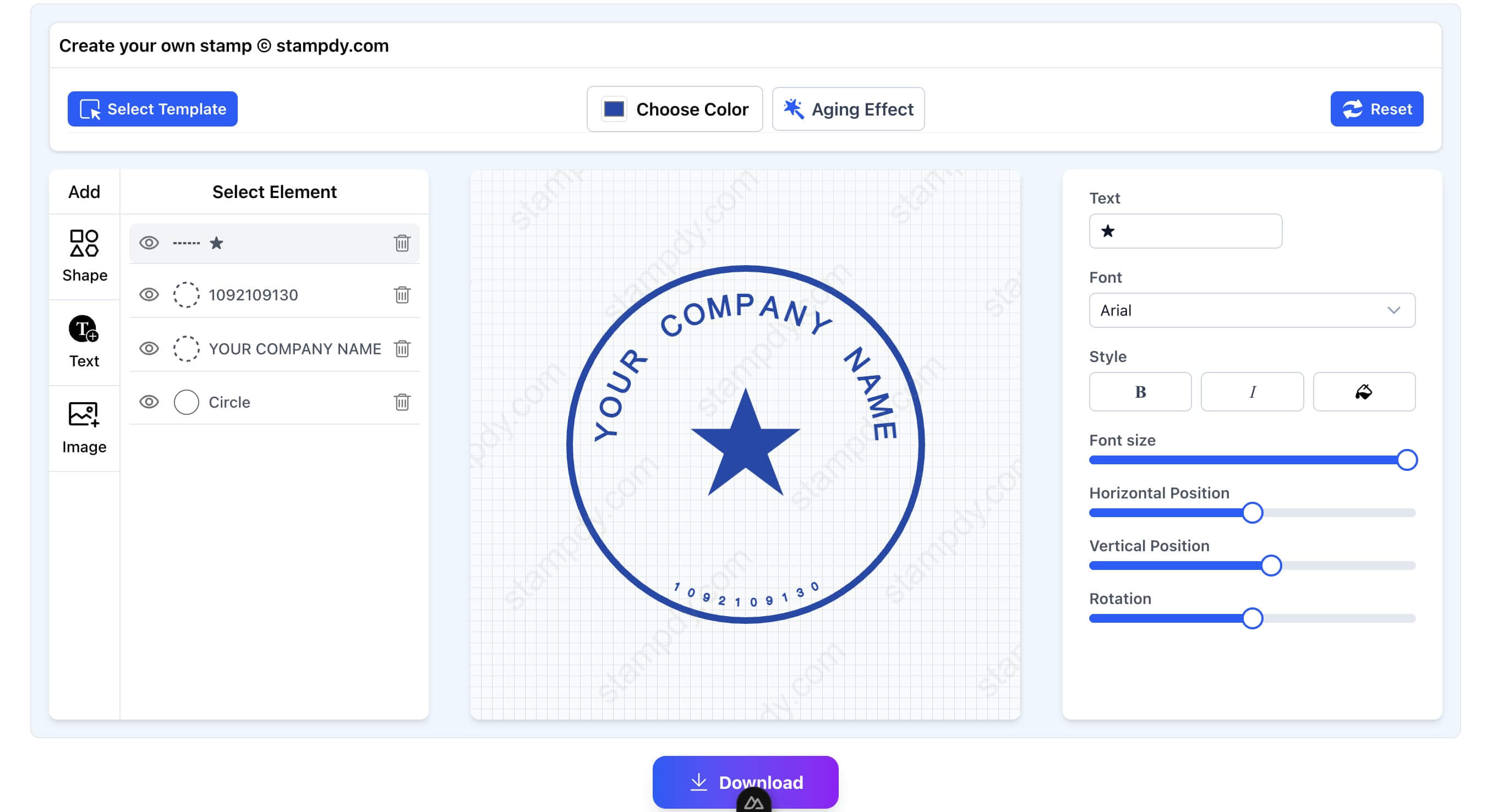
Decide What The Stamp Is Supposed To Prove
Before changing fonts or borders, decide what the stamp is doing in the document. Is it saying the file was reviewed? Is it marking a payment status? Is it showing a company identity? Is it a branch office mark used for local paperwork? Those are different jobs, even if they all look like stamps on a PDF.
This question keeps the stamp maker work grounded. A "Paid" stamp needs to be short, legible, and hard to misread. A company seal may need a more formal layout and better spacing around the name. A "Reviewed" stamp can be lighter, because it supports the approval record rather than acting as the main proof. When the purpose is clear, the design choices get easier.
It also prevents a common mistake: making one stamp do too many things. I have seen teams try to fit company name, department, date, approval status, reviewer initials, and a slogan into one small mark. It looks official for about ten seconds, then everyone realizes it is hard to read. Make the stamp say the thing people actually need to know.
For signature-ready files, that usually means restraint. The signature is the main action. The stamp supports the page. A clean document does not need every visual element to shout.
Pick Export Formats Like A Real Team
The export choice should match the path the document will take. If the stamp will be placed into a PDF and kept digital, a clean image format may be enough. If a vendor or print shop may use it later, keep a vector-friendly export nearby. If the team works in Word before turning the file into a PDF, store the version that fits that workflow.
The mistake is downloading a folder full of formats and assuming that counts as organization. It does not. A folder with six unnamed exports can be worse than one properly named file. I would rather see "approved-stamp-blue-pdf-use.png" and "approved-stamp-vector-source.svg" than a loose pile of files called "download", "download-1", and "new stamp".
This is another reason to prepare stamp maker assets before the signature rush. When the signer is waiting, people choose speed. When the team prepares assets ahead of time, people can choose clarity.
Put The Stamp In The Signing Path
When the same document also needs signatures, move from design into the signature workspace with the same discipline. Confirm that the PDF is the right version. Place signature fields where signers expect them. Keep the stamp close to the document purpose instead of dropping it wherever there is blank space.
A sales contract might need a company stamp near the final signature block. A purchase order might need an internal review mark before it goes to finance. A policy PDF might need a date stamp after leadership approval. These are small differences, but they are exactly the differences that make a document feel prepared instead of patched together.
At that point, the stamp maker is no longer just a design tool. It is part of document control. The same mark, placed consistently, tells people the file followed the right path.
Watch For The Quiet Layout Problems
Most bad stamp usage does not look obviously broken. It looks almost right. The stamp is a little too close to the signature. The border is too thin after export. The mark sits on top of a faint table line. The date field is technically visible, but the page feels crowded. These are the kinds of issues that make a signed document feel less trustworthy even when the content is correct.
I would check the PDF at the size people will actually use. Do not judge only from a zoomed-in editor view. Open the exported document, look at the whole page, and ask whether the stamp still reads quickly. If the document will be printed, test a single page before using the stamp across a recurring packet.
For teams that send the same kind of document every week, it is worth making a tiny placement rule. The stamp goes under the approval line, or in the lower right of the review block, or beside the internal routing table. The exact location matters less than the consistency. Once people know where the mark belongs, they stop improvising.
Keep A Short Change History
If the stamp changes, write down why. That sounds formal, but it can be as simple as a line in a shared note: "June 2026 - changed finance approval stamp from red to blue for better contrast on signed PDFs." Six months later, that note can explain why two versions exist.
This matters when older documents stay in circulation. A client may send back a signed PDF from March, while the team now uses a June stamp. Without a small record, someone may think one of the files is wrong. With a small record, the difference is easy to explain.
The same habit helps with brand changes, department name changes, and legal wording updates. A stamp maker makes the visual update easy. The team still needs a human reason attached to the change.
Test The Stamp In The Kind Of PDF You Actually Send
Do not approve a stamp only by looking at it on a blank canvas. Put it into the kind of PDF your team actually sends. If the stamp will appear on purchase orders, test it on a purchase order. If it belongs on contracts, test it beside a signature block. If it will be used on a document with tables, make sure the stamp does not make the table harder to read.
This test often changes the design. A border that looked elegant in the editor may look weak on a busy PDF. A red stamp may be too loud on a page that already has warning text. A small department name may be readable on desktop but unclear after printing. These are not design failures; they are normal adjustments once the stamp meets the real document.
I would also test the stamp with the signature flow before calling it finished. The final page should make sense as a whole: document title, approval mark, signature field, date, and storage name. If one piece feels out of place, fix it before the workflow becomes routine.
It helps to keep one example PDF as a reference. Not a live customer file, just a harmless sample that shows the approved stamp size and placement. When a teammate is unsure, they can compare against that sample instead of guessing. This keeps the stamp maker output consistent without turning every document into a design review.
Leave Fewer Loose Files Behind
After the document is signed, store the final PDF and the source stamp asset in predictable places. If a client asks for a copy later, no one should need to search through exports, screenshots, and old email attachments.
For PDF-heavy work, the Stampdy PDF viewer can sit alongside the stamp and signature tools as a quick way to review the file before the last step. That small review habit matters because most document errors are boring: wrong date, wrong page, missing initials, old stamp, or unclear filename.
The whole process should feel almost too plain. People know which stamp to use. Signing requests move with less cleanup. The final document looks intentional because the team stopped treating stamps as last-minute artwork. Getting there requires a little thought about ownership, reuse, and what happens when the document leaves the editor.
Start With The Words, Not The Shape
When people open a stamp maker, they often begin by choosing a circle, border, color, or icon. I would start with the exact words. The wording determines whether the stamp will still make sense when it appears in an email attachment, a printed packet, or a PDF opened months after the original conversation.
Short status stamps should be unambiguous. "Approved" may be enough for an internal workflow where the surrounding record shows who approved it. In another team, "Finance Reviewed" may be more useful because it separates financial review from legal or operational approval. A date may help on recurring paperwork, but a fixed date inside a reusable asset will cause trouble. Decide whether the date belongs in the stamp design, in a separate PDF field, or only in the signing record.
Company and department names deserve a spelling check before design begins. Confirm abbreviations, punctuation, and legal suffixes. If the organization recently changed its name, ask which documents still require the old form. A polished stamp with the wrong company name is harder to excuse than an obviously temporary draft.
Read the wording at the smallest size you expect to use. Long phrases that look balanced on a large canvas can collapse when the stamp is placed beside a signature block. Removing one unnecessary word often improves the result more than changing the font five times.
Choose A Visual System The Team Can Repeat
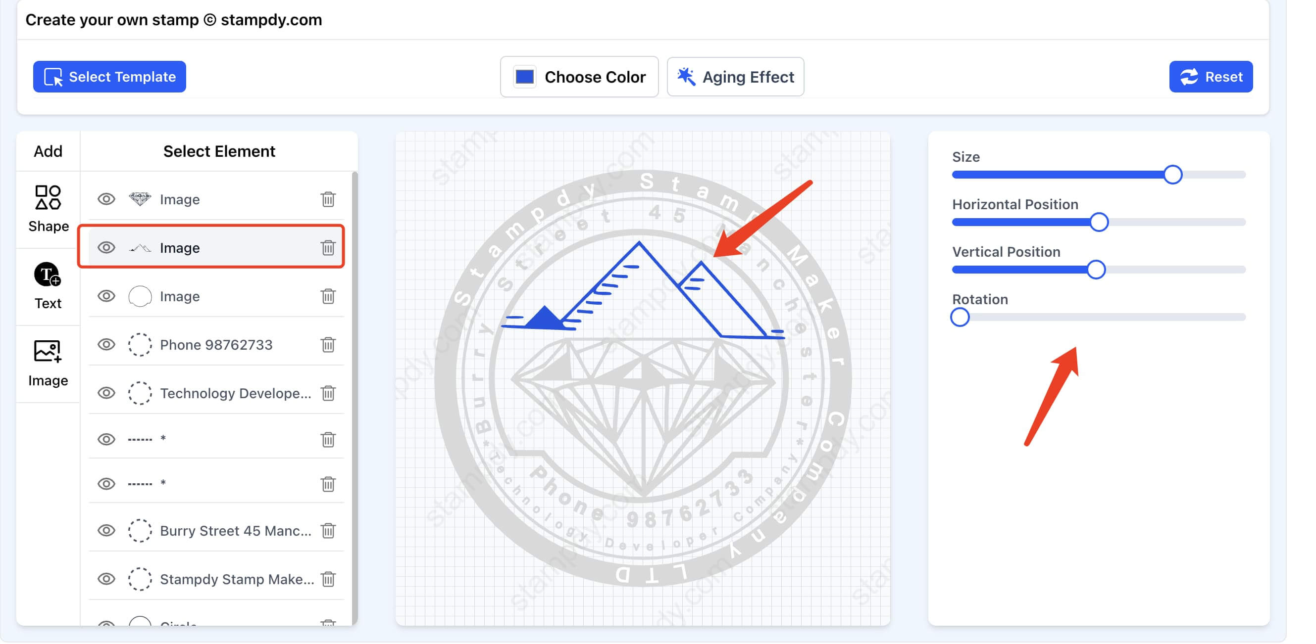
A single stamp can be designed by instinct. A set of stamps needs a system. If finance, operations, HR, and sales all create their own marks, the document library can quickly look as if it came from four different companies. The solution is not to make every stamp identical, but to agree on a few visual rules.
Choose a small set of shapes, border weights, type styles, and colors that work in the PDFs your team uses. Perhaps official seals use a circular format, while status marks use a rectangle. Perhaps final approvals use one dark color and temporary review marks use another. The exact choices matter less than being able to explain them.
Avoid a color system that is understandable only to the designer. A red mark may mean rejected in one department and urgent in another. Text should carry the meaning; color can support it. This is especially important when documents are printed in grayscale or viewed by someone with limited color perception.
Keep the system modest. You do not need a brand manual for six office stamps. A sample page showing approved sizes, colors, and placements may be enough. Store that page beside the source assets so a teammate using the stamp maker can compare a new mark with the existing set before exporting it.
Assign An Owner To Every Reusable Stamp
Reusable assets need an owner, even in a small company. Ownership does not mean that one person must place every stamp. It means someone can answer whether the wording is current, approve a replacement, and retire an old version.
The owner should match the meaning of the mark. Finance should own a payment approval stamp. HR should own a personnel-review mark. A brand or operations owner may manage the general company seal. If legal requirements apply to a particular stamp, the appropriate legal owner should decide when and where it may be used.
Without an owner, changes happen by convenience. Someone notices that the border is faint, makes a darker version, and uploads it beside the old one. Another person changes the department name but leaves both files active. A month later, three versions appear in signed documents and nobody knows which one should be trusted.
Put the owner's role, not necessarily their personal name, in the shared note. People change jobs. "Finance Operations owns this asset" lasts longer than "ask Mia." The note can also say when the stamp was last reviewed and which folder contains the current export.
Keep The Source Separate From The Approved Export
The editable source and the file people place into documents are not the same thing. The source exists so an authorized person can revise wording, spacing, or color. The approved export exists so everyone else can use the mark without accidentally changing it.
Store them separately. A source folder may contain editable versions and experiments. A published-assets folder should contain only the current files that are ready for documents. If people must sort through drafts such as "blue-test-2" and "new-border-final," they will eventually choose the wrong one.
Use file names that expose purpose and status. For example, "finance-reviewed-current.png" is useful in the active folder, while the source archive can include dated versions. If your record practices require exact historical assets, keep those older exports in an archive that is clearly separated from current use.
This separation also protects quality. A teammate should not resize the source canvas, take a screenshot, and paste the result into a contract simply because the official export was hard to find. The approved file should be the easiest option. Good document control often comes down to making the correct action more convenient than the improvised one.
Check Transparency, Contrast, And Edges
Stamp quality problems often appear after export. A white background covers a table line. A transparent edge carries a faint halo. Dark blue text becomes muddy on a gray form. A thin circle looks broken when the PDF is compressed or printed.
Test the export on three backgrounds: white, light gray, and the actual area of the target document. Look closely at the edges, then zoom out to normal reading size. The close view catches rough pixels and unwanted backgrounds; the normal view tells you whether the mark still communicates quickly.
If the stamp may be printed, print one ordinary office page. Do not rely on a professional printer test if most recipients will use a basic desktop printer. Fine lines, pale colors, and small reversed text are common points of failure. A slightly heavier border may look less delicate in the editor and much better in the real workflow.
Be cautious with shadows, texture, and simulated ink effects. They may suit a creative project, but routine business records usually benefit from cleaner edges. The stamp should survive copying, scanning, compression, and resizing without becoming ambiguous. A simple mark that remains legible is more valuable than a realistic effect that falls apart outside the original preview.
Place Stamps According To Meaning
Blank space is not automatically the right place for a stamp. Placement should relate to what the mark says. A payment-status stamp belongs near the payment summary or routing area. A department review mark belongs near the section reviewed or in a consistent approval block. A company seal used with signatures belongs where that convention is expected for the document.
Consistent placement helps readers scan. If every purchase order puts the finance mark in the same location, staff can confirm status without searching the page. It also makes missing stamps easier to spot before sending. An empty approval block is a clearer signal than an unpredictable mark that could be anywhere.
Leave enough separation between the stamp and editable or signed fields. A mark placed too close to a date field can make it look as if the date is part of the stamp. A company seal touching a signature can make both elements harder to read. White space is not wasted space here; it keeps the meaning of each action distinct.
For multi-page packets, decide whether the stamp appears once or on specific pages. Repeating a large mark on every page may create noise and increase the chance of covering content. One meaningful placement is often stronger than many decorative repetitions.
Prepare For Document Changes After Approval
A difficult question appears when a document changes after a stamp has been placed. If the mark means "reviewed" or "approved," does it still apply to the revised file? Usually the answer depends on what changed and on the team's policy, but the workflow should not pretend the question does not exist.
When a material section changes, return the document to the appropriate reviewer before using the approval stamp again. Do not carry the mark forward automatically from an earlier PDF. If only a harmless formatting issue changed, the owner may decide that a second review is unnecessary. The important part is that someone makes the decision consciously.
Keep the stamp out of editable draft templates when its meaning depends on completed review. Otherwise every new draft begins with an approval mark already visible. Place the stamp after the related step is complete, or keep an obvious placeholder that cannot be mistaken for the real asset.
If the wrong stamp reaches a signing request, cancel or correct the request according to the document's importance. Fix the source PDF and explain the change to signers. Trying to patch the completed file later weakens the record because the visible document no longer matches what the signer saw.
Review The Stamp Library A Few Times A Year
Stamp libraries accumulate quietly. A team creates a special mark for one client, a temporary project, or an old department. The file remains long after the need disappears. People searching in a hurry see ten plausible choices instead of three reliable ones.
A short quarterly or twice-yearly review is enough for many teams. Ask whether each active stamp still has a purpose, owner, current wording, and usable export. Move old marks to an archive instead of deleting them if they appear on historical records. Rename anything that forces people to open the file just to understand it.
This review is a good time to inspect actual signed documents. The source image may look perfect while the real PDFs reveal weak contrast, inconsistent size, or awkward placement. Pick a few examples from different workflows and compare them. If the same stamp looks different each time, the team may need a placement sample or a better export.
Do not use the review as an excuse to redesign every asset. Change a stamp when its wording, ownership, quality, or use is genuinely unclear. Stable assets are easier to recognize and explain. A stamp maker makes redesign fast, but consistency has value too.
The result should remain plain: a small library of marks with clear meanings, owners, and approved files. When the team can find the right stamp without asking around, the PDF can move into review and signature without a last-minute design task attached to it.