AI Image Stamp Generator Prompts for Business Marks
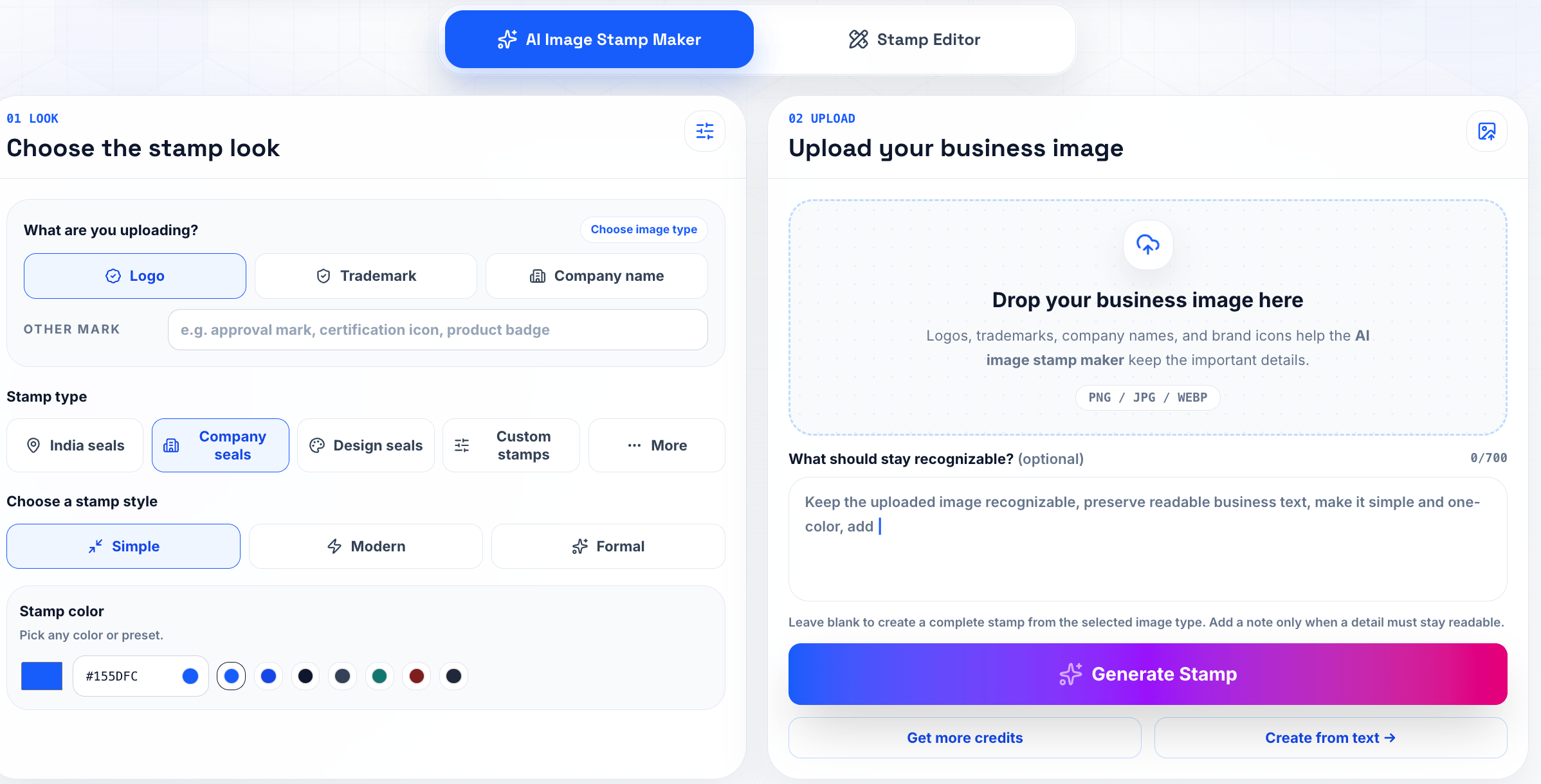
A good AI stamp prompt usually starts before anyone opens the generator. Someone has a document on screen, a stamp is missing, and the first instinct is to type something broad like "make a professional company stamp." That request may produce a decent-looking image, but it rarely produces a mark the office can use without cleanup. The missing information is practical: who owns the mark, where it will sit, what exact text it must carry, and whether it needs to survive a printed copy. That is why AI image stamp generator prompts should read less like design wishes and more like a short production note. The goal is not to impress the generator with extra adjectives. The goal is to give it the same facts you would give a designer sitting next to you. Start in the Stampdy AI Image Stamp Maker, but keep the document use case in front of you while you write.
Write the document job first
Before choosing a style, write one plain sentence about the stamp's job. "Finance reviewed this invoice" is more useful than "modern blue stamp." "North branch received this package" is more useful than "clean logistics seal." Once the job is written down, the prompt has a spine. You can still ask for a round border, a red ink look, or a minimal layout, but those choices now serve the document instead of replacing the document logic.
For an AI stamp generator for business marks, include the business name exactly as it should appear. Add department wording if it matters. Mention whether the stamp is for a contract, invoice, certificate, packing slip, or internal PDF. Those contexts change the layout. A certificate stamp can tolerate more formality. An invoice status stamp needs to be quick to read. A contract-adjacent seal should leave enough quiet space around signatures.
I would also include the export expectation in the prompt. If the mark will be dropped into PDFs, ask for a clean high-contrast image with a transparent background. If a person will later rebuild the mark in the editor, ask for simple geometry and readable text. That small instruction keeps the result from drifting into decorative artwork that looks fine in isolation but awkward on a real page.
Use examples, not adjectives
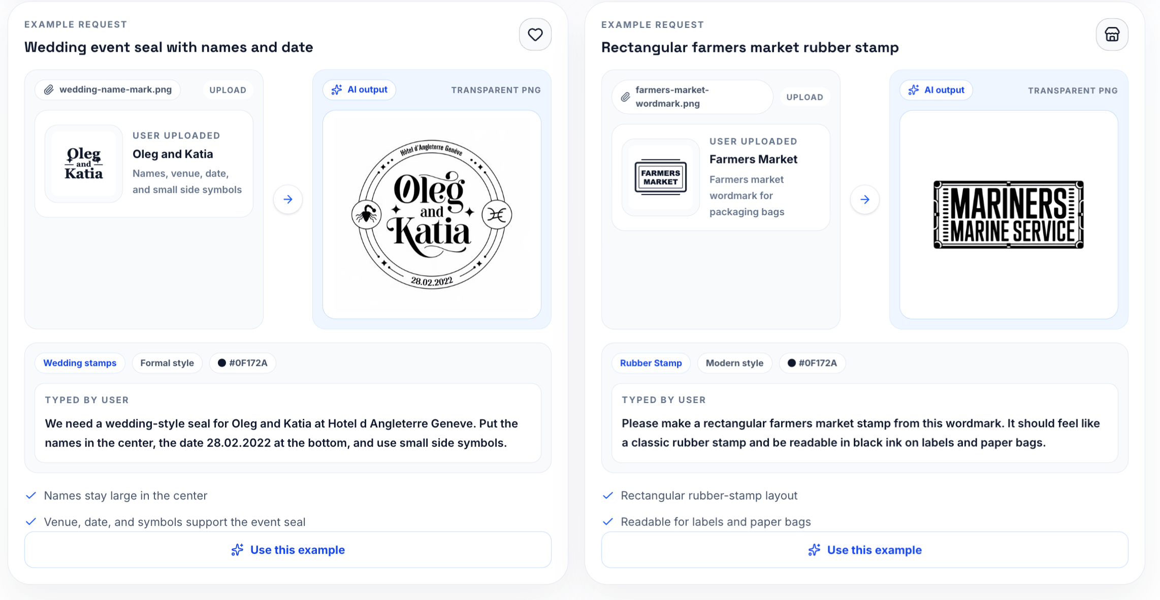
Prompt examples are useful when they describe constraints. "Round company seal, outer text reads EASTRIDGE SUPPLY CO., center text reads APPROVED, dark blue ink, no texture, white or transparent background" is a stronger starting point than a paragraph full of words like premium, official, elegant, and trustworthy. Those adjectives can help with tone, but they do not solve layout.
Good business stamp prompt examples also say what should not appear. If the stamp should not include dates, signatures, mock registration numbers, background shadows, or fake government symbols, say so. AI image tools sometimes add plausible-looking details when the prompt leaves room for them. In a business workflow, plausible is not enough. The text needs to be current and authorized.
When you need broader design control, generate a simple draft first, then compare it with a structured online stamp maker workflow. That second pass is where you can tune spacing, line weight, and placement with more precision. Treat the AI result as a draft with momentum, not as a file that must be accepted untouched.
Keep the prompt short enough to inspect
Long prompts often hide problems. A one-screen prompt is easier to review before generation and easier to reuse later. Keep the must-have details near the top: exact wording, shape, color, usage, background, and readability. Put optional style notes after that. If someone else reads the prompt, they should be able to spot a wrong company name or a wrong department before any image is generated.
A practical image to stamp maker prompt might include three lines: text, layout, and output. Text covers the legal or operational wording. Layout covers circle, rectangle, border, icon, and hierarchy. Output covers transparent background, clean edges, and document placement. That format is boring, but it works because every line answers a production question.
The related AI stamp maker page is useful when you want the generator to build from a more structured stamp flow. For prompt-heavy image work, the image stamp maker gives you more freedom; for repeatable office stamps, a guided stamp maker can keep the design closer to familiar document patterns.
Review the first draft like an office file
The first draft should be checked at normal document size. Zooming in makes every stamp look more legible than it will feel in a PDF packet. Place the image next to the kind of content it will touch: a signature block, a table, a header, or an approval line. If the stamp fights the surrounding text, simplify it before downloading.
Watch the boring details: letters inside the ring, punctuation in the company name, spacing between outer text and border, and the thickness of the center mark. These details decide whether an AI generated stamp design feels usable or temporary. A stamp with one wrong character is not close enough, even if the layout is attractive.
For teams that are new to this, the article AI stamp maker guide is a useful companion because it explains the broader generation flow. Pair that with one internal review habit: no stamp becomes a shared asset until it has been tested on a sample page.
Save the prompt with the file
If the stamp will be reused, save the prompt beside the exported image. Six weeks later, someone may ask why the mark is blue, why the date was excluded, or why the outer ring uses a short company name instead of the legal name. The prompt gives the answer without another meeting.
Use file names that carry context: finance-reviewed-blue-current.png, north-branch-received-clean.png, or vendor-approved-round-source.txt. A folder full of downloads called stamp-1 and stamp-final is how teams accidentally reuse old versions. The practical value of AI image stamp generator prompts is highest when the prompt becomes part of the asset record, not just a one-time instruction.
For broader background, keep stamp generator basics nearby. It helps explain the difference between a fast visual draft and a repeatable stamp workflow.
A final human pass
The last check should be done by a person who understands the document, not only the design. Ask three questions: Is the text correct? Is the mark readable where it will appear? Is the file easy for someone else to reuse without guessing? If any answer is weak, fix the stamp before it leaves the maker.
A strong prompt will not remove every review step, and it should not. It simply gets the draft closer to the real need: a clean, current, readable mark that fits the document. That is the difference between a nice AI image and a business stamp people can trust in daily work.
A normal prompt session in an office
Imagine a finance lead and an operations assistant working through a vendor approval packet. The starting point is a one-line request in Slack, not a polished brand system. That is why the first few minutes matter. The team should name the job, decide who can approve the mark, and create one draft file with a clear temporary name such as finance-reviewed-blue-draft.png. That sounds mundane, but mundane is good here. Stamp work goes wrong when people treat every file as temporary and then reuse the temporary file for months.
The practical question is where the mark will appear. In this case, it belongs beside the totals table, not over the signature block. That placement tells you how large the text can be, whether the border can be heavy, and how much transparent space should surround the asset. It also keeps AI image stamp generator prompts connected to a document, not just to a preview screen.
After the first export, the team should save one approved file named finance-reviewed-blue-current.png. The source, draft, and final file should not sit in the same folder without labels. A person who was not part of the original conversation should be able to open the folder and know which file belongs in the next document.
Brief wording that does not sound like a prompt hack
A useful brief is short, but it should not be vague. It should say what the stamp means, which text is fixed, which source file was used, and what output is expected. If the owner is Finance Operations, put that in the note. If the stamp is only for PDF placement, say that too. Teams get into trouble when a file made for one narrow use quietly becomes the default for every use.
For AI stamp generator for business marks, I would rather see a plain note than a polished paragraph. Example: "Use this mark for a vendor approval packet. Keep current wording. Export transparent PNG. Owner: Finance Operations. Do not use for external legal seals." That kind of note has no marketing shine, but it prevents the exact questions that slow people down later.
The brief should also say what is out of scope. If the stamp should not include a date, a fake registration number, a decorative icon, or a simulated signature, write that down. Negative instructions are not fussy. They are a way to keep office marks from collecting details that nobody approved.
Small review habits that keep the draft honest
The obvious failure to watch for is this: the stamp says Approved when the document only passed review. A quick preview may not catch it. Place the stamp into a vendor approval packet and read the page the way a recipient would read it. If the mark makes a table, date, signature, or status line less clear, the design is not finished.
A good review uses three views. First, inspect the stamp close up for text and edge problems. Second, look at it at normal document size. Third, print or export a single sample page if the workflow is repeated. This is where image to stamp maker becomes more than a keyword; it becomes a practical check on whether the file can survive daily handling.
Do not ask reviewers whether they like the stamp. Ask better questions: Is the wording current? Is the owner clear? Does the mark sit in the right place? Does the file name identify the approved version? Would a new teammate choose the right file without asking? Those questions produce actionable feedback.
Keep a prompt ledger, not a gallery
AI stamp work gets messy when every draft is treated like a saved design. A better habit is to keep a prompt ledger: the exact prompt, the reason for the prompt, the file it produced, and the decision made after review. The ledger can be a plain text file in the same folder as the export. It does not need a project management system. It only needs enough memory to stop the team from asking the same question again next month.
For a finance stamp, the record might show that the first prompt used "APPROVED" and the second changed it to "FINANCE REVIEWED" because the stamp should not imply final legal approval. That small distinction is the kind of thing people forget when they only keep images. The prompt explains why the wording changed. The sample page shows whether the change worked.
This is also where business stamp prompt examples become useful in a natural way. Do not collect examples because they sound impressive. Keep the ones that solved a real document problem. If a short prompt produced a cleaner outer ring, save it. If a negative instruction stopped the generator from adding fake dates, save that. A small prompt library built from actual mistakes is more valuable than a long list of generic prompt formulas.
Four prompt shapes worth reusing
The strongest prompts tend to fall into a few practical shapes. A status prompt names the document state: "FINANCE REVIEWED", "RECEIVED", "PAID", or "VOID". A department prompt names ownership: "North Branch", "Accounts Payable", or "Quality Control". A document prompt names the placement: invoice, certificate, contract packet, packing slip, or internal PDF. A cleanup prompt asks for fewer details, cleaner text, and a transparent background.
Those shapes can be combined without turning the instruction into a long performance. For example: "Round blue business stamp for an invoice packet. Outer text: EASTRIDGE SUPPLY CO. Center text: FINANCE REVIEWED. No date, no signature, no government seal, transparent background, readable at one inch." That is plain, but it gives the generator real boundaries. It also gives the reviewer something concrete to approve or reject.
When using an AI stamp generator for business marks, I would avoid wording that asks for authority the business has not granted. "Official legal seal" is risky if the company only needs an internal review mark. "Board certified" is risky if nobody certified anything. The prompt should make the stamp useful without making the document claim more than the workflow can support.
The first rejection is usually about words
Teams often expect the first rejection to be about style, but business stamps usually fail on wording first. The mark says APPROVED when it should say REVIEWED. It uses a short brand name where the document requires the legal company name. It includes a date line that nobody maintains. It adds a fake registration number because the prompt asked for a "formal seal" and left too much room.
That is why the first review should be a wording review, not a design critique. Read the stamp aloud. Compare it with the document status. Ask the owner whether the wording would still be true if the stamp appeared on a customer-facing PDF. If the answer is uncertain, fix the words before adjusting color, border, or texture.
An AI generated stamp design can look convincing even when the wording is wrong. That is the dangerous part. The preview may feel finished because the ring is balanced and the ink texture looks realistic. The document does not care. It needs the right claim in the right place. Treat the image as a draft until the words survive that check.
A lightweight review table
For a recurring office mark, make the review table small enough that people will actually use it. Four columns are enough: check, result, owner, note. The checks can be wording, placement, readability, and file name. The result can be pass or fix. The owner is the person who can make the decision. The note captures the reason, not a long explanation.
Here is a practical version:
- Wording: pass, Finance Operations, "changed APPROVED to FINANCE REVIEWED."
- Placement: fix, Operations Assistant, "stamp touches totals table at 85 percent size."
- Readability: pass, Finance Lead, "center text remains clear in exported PDF."
- File name: pass, Finance Operations, "finance-reviewed-blue-current.png."
The table is not meant to slow the team down. It prevents vague comments from becoming another round of random generation. If someone says the stamp feels too heavy, the table forces the question: heavy where, at what size, in which document? That keeps the review tied to the work.
File names should carry decisions
The file name is part of the prompt workflow. A generated image called stamp-3.png tells the next person almost nothing. A name like finance-reviewed-blue-current.png says the owner approved the wording, the color, and the intended use. A name like finance-reviewed-blue-draft.png says the opposite: useful for review, not ready for live placement.
For teams using several AI image stamp generator prompts, the naming pattern should stay boring. Use department, purpose, color, and status. Avoid clever names. Avoid "final" unless the team also has a rule for retiring older finals. A folder with final.png, final-new.png, final-real.png, and final-use-this.png is a folder that will eventually put the wrong stamp into a document.
Keep the prompt in a matching text file when the mark matters. finance-reviewed-blue-current.txt can contain the approved prompt, the reviewer, and the date. If the stamp needs to be regenerated because the image is lost or the color changes, the team is not starting from memory.
The quiet parts make the stamp believable
The easiest way to make an AI stamp look artificial is to ask for too much. Too much texture, too much decorative geometry, too many tiny words, too much simulated ink, too much drama in the border. Real office stamps are often restrained because they have to survive printing, scanning, compression, and quick reading. The quiet version is usually the better version.
Ask for clean edges before asking for style. Ask for readable center text before asking for a vintage impression. Ask for a transparent background before asking for a realistic paper surface. If texture is useful, keep it subtle and check that it does not break letters at document size. The goal is not to hide that the stamp came from a generator. The goal is to make the asset behave like a normal office mark.
That mindset also helps the page sound less synthetic. Instead of saying the prompt creates a "professional, premium, trustworthy stamp," describe the job: the stamp needs to sit beside a totals table without covering numbers. It needs to read in a vendor approval packet. It needs to be easy for a new teammate to place correctly. Specific work always sounds more credible than broad praise.
Before sharing the file
Do one last pass with the document owner, not a design-only reviewer. Open the sample PDF, place the stamp at the intended size, and ask whether the mark says exactly what the process allows it to say. Then check the export on a plain white background and on the actual document background. If both views are clean, the file is ready for the shared folder.
Retire the drafts immediately after approval. Keep them in a source folder if they are useful, but do not leave them beside the current file. Drafts that look polished can escape into live work. The more believable an AI draft looks, the more carefully it should be labeled.
The best result from AI image stamp generator prompts is not a dramatic design. It is a small asset with clear wording, a saved prompt, a documented owner, and a sample page that proves the mark works where people will actually use it.
Keep the review room small
AI image work can attract too many opinions because the drafts arrive quickly. For a business stamp, keep the review room small. One person should own wording, one person should check the document placement, and one person should confirm the file can be reused. More reviewers usually create style noise before the basic questions are settled.
Give each reviewer a job. The finance owner checks whether the mark says the right thing. The operations assistant checks whether it fits beside the totals table. The person who manages shared files checks the name, source prompt, and approved folder. That division makes feedback sharper. It also keeps the team from regenerating the stamp just because someone prefers a different blue.
When a prompt produces a strong first draft, resist the urge to generate twenty alternatives. Make two or three controlled changes, compare them on the same sample page, and choose the one that creates the least confusion. A stamp that passes a small, practical review will beat a folder full of attractive unused options.