Design a Stamp Online for Handmade Thank-You Cards
A thank-you stamp works best when it carries the part of a message you genuinely want to repeat. Keep the customer's name, a reference to their order, and any personal sentence outside the fixed artwork. When you design a stamp online, begin with that division instead of trying to fit an entire insert card inside a circular border.
For a handmade shop, the stamp can identify the maker and express thanks. It does not need to double as a care label, a discount offer, and a list of product claims. Those messages may require different wording, more space, or information that changes from one order to another.
Write the Repeated Message Before You Design a Stamp Online
Start with the simplest sentence you can sincerely use on every relevant order. “Thank you for supporting my work” is one possible message for a solo maker. “Thank you for choosing our studio” may fit a team. Choose the pronoun that reflects who is speaking rather than adopting the wording that happens to fill the template.
The point is not to discover a phrase that guarantees a response. This is a writing and layout decision, not a claim about repeat purchases or customer behavior. A short, accurate message is easier to use consistently than an elaborate promise that does not fit every order.
Read the phrase alongside the shop name. If both communicate the same information, one may be unnecessary. For instance, a long sentence explaining the maker's identity can compete with a clearly printed studio name on the card. The stamp can do less because the surrounding material already does part of the work.
Keep the message independent of temporary offers unless it is specifically a campaign stamp. A discount amount, shipping promise, or seasonal deadline can become outdated while the rest of the artwork still looks usable. A separate insert or handwritten note gives those changing details their own place.
Let the Main Message Have the Best Space
Decide whether the strongest element is the thank-you phrase or the maker's name. Both can appear, but they do not have to be equally large. The reader should not need to turn the card through a full circle just to find the sentiment.
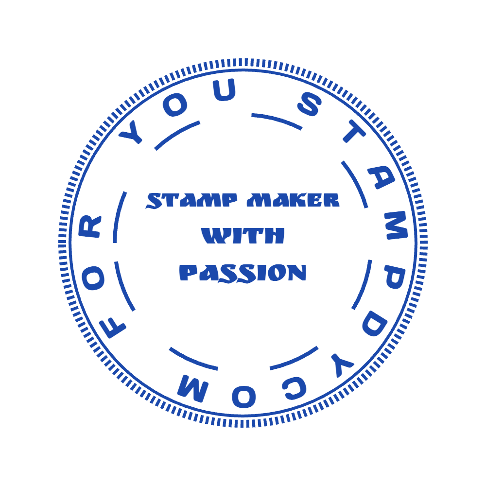
This existing custom template demonstrates a central message surrounded by an outer name line. Its sample wording is not a finished thank-you card.
In this example, the center contains several short lines, while the perimeter carries additional wording. For a thank-you adaptation, you might reserve the center for the message and use the outer line for a short studio name. That is a suggested adaptation, not a claim that the preview already contains it.
Test the actual phrase before choosing the final frame. “Thank you” and “Thank you for supporting independent craft” need different amounts of room. If the longer version only fits in small letters, shorten the sentence or choose a text-led rectangle rather than preserving a circle at all costs.
Look at the whole card, too. A large stamped name beside the same name in a printed heading may feel redundant. You could use a quieter stamp, move the printed name, or keep only the message inside the stamp. The appropriate choice depends on the existing card, not on a rule that every mark must contain a logo.
Decide What the Outer Ring Is Actually For
Decorative rings often invite extra text simply because there is an empty arc. Resist filling it until you know what information belongs there. A motto, location, year, and shop name can all compete for a limited space that may be better left open.
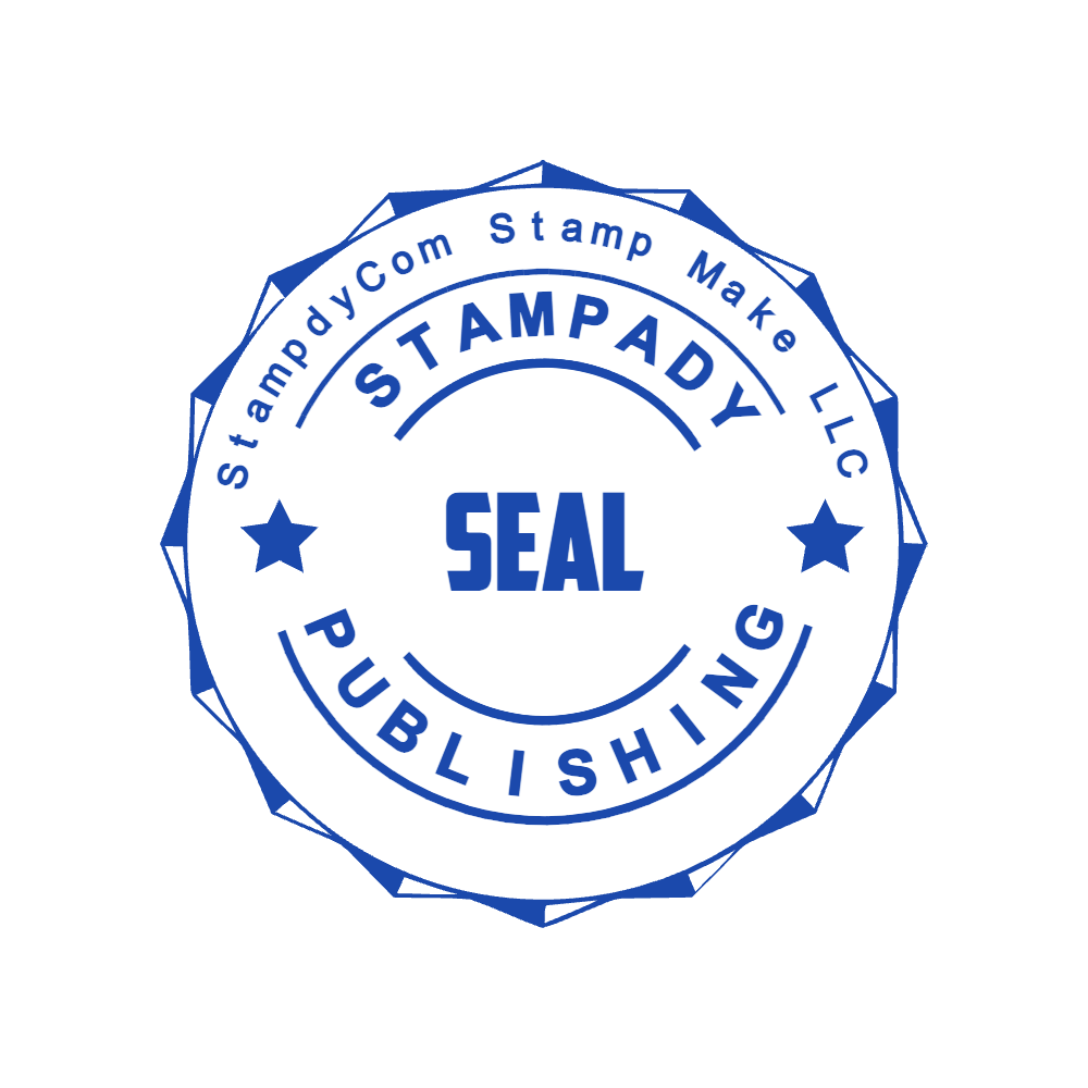
A second existing template shows a more layered text hierarchy. The publishing wording and sample brand text would need replacement for a maker's thank-you design.
This composition demonstrates the tradeoff. Several text bands create a badge-like appearance, but they also ask the reader to inspect several messages. For a small insert, decide whether the additional ring provides useful identity or merely makes the stamp busier.
Browse the Custom Stamps templates for structures rather than ready-made promises. A template may contain a company name, founding year, profession, or slogan unrelated to your work. Every retained word becomes part of the message you send, so review the perimeter as carefully as the center.
If a design relies on many decorative words to appear balanced, try another starting point. You should not have to invent an establishment date or professional title to make a thank-you mark look complete.
Reserve a Real Handwriting Area
Lay out the complete insert with a blank area for the personal sentence. Do this before choosing the stamp's final dimensions. The writing area should be an intentional part of the card, not the narrow strip left over after an oversized badge is placed.
Try writing a realistic note on a paper mock-up. Use your ordinary handwriting and pen. A neatly typed placeholder does not show how much space you need for a customer's name or a brief reference to the item they ordered.
Decide whether the stamp belongs above, beside, or below that note. Above can work like a greeting; below can feel like a closing mark. Beside can leave a taller writing area. These are possible arrangements to compare, not fixed etiquette rules.
Keep the stamp away from a fold, a punched hole, and any area covered by ribbon or packaging. Also consider what the customer sees first when the insert is removed. A beautiful mark hidden behind another card contributes little to the intended message.
For small cards, a simple unruled blank may be more usable than several short labeled lines. For a larger card, a label such as “A note for you” can establish where the handwritten part begins. Choose based on the note you actually plan to write.
Test Two Different Orders Against the Same Wording
Imagine a shop preparing one order for a first-time buyer and another as a gift sent directly to its recipient. This is a hypothetical writing exercise. The fixed phrase “Thank you for your order” addresses the buyer naturally, but may be less suitable when the person opening the package did not place the order.
That difference does not require an elaborate system. You might choose a more neutral repeated phrase, keep two clearly labeled versions, or omit the thank-you stamp on gift orders. The useful question is whether the same words still make sense when the recipient changes.
Next consider an order containing more than one kind of product. If the fixed message says “Enjoy your new mug,” it will not suit a package of prints. Keep product-specific references in the handwritten portion unless the stamp is deliberately dedicated to one product line.
Read the stamp without the note and then with it. The fixed message should stand on its own, while the note adds something personal rather than repeating the same sentence. If both say exactly the same thing, use the available handwriting space for a detail that genuinely belongs to that order.
Do Not Hide Product Claims Inside a Friendly Message
A thank-you card can accidentally become a source of unsupported claims. Words such as handmade, local, recycled, or limited edition describe something about the product or its production. Use them only when they accurately describe the items receiving that card; they are not interchangeable decorative adjectives.
If the shop sells a mixture of things it makes and things it sources, a universal “Handmade by us” stamp may be the wrong repeated message. A straightforward thank-you leaves the product description to the appropriate item information. This is a scope decision: gratitude does not need an extra claim to sound sincere.
Keep care instructions separate when they depend on materials or product type. Do not use a decorative stamp as a reason to compress a nuanced instruction into a vague symbol or a few tiny words. This article concerns the thank-you mark, not a determination of which labeling or safety information a product requires.
Likewise, do not add a certification-style emblem simply to make the card look more official. The maker's own identity and a clear message are sufficient design material. Any statement about certification or approval needs its own factual basis.
Prepare the Actual Card, Not Just the Stamp File
Use the Stampdy editor to customize a starting layout or arrange your own text. Replace all demonstration wording, check the reading order, and compare the result against the complete insert design. The template's original industry category does not determine your message.
If you intend to use a physical stamp, ask the producer to review the artwork and intended size. Check an impression on the intended card stock before preparing a large batch. A screen preview does not verify how that combination of stamp, ink, and paper will look.
If your project also includes marking the outer packaging, treat that as a related but separate surface. The kraft packaging stamp guide addresses that design context. A layout that works inside a smooth card may need another review on the package itself.
Keep the reusable wording in your source notes. When the shop name or message changes, compare the new design with the physical stamps and inserts still on hand. An updated file does not alter previously produced supplies.
Frequently Asked Questions
Should the customer's name be part of the stamp?
Usually it belongs in the changing part of the card rather than a reusable physical stamp. If you prepare personalized digital artwork for each order, verify each name individually; do not assume the repeated template has checked it for you.
Can I use the same design on gift tags?
You can adapt it, but check the available area, punched hole, and wording for that use. A message addressed to a purchaser may need revision when the tag accompanies a gift to someone else.
Does a thank-you stamp need a logo?
No. A short maker name and a clear phrase may be enough, particularly when the surrounding card already carries your branding. Add a logo when it helps identify the sender, not merely to fill an empty center.
Conclusion
Design a stamp online around a message that remains true across the orders you intend to use it on. Give the repeated thanks a clear place, leave practical room for a personal note, and keep changing offers or product-specific claims separate. Before producing the card, read it once as the buyer and once as the person receiving a gift.