Stamp Maker Guide for Kraft Packaging and Shipping Boxes
A packaging stamp should be designed for the surface that receives it, not only for the clean preview in a stamp maker. Kraft fibers, corrugated flutes, folds, coatings, recycled content, and packing pressure all change the final impression. A design that looks balanced on screen may become patchy on a box or spread on an absorbent mailer.
The practical workflow is simple: identify the exact packaging materials, choose a forgiving one-color layout, reserve a flat stamping zone, and proof the physical stamp on real production samples. The result does not need to look mechanically perfect. It does need to remain recognizable, readable, and repeatable across the acceptable variation of your packing process.
Start With the Packaging Surface, Not the Artwork
Collect the materials you actually use before deciding on a stamp size. Include each box grade, mailer, tissue paper, paper bag, tag, and label stock that might receive the mark. Similar-looking kraft materials can behave differently because their texture, absorbency, coating, and stiffness are not identical.
Sort the samples into intended uses. A brand mark on the outside of a shipping box has different requirements from a care message inside the lid. A small logo on a paper tag has less room than a return instruction on a mailer. Defining the job prevents one oversized, crowded stamp from being forced onto every surface.
Check whether the package is stamped flat or after assembly. A flat blank usually provides better support. An assembled box may flex between corrugations or sit over empty space. If the production team cannot change the order, the design and placement must tolerate that condition.
Finally, mark any areas that must remain untouched: shipping labels, barcodes, closure tape, legal copy, recycling instructions, tamper seals, and folds. A decorative stamp should never reduce the readability of operational information.
Simplify Packaging Artwork in the Stamp Maker
Packaging rewards simple shapes, open gaps, and a clear silhouette. Fine brand details that work on a screen or offset-printed carton may not survive a hand-applied rubber impression. Begin by identifying the one element customers must recognize. It may be a short name, an original symbol, or a compact name-and-symbol lockup.
Open the Stampdy stamp maker and build the design at the intended aspect ratio. Use the editor to place text, a permitted logo, borders, and simple shapes. Keep the most important content large enough to dominate the mark. Secondary copy should not compete with it.
Remove features that create fragile islands or narrow ink channels. Tiny taglines, hairline rings, close parallel strokes, and intricate shading often add density without improving recognition. Convert tonal artwork into a deliberate one-color version rather than trusting a grayscale image to behave like a relief stamp.
Review the mark as a filled silhouette and as a small preview. If the identity disappears when the texture is removed, the design is relying on details the stamp may not preserve. If several letters merge at the planned size, shorten approved wording or increase the mark rather than reducing spacing to a token gap.
Keep a clean master that contains only confirmed content. Packaging messages change; a seasonal phrase or temporary campaign should not be embedded in the permanent brand stamp unless replacement is planned.
Reserve a Flat and Repeatable Stamping Zone
Placement affects impression quality as much as the artwork. Choose an area with continuous backing, minimal curvature, and enough clearance for the entire stamp mount. Avoid corrugated scores, flap edges, raised seams, handles, and areas where contents push unevenly against the box.
Create a simple placement rule the packing team can see and repeat. For example, align the stamp with a box edge using a card guide, or place it within a defined blank panel. The rule should describe the physical reference point rather than an approximate instruction such as “near the top.”
Test reach and hand position. A large wooden mount may collide with a box wall even when the printed area technically fits. The operator should be able to press vertically and lift cleanly without twisting the wrist or rocking the die.
Allow breathing room around the mark. A stamp placed directly beside tape, a label, or dense printed copy may look like part of that information. Clear separation makes the handmade variation feel intentional and protects nearby functional content.
Match the Physical Stamp and Ink to the Job
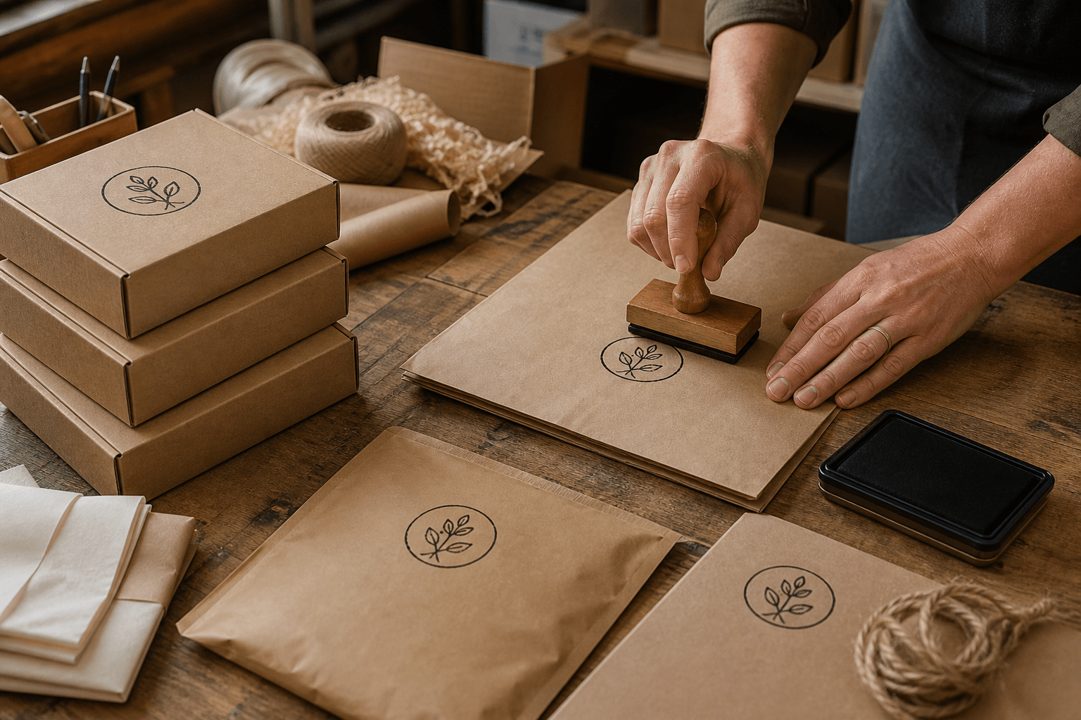
The digital file defines the image, but the mount and ink determine how it reaches the package. A traditional hand stamp with a separate pad offers direct control over inking and can suit larger marks. A self-inking format can support repeated office-style impressions, but its available sizes and ink system must match the application. Ask the manufacturer which construction is suitable for the design dimensions and expected use.
Ink compatibility is material-specific. An ink that dries well on porous kraft may behave differently on a coated mailer or glossy label. Confirm the intended substrate with the ink supplier and follow its handling and drying instructions. Do not describe an ink as permanent, food-safe, weatherproof, or archival unless the exact product documentation supports that use.
Color selection begins with contrast. Black or another dark approved color is a straightforward test on light kraft, while a light ink on dark stock may need a different ink system and proofing approach. A brand color on screen does not guarantee the same appearance when absorbed into brown paper.
For a large solid design, discuss ink coverage with the manufacturer. Broad filled areas can show texture, especially on corrugated stock. That variation may be acceptable for an artisanal look, but it should be approved from real samples rather than hidden in a smooth mockup.
Build a Packaging Material Proof Board
Make a proof board from offcuts or unused packages from the current supplier batch. Include smooth kraft, rough kraft, corrugated board, white label stock, and coated material only when they are part of the real workflow. Label the back of each sample so notes do not interfere with the impression.
Use the same stamp, ink, and technique across the first comparison. Apply an even ink load, press vertically, hold only as required by the stamp system, and lift straight up. Make several impressions on each surface rather than choosing one attractive result.
Inspect four things:
- Coverage: Are the important filled areas present without requiring excessive pressure?
- Edges: Do letters and symbols stay distinct instead of spreading together?
- Contrast: Does the mark separate from the material color and printed pattern?
- Drying behavior: Does normal handling smear or transfer ink to adjacent packages?

Keep the imperfect examples. A proof board is useful because it shows the operating range, not because it displays a single ideal impression. Agree on what variation still protects the brand and what requires rework.
If one material consistently fails, choose a different stamping zone, add a compatible uncoated label, revise the ink system, or prepare a simplified mark for that substrate. Do not weaken every version to accommodate an edge case without testing the alternative.
Standardize the Packing-Bench Technique
A good design can still vary when every operator inks and presses differently. Write a short bench instruction that covers setup, application, drying, and inspection. It should fit beside the station and use the approved impression as a visual reference.
Start each run with a scrap impression. Confirm that the die is clean and evenly inked. Place the package on a stable backing board if the work surface or assembled box flexes. Press down without sliding, then lift vertically. Move the package to a drying area where the fresh mark will not touch another surface.
Define when the pad should be re-inked or replaced according to its product instructions. Do not compensate for a dry pad with heavier and heavier force; pressure cannot transfer ink that is not present. Likewise, an overloaded pad may fill counters and create halos around the design.
Store the stamp in a way that protects the die from dust and deformation. Keep the approved proof and material list with it. If the packaging supplier changes a box or label stock, repeat the relevant proof rather than assuming the old approval transfers.
Diagnose Packaging Stamp Defects by Their Pattern
The center is light but the edges print. The package may be flexing, the stamp may be rocking around its perimeter, or the surface may lack support. Test a flat blank on a firm backing before changing the artwork.
One edge disappears repeatedly. Check the die and mount for unevenness, then review hand position and the local package seam. Rotate the test material; if the defect follows the stamp, inspect the tool. If it stays with the package area, change placement or support.
Small letters become dark blocks. Reduce ink load, clean the die, and check actual size. If the failure remains, open the spacing or remove secondary text in the master design.
The mark smears after a clean lift. The ink and surface may be incompatible or the drying workflow may be too short. Follow supplier instructions, test another approved ink system, or move the mark to a more suitable uncoated area.
Corrugated lines show through the image. Test on a supported flatter panel, rotate placement relative to the flutes, or approve a design whose recognition does not depend on continuous solid coverage.
Change one variable per proof. When ink, pressure, backing, and artwork all change at once, a better result does not reveal which correction mattered.
Maintain One Packaging Stamp System
Create a small asset set instead of a folder of unexplained exports. Keep the editable master, the manufacturer delivery file, a placement reference, and photos or scans of approved impressions. Use filenames that identify version, size, and use rather than variations of “final.”
If the same mark is needed at several sizes, create controlled versions from the master. The resize stamp tool can prepare raster delivery copies, but a very small stamp may need redesigned spacing rather than simple scaling.
Record which version belongs to which package. This prevents a compact tag stamp from being used on a large box or an old campaign mark from returning to the bench. When the brand artwork changes, retire the physical tool and all delivery files together.
For teams using several related stamps, follow the review principles in the logo stamp brand consistency guide. Shared rules for symbol shape, wording, and approval matter more than forcing every physical stamp to use identical detail.
Frequently Asked Questions
What size should a packaging stamp be?
Choose the size from the available flat area, the amount of required content, and the manufacturer's practical feature limits. Print the artwork at actual size, then proof the physical stamp on the package. There is no single size that works for every box and mailer.
Can I stamp directly on corrugated cardboard?
Often yes, but surface texture and internal flutes can interrupt contact. Test the actual board with firm backing and a simple design. If important details remain incomplete, use a flatter panel, an uncoated label, or a more forgiving artwork version.
Should a packaging stamp include a website and social handle?
Include only information that remains useful and readable. A short website may be practical; multiple handles, a tagline, legal copy, and a detailed logo can overcrowd the mark. Put the primary brand identifier first and move secondary information to printed packaging or a label.
Is a rough impression acceptable for handmade packaging?
Natural texture can support a handmade character, but required words and identifying shapes should remain recognizable. Define an approved range with physical examples so “handmade” does not become an excuse for missing content or smears.
Conclusion
A packaging mark succeeds when its artwork, material, ink, placement, and technique work as one system. Use a stamp maker to create a simple one-color master with open spacing, then reserve a flat zone and prove it across every approved package type. Keep the failures because they reveal where the process needs support, a new ink choice, or a simplified design.
Before releasing the stamp to the packing bench, approve the physical impression, document the placement, define acceptable variation, and store one controlled set of files. Reproof whenever the package, ink, supplier, stamp, or artwork changes.