Seal Maker Update: 30 New Company Seal Templates to Explore
Stampdy's latest Company Seals update adds 30 templates, giving you more starting layouts for a business mark without having to build every ring and text line yourself. This seal maker update includes divided badges, open-center compositions, decorative borders, and designs that give the company name different levels of prominence.
As of September 30, 2026, the category contains 68 templates. You can browse the Company Seals template collection and choose a design to customize. We will keep expanding and refining the collection, so it is worth revisiting when you have a new design requirement. This update is about more layout choices, not a requirement to replace a stamp that already works for you.
What the New Seal Maker Templates Help You Choose
The most useful difference between templates is where they put the reader's attention. Some lead with a central name or short phrase. Others place the company name around the edge and reserve the center for a symbol. A divided badge makes separate areas of the composition more noticeable.
Look at those relationships before reading the sample company details. The example wording is there to demonstrate a layout; it is not a list of fields that every business must use. A template with a state name, telephone number, or abbreviation does not require your version to contain the same kind of information.
Three questions make browsing more purposeful:
- Should someone recognize the company name first, or a central logo?
- Is the actual wording short enough for one arc, or does it need straight lines?
- Should the border remain quiet, or be a visible part of the design?
Choose a few candidates that answer those questions differently. Comparing a split badge with an open-center seal is more informative than comparing several nearly identical rings before you have entered your own text.
A Split Badge for a Strong Central Line
One of the new additions is a blue circular badge with repeated initials above and below a prominent horizontal company-seal line. Several curved text elements surround that central structure. Its useful feature is the division of space: the center reads as a distinct band rather than an empty area inside a ring.
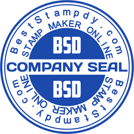
An actual Company Seals template preview. The initials and sample wording are demonstration content to review and replace.
This layout is a reasonable candidate when you have a short central phrase or recognizable initials. It gives that content a clear place in the composition. It is a less obvious choice when you need several long lines of equal importance, because the badge's strongest visual area is concentrated across the middle.
When personalizing it, start with the central wording and initials. Then work through every surrounding arc. Repeated content is easy to overlook: changing one occurrence does not mean that all separate text elements have changed with it.
Also examine the light lettering against the darker center. That contrast is part of the sample's appearance, not simply another outline. If you alter the color or remove a central visual element, inspect the remaining lettering again. A text treatment that was clear against a filled area may need a different treatment against an open background.
The aim is to keep the useful hierarchy while making the content yours. There is no need to retain an extra ring of wording merely because the example has one.
A Decorative Ring That Leaves the Center Open
Another new option uses a close-set, ticked outer ring. The sample places the company name on the upper arc, a location on the lower arc, and two lines in the center. Compared with the split badge, the emphasis comes from the perimeter and the space around the central words.

A template from the same update, showing a different relationship between the border and the central content. The location and company wording are placeholders.
This is a useful composition to compare when you want a visibly framed seal but do not want a large filled center. The ornament supplies texture around the edge, allowing the inner lettering to remain relatively simple.
Try your company name before committing to the border. A short sample name can make an arc look spacious; a longer real name may occupy much more of the circumference. If the letters become crowded, consider another template rather than preserving the example's appearance at the expense of readability.
The location line deserves a separate decision. Keep it only when it is relevant and correct for your intended mark. Sample state names and corporate wording are not credentials or evidence of authorization. Treat them as content to review, not as a status that comes with the design.
Finally, look at the decorative ring at the intended display size. Its repeated marks should read as a border, not compete with the company name. A visually busy frame is a choice, not an automatic improvement over a plain circle.
Let Your Actual Content Decide Between Layouts
Suppose your business mark needs a short trading name and a small emblem. An open center with the name around the edge may leave room for both without making either secondary detail too prominent. If the mark instead needs a long name and a short department label, a text-led arrangement may be easier to adapt.
Those are hypothetical examples, not fixed rules for particular industries. The collection offers alternatives because businesses arrive with different content, not because one seal shape can solve every request.
Use the same wording in each candidate you compare. Otherwise, the template with the shortest sample text will often seem cleaner for a reason that disappears as soon as you personalize it. Keep the intended overall size consistent during the comparison as well.
It helps to separate essential content from optional decoration. Essential content includes the words or symbol that identify the mark for its intended audience. Optional content might include a secondary motto, repeated initials, or another border. If the essential information does not fit comfortably, remove or reconsider the optional part before shrinking everything.
For a logo-led design, bring a suitable source image and inspect how it works inside the available area. Replacing a central image does not automatically simplify fine details or turn a bitmap into editable text and shapes. The template supplies a composition; the uploaded artwork still has its own limitations.
Open a Template, Then Personalize Its Separate Elements
Selecting a template from the category page opens its design in the editor. The template's saved content is the starting point for your changes, rather than a finished stamp assigned to your business. You can also work in the regular Stampdy stamp editor when you want to focus on the editable composition.
Work through the content before refining the decoration. Replace the main name, review secondary lines, and inspect any abbreviation, date, location, or contact detail. In a circular design, rotate your attention around the whole perimeter rather than checking only the upper arc that is easiest to read.
Then review spacing around the changed text. A longer name can alter the balance even when the frame remains untouched. Adjust the relevant element, or choose a roomier composition, instead of assuming that the original sample's geometry will suit every replacement string.
Keep a reference of the candidate you chose if you want to preserve its general appearance. That reference can help you notice an unintended change while editing, but it should not prevent a necessary adjustment to accommodate your own wording.
Before using the result, inspect it at the size and in the setting you intend. For physical production, ask the maker to confirm that the supplied artwork fits the chosen process. A catalog preview shows a design; it is not a manufactured sample of your personalized version.
AI Reference Mode Is a Different Route
The AI stamp maker also includes a reference-template selection mode. Its template images use the same named CDN assets, so a reference can provide a recognizable visual starting point for generation.
That is different from opening the template's structured design in the regular editor. In the editor, you work with the available individual elements. In AI reference mode, the selected image guides a generated result. Do not assume that generation will preserve every letter, spacing decision, or decorative detail exactly.
Choose the route according to the change you need. If you already like a composition and need to replace exact wording, direct editing gives you explicit control over that content. If you want to explore a visual variation, a reference-guided result can be reviewed as a new candidate rather than treated as an unchanged copy.
Either way, read the resulting text carefully. A familiar border can make a revised or generated mark feel correct before its details have actually been checked.
Why We Will Keep Updating the Collection
A template library is more useful when returning visitors can find alternatives for new requirements. A company might need a compact identity mark for one project and a more text-focused design for another. Adding options gives those visitors somewhere to start without asking them to reuse an unsuitable arrangement.
We plan to continue adding and refining templates across the collection. There is no fixed release schedule promised in this article; the available category page is the place to check what you can use now. Future additions should be judged by whether they give you a better starting point for your actual content.
An existing approved design does not need to change whenever the library grows. Browse again when your name, purpose, visual identity, or required layout changes. Keep what remains useful, and select a new composition when it solves a specific design problem.
Frequently Asked Questions
Are the company names and locations in the previews part of my finished stamp?
They are sample content. Review and replace the relevant elements before using the design. Check repeated lines and lower arcs as well as the main name; separate text elements can contain details that are easy to miss during a quick edit.
Do I need AI generation to use these templates?
No. The category's editing route loads the template for customization in the regular editor. AI reference mode is an alternative way to explore a generated design, not a required step for changing the wording in an editable template.
Will later additions automatically change the design I downloaded?
New catalog entries do not rewrite a file already downloaded to your device. If you return to the site for another version, check which template and wording you are using. Keep your approved deliverable clearly identified so a fresh experiment is not mistaken for the existing design.
Conclusion
This seal maker update gives the Company Seals collection 30 more starting points. Compare a divided badge, an open center, and a decorative ring using your own wording, then choose the structure that needs the fewest compromises. Replace the sample details, inspect the complete mark, and revisit the category when you need another layout as the collection continues to grow.