Stamp Maker Online Guide to Backgrounds for Document Exports
A stamp maker online can add a background when the destination cannot display transparency reliably or when the mark needs a deliberate panel behind it. Use white for ordinary white-page documents, a matched paper tone for a softer blend, or a chosen color only when contrast remains strong. Keep the transparent original as the master, because a background is a delivery choice rather than a permanent improvement to every stamp file.
The wrong background can make thin lettering disappear, cover nearby form content, or create an obvious rectangle around the mark. The right workflow begins with the destination, previews color and opacity against the stamp, and exports a separate PNG that is clearly named for that use.
When Does a Transparent Stamp Need a Background?
A transparent PNG is usually the most flexible asset for placement over a PDF or digital form. It lets page color, rules, and nearby content remain visible around the ink. Transparency becomes a problem when the receiving application converts it poorly, displays a dark fallback, flattens it unexpectedly, or requires an opaque image.
An opaque background can also be useful when the stamp must remain visually separate from a busy document. A white panel behind a red approval mark may protect readability over gray table rows. A soft paper tone may fit a scanned page better than pure white. A custom background can support a presentation or branded document, but it should never reduce the ability to read the mark.
Do not add a background merely because the checkerboard preview looks unfinished. The checkerboard is an editor convention that shows transparent pixels; it will not appear in the downloaded image. Test the transparent file in the actual destination before deciding that it needs an opaque layer.
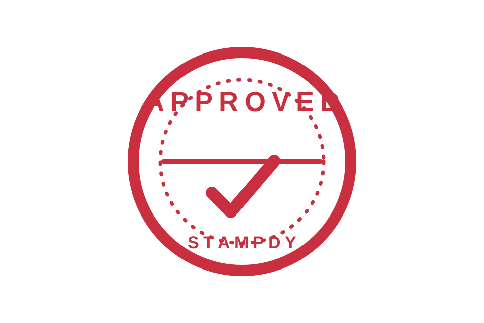
Preserve the transparent original even after choosing an opaque version. Future documents may use a different page color or allow transparency correctly. One master plus purpose-specific exports is easier to manage than repeatedly removing and rebuilding backgrounds.
How to Add a Background With a Stamp Maker Online
Open the Stampdy add stamp background tool and upload the approved image. The tool provides a background color, preset choices, an opacity control, a preview, and a PNG download. It keeps the source dimensions, so background work does not need to change the stamp's approved proportions.
1. Confirm the transparent source is ready
Inspect the source before adding anything behind it. The stamp should already have the correct wording, borders, color, crop, and orientation. A background may reveal pale halos, leftover paper pixels, or uneven margins that were difficult to see on a transparent checkerboard.
If the source still includes excess canvas, use the crop stamp tool first. Keep a small even margin; do not crop directly against the ink. Background color will fill the entire canvas, so unequal transparent space becomes unequal visible padding in the result.
Name the master clearly, such as department-approved-transparent.png. Do not overwrite it with the background version. Clear naming prevents an opaque delivery copy from silently becoming the only asset available to the team.
2. Choose color from the destination, not from habit
Start with the page or interface where the stamp will appear. For a standard white PDF, white is the simplest choice. For a scanned cream page, a warm paper preset may reduce the visual jump between the image rectangle and its surroundings. Gray or another soft tone can separate the mark from a complex background.
A background that looks attractive in isolation may fail in context. Place a quick preview over the actual form area. Check nearby text, table borders, signature lines, and page shading. If the background covers information that should remain visible, return to transparency or reposition the mark into a clear area.
For custom color, enter a verified hex value rather than approximating it by eye when consistency matters. Even then, expect differences across screens and printers. The practical goal is sufficient contrast and a coherent document, not an unsupported claim of exact physical color matching.
3. Set opacity deliberately
At 100 percent, the selected background is fully opaque. Lower opacity lets some destination content show through once the image is placed, but the final effect depends on the application that composites the image. Preview it on more than the editor's neutral background.
Low opacity is not automatically subtle or safer. It can reduce contrast around thin stamp strokes and make the rectangular boundary uneven over mixed page content. If underlying text remains important, a transparent master may be the better file. If separation is important, use enough opacity to create a consistent panel and place it where it does not conceal required information.
Change opacity in measured steps and compare the smallest letters first. Large stamp words may remain readable while fine ring text fades into the new background. Stop at the point where the entire mark, not just its center, remains clear.
4. Inspect the full canvas
Look beyond the stamp itself. The result should have balanced padding, no isolated edge pixels, and no unexpected color fringe. A red impression extracted from paper may carry pale pink or gray pixels around its edge. Those pixels become more visible against a colored background.
Zoom in to inspect the border and negative space inside letters. Then zoom out to working size. At normal size, the mark should read as one intentional element rather than ink floating inside an oversized card. If the panel feels too large, adjust the source crop rather than scaling the entire result inconsistently.
5. Download a separate delivery copy
Download the PNG and name it for the destination, for example finance-approved-white-bg.png or event-mark-cream-panel.png. Record the selected color and opacity when the file will be recreated or reviewed by another person.
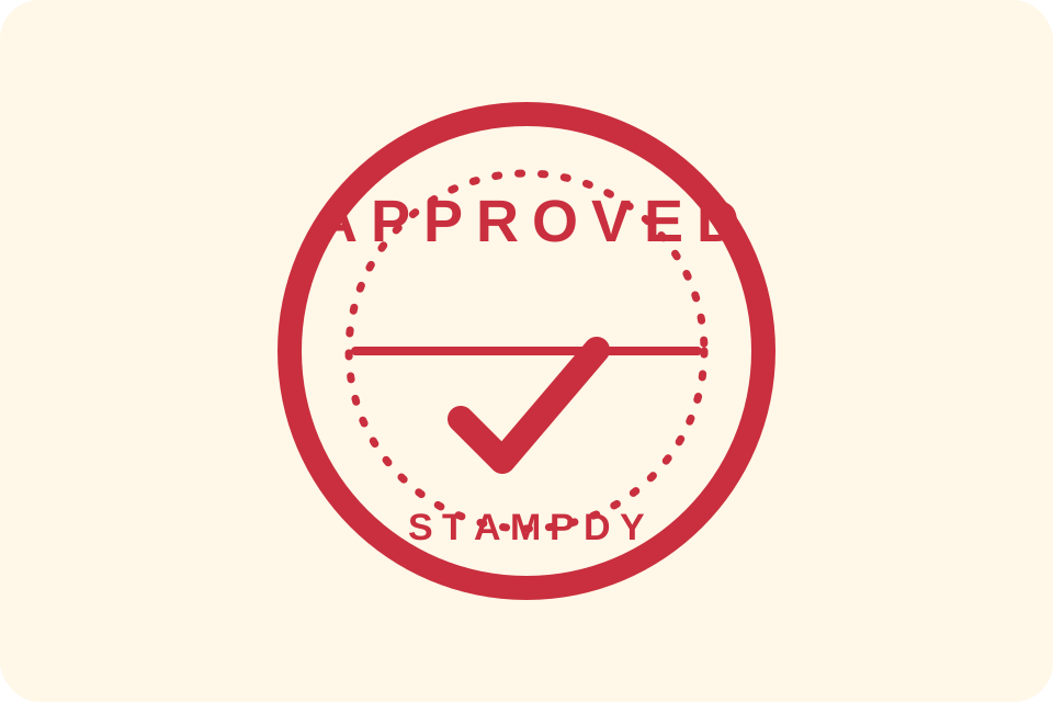
Open the exported file in the receiving application and make a test document. Confirm that the background displays, the edges are clean, and the image is not being stretched. A correct editor preview is necessary, but the final destination is the acceptance test.
White, Paper-Toned, or Custom Background?
Choose white when the stamp is headed for a normal white page, email attachment, simple office document, or system that replaces transparency unpredictably. White is easy to review and print. Its main limitation is the visible rectangle it can create over tinted sections, scans, or colored forms.
Choose a paper tone when the destination is consistently cream or warm gray and the panel should blend more gently. Use the actual destination as a reference. A paper preset is a starting point, not proof of a perfect match. Scans can vary across a single page because of lighting, shadows, and compression.
Choose soft gray when a clear neutral panel improves separation from a busy background. Check that gray does not weaken blue, black, or red ink. A mark that relies on pale strokes may require white instead.
Choose a custom color for a controlled design use, such as a branded internal presentation or a specific form component. Avoid using background color as the only signal for approval, rejection, urgency, or document status. The status should remain readable in the stamp wording and surrounding document context.
When none of these choices works without hiding page content, use the transparent master. Adding a background is optional. It should solve a destination constraint, not create one.
Keep the Stamp Readable After Background Changes
Contrast is the first check. Compare the darkest and lightest parts of the stamp against the chosen color. Fine text and thin rings need more separation than large solid shapes. If the border remains visible but small letters disappear, the background fails the complete mark.
Check negative space next. Counters inside letters and gaps inside icons should remain open. A background cannot fill those areas by itself when transparency is correct, but edge halos or a very similar color can make them appear closed.
Then check the rectangular panel. If it covers table rules or printed instructions, move the stamp or return to a transparent version. Do not solve a placement problem by making the background nearly invisible; that can create inconsistent readability across the panel.
Finally, check the image at the size readers will see. Large previews exaggerate minor texture and hide small-size legibility problems. Place the image into a copy of the document and view the page at an ordinary reading scale. If printing is part of the workflow, print a non-sensitive test page before approving a reusable asset.
The Stampdy PDF viewer can help inspect a working PDF, but placement authorization and document approval remain separate decisions. A clean background does not establish that a stamp is permitted for a particular record.
Avoid These Background Mistakes
Converting every master to white. Keep transparency as the reusable master and create white versions only for destinations that need them.
Matching a scan from one sampled pixel. Scanned paper often has uneven color. Test the panel across the intended placement area instead of assuming one pixel represents the page.
Using low opacity to cover important content. If underlying text must remain readable, transparency or a different location is usually clearer than a semi-opaque box.
Ignoring margins before filling the canvas. A background makes all unused canvas visible. Crop and balance the master before creating the opaque copy.
Treating color as proof of status. A red or green panel can support visual organization, but it does not create approval, authority, or validation. Keep status explicit in the document workflow.
Overwriting the transparent original. Background needs change. Store the source and delivery versions separately with meaningful names.
Frequently Asked Questions
What background color works best for a stamp?
Use the color of the destination page when a seamless panel is needed, or white when the receiving system requires a conventional opaque image. Always check contrast with the complete stamp.
Does a checkerboard mean the stamp already has a pattern?
No. In image editors, a checkerboard usually represents transparent pixels. Download and test the file before deciding whether an added background is necessary.
Can I make the background partly transparent?
Yes, the opacity control can create a partially transparent background. Test it in the destination because the page beneath it determines the final appearance.
Will adding a background improve a low-quality stamp?
It may make edges easier to see, but it cannot recover missing letters, repair a clipped border, or add resolution. Correct the source before creating delivery versions.
Should I use a background before placing a stamp on a PDF?
Only when the PDF workflow needs an opaque image or readability improves in a clear area. Otherwise, a transparent PNG is usually more flexible and covers less page content.
Conclusion
Use a stamp maker online to add a background only after the transparent source is approved. Choose color from the destination, set opacity by checking the smallest details, inspect the full canvas, and test the exported PNG in the real document. Keep the transparent master beside the named delivery copy. That simple separation preserves future flexibility while giving the current workflow the exact background it needs.