AI Image Stamp Maker Guide for Simplifying Detailed Logos
An AI image stamp maker cannot preserve every feature of a detailed logo and still produce a clear one-color stamp. The useful question is not “How do I keep everything?” It is “Which features make this mark recognizable?” Choose those features before generation, use a clean source image, and compare the result with the source at a small practical size. This turns simplification into a controlled design decision rather than an accidental loss of detail.
Detailed logos are challenging because they often combine gradients, thin lines, small lettering, overlapping shapes, and subtle color differences. A stamp image has fewer ways to separate those parts. It relies on solid shapes, open gaps, and a strong silhouette. Successful conversion therefore means preserving identity while reducing visual instructions.
Identify the Logo’s Recognition Anchors
Start by listing the two or three features someone uses to recognize the logo. These are its recognition anchors. They may include:
- a distinctive outer silhouette;
- one central symbol or letterform;
- a specific relationship between two shapes;
- a short, readable wordmark;
- a meaningful opening or negative-space cutout.
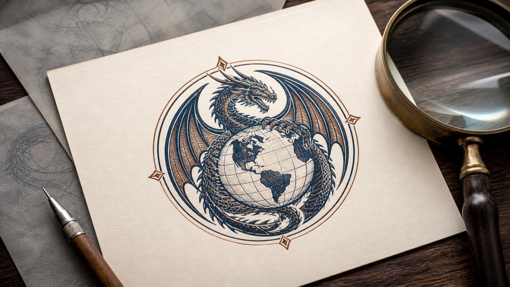
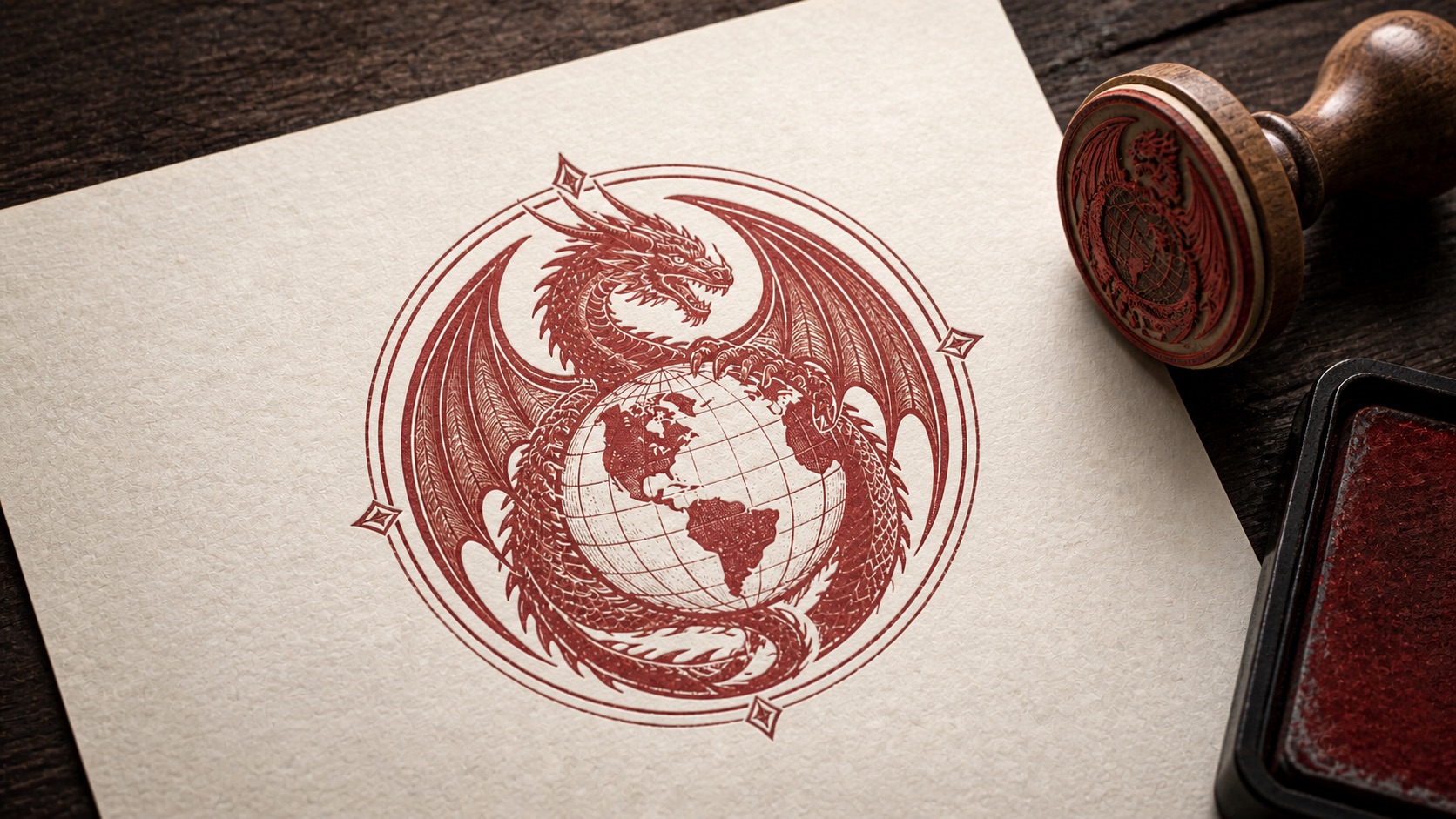
Do not list every line. If a dragon emblem includes a globe, wings, scales, a ribbon, and small text, the anchors might be the circular globe and the dragon’s overall posture. Individual scales may add richness in a full-color identity but contribute little in a small stamp.
Write the anchors in plain language before uploading anything. This gives you a review standard. Without one, people tend to judge the result by vague similarity and may either accept a confusing mark or reject a useful simplification because it looks less detailed.
Also identify protected wording. If a company name must remain exact, verify the spelling in the source and plan to inspect it separately in the result. AI-generated image text needs careful human review. When wording is critical and editable text is preferable, a regular stamp editor may be the better place to assemble the final design.
Remove Source Problems Before Asking for Simplification
The best source is a single clear company image, logo, trademark, name graphic, or business mark with visible edges. A busy screenshot gives the tool extra material to interpret: interface controls, document text, shadows, backgrounds, or nearby graphics.
Prepare the source with these checks:
- Crop away unrelated page content and generous empty margins.
- Use the clearest available version rather than a thumbnail copied from a document.
- Prefer a plain background with strong separation from the mark.
- Avoid heavy shadows, glow effects, texture, and photographic surfaces.
- Confirm that the main symbol is not already clipped at the edge.
Do not upscale a tiny blurred image and expect new detail to appear. Enlarging can make pixels bigger, but it cannot recover the original contours. If you have access to a cleaner brand asset, begin there.
If the logo includes several lockups, such as a symbol plus a long slogan, choose the version closest to the stamp’s job. A compact symbol-and-name lockup is usually easier to simplify than a full marketing signature with a tagline and date.
Decide What Can Be Simplified Safely
Put the source features into three groups: preserve, simplify, and remove.
Preserve
Preserve the anchors that carry recognition. This includes the main silhouette, important internal openings, and required short wording. If the relative position of two symbols matters, preserve that relationship even if their fine texture changes.
Simplify
Simplify repeated details, thin decorative strokes, shading, and small texture. Feathers can become larger grouped shapes. A shaded globe can become a circle with a few strong latitude or longitude lines. Several outlines can become one clear contour.
Remove
Remove details that cannot survive at the intended size or that compete with the anchors. Tiny taglines, registered-mark symbols, background ornaments, and photographic effects often belong in this group. Their absence may make the result more faithful to how the identity is perceived, even though it is less faithful to every pixel.
This classification also helps with internal review. Instead of asking whether the output is “close enough,” a reviewer can confirm that preserved features remain, simplified features are still understandable, and removable details have not left confusing fragments.
Use the AI Image Stamp Maker for the Right Transformation
The Stampdy AI image stamp maker is designed for an image-first workflow: upload a source mark, generate a one-color stamp interpretation, review it, and download the result. It is useful when the identity already exists as an image and the main job is visual simplification.
It is not a substitute for approving a new identity, verifying official wording, or deciding whether a mark is authorized for a particular document. Those decisions remain with the person or organization responsible for the asset.
During generation, keep your review objective narrow. You are looking for a result that preserves the recognition anchors and produces solid, separable shapes. Do not judge it only at the large preview size. A complex result can look impressive when enlarged but collapse into a dark patch in normal use.
If the first result changes an essential contour, return to the source. A clearer crop or a simpler logo lockup may help more than repeatedly accepting new decorative interpretations. The source image is part of the instruction.
Compare the Generated Stamp in Three Passes
Use a repeatable comparison rather than switching rapidly between the source and output.
Pass one: silhouette
View both images small or from a distance. Does the generated stamp retain the source’s overall shape and orientation? Can you still distinguish the central subject? Ignore internal detail for this pass.
Pass two: recognition anchors
Inspect the features you listed earlier. Confirm the correct number of major shapes, their relationship, and the meaningful negative spaces. A missing opening can matter more than several missing decorative lines.
Pass three: artifacts and wording
Zoom in and look for broken contours, accidental blobs, isolated marks, or false shapes created by simplification. Check every visible letter against the approved source. Then zoom back out. A correction that looks clean up close still needs to work as a whole.
The final pass should include the intended background. A transparent one-color stamp may sit on white, a shaded document area, or near table lines. Make sure its open spaces remain open and the outer shape does not blend into nearby content.
Know When to Rebuild Instead of Regenerate
Some source marks are poor candidates for direct image conversion. Switch workflows when:
- exact editable wording is more important than preserving the source image;
- the logo is mostly tiny text;
- the source is too blurred or clipped to reveal the actual contours;
- required elements need a new layout rather than a simplified rendering;
- the result needs manual placement of text, borders, or additional symbols.
In those cases, use the Stampdy stamp maker to build the composition with editable elements. You can use a simplified symbol as one part of the design and add approved text separately. This hybrid approach often gives a team better control over wording while preserving the recognizable visual anchor.
Do not try to rescue an unsuitable source through endless generation. Set a limit before beginning—for example, review a few meaningful source variations, then choose between conversion and manual assembly. The purpose is a usable asset, not a gallery of near-duplicates.
Review the Result at Document Size
A stamp image usually appears much smaller than its creation preview. Place the result into a sample page at the size expected in the real workflow. Review on screen at normal zoom and, if printing matters, on an ordinary printed sheet.
Check:
- The main silhouette is recognizable without zooming.
- The required wording is readable and exact.
- Open spaces have not filled in.
- Thin lines have not disappeared.
- The stamp is visually separate from document text and rules.
- No stray marks look like punctuation, initials, or extra symbols.
If the design fails only at a very small size, consider making a simplified delivery variant rather than weakening the master. Remove secondary detail deliberately. Do not rely on aggressive sharpening or repeated resizing to create clarity that the composition lacks.
Use the stamp image quality checklist for the final asset-level review after the conversion itself has passed. That separates two questions: “Did the logo simplify correctly?” and “Is the downloaded image ready for this document?”
Keep an Approval Record With the Asset
Save the source, chosen output, and a short note describing the preserved anchors. Use filenames that distinguish them, such as:
north-river-logo-source.svgnorth-river-stamp-review-01.pngnorth-river-stamp-approved.png
If the stamp is revised, do not overwrite the only approved copy. Record what changed: simplified wing lines, removed tagline, corrected company name, or increased open space. This makes later review faster and helps prevent an earlier result from returning to circulation.
The record does not need to be complicated. A small folder with the source, approved output, owner, and approval date is more useful than many unexplained downloads.
Frequently Asked Questions
What kind of detailed logo works best in an AI image stamp maker?
A clear logo with a distinctive silhouette, visible edges, limited critical wording, and separable major shapes is a strong candidate. Heavy texture, tiny text, and photographic detail make one-color simplification harder.
Should all logo details remain in the stamp version?
No. Preserve the features required for recognition and approved wording. Simplify or remove details that close up, disappear, or distract at the intended stamp size.
Can I use a screenshot as the source image?
A tightly cropped, clear screenshot may work, but a clean original asset is preferable. Screenshots often include small interface text, compression, backgrounds, or clipping that can be interpreted as part of the mark.
What if the generated company name is not exact?
Do not approve it. Use a clearer source or assemble the final stamp in an editor where the wording can be entered and checked directly. Required text should be reviewed character by character.
Conclusion
Use an AI image stamp maker when you have a clear source image and can identify the visual anchors that must survive. Prepare the source, classify features as preserve, simplify, or remove, and compare the output in silhouette, detail, and document-size passes. If exact editable wording or a new composition is the real requirement, move to a regular stamp maker instead.
The strongest simplified stamp is not the one with the most retained lines. It is the one that keeps the right identity cues, removes fragile detail, and remains understandable where the asset will actually be used.