Stamp Maker Border and Spacing Guide for Clear Designs
Borders and spacing determine whether a stamp looks organized or cramped. In a stamp maker, they are not finishing touches. The outer edge defines the design, internal gaps separate information, and empty space keeps text from merging with lines or symbols. Get those relationships right before adding decorative detail, and the result is much more likely to stay clear when it is reduced for a PDF or printed on an ordinary office page.
There is no universal border thickness or perfect gap measured in pixels. A useful setting depends on the stamp’s shape, output size, text weight, and surrounding document. The reliable method is to build a simple hierarchy, compare the visual weight of each part, and test the result at the size people will actually see.
Think of the Border as Part of the Reading System
The outer border has three jobs. It contains the composition, gives the mark a recognizable silhouette, and creates separation from the document beneath it. It should not compete with the company name or status wording.
A border that is too heavy becomes the first thing a reader sees. A border that is too thin can disappear after the image is reduced, compressed, or printed. The right weight is strong enough to complete the shape but quiet enough to leave the text in charge.
Begin with one border. Add an inner ring only when it creates a useful zone for perimeter text or a distinct center. Double borders consume space, so they need a reason. If a second line merely makes the design feel “official,” compare the stamp without it. The simpler version may read better.
The same principle applies to rectangular frames. Rounded corners, double boxes, and inset dividers all reduce the area available to words. Build the content first, then choose the minimum framing that organizes it.
Establish Three Kinds of Space in a Stamp Maker
Good spacing is easier to control when you separate it into three categories.
Edge clearance
Edge clearance is the gap between the outer border and the nearest text or symbol. It prevents accidental contact and keeps the border from visually swallowing the content. In a round design, review this gap all the way around the curve, especially where long letters or a logo reach outward.
Element spacing
Element spacing is the gap between the name, qualifier, date, icon, divider, and other internal parts. Related items can sit closer together, while unrelated levels need more separation. This is how the stamp communicates structure without extra labels.
Internal letter and line spacing
Letter spacing affects the texture of words. Line spacing controls how stacked text behaves as a block. These settings should help reading, not force text into a predefined shape. Tightening them too far may solve a width problem while creating a recognition problem.
Work from the outside inward: establish edge clearance, place the main groups, and refine letters last. If you start by tuning individual characters, later changes to the border or logo will undo that work.
Match Border Weight to Text Weight
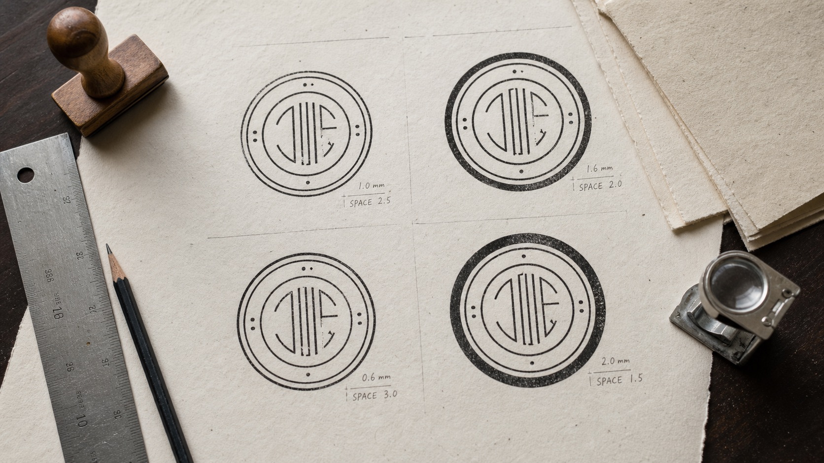
Compare the border with the strongest text in the design. They do not need identical thickness, but they should belong to the same visual system. A heavy frame around delicate lettering looks disconnected. Very bold lettering inside a hairline circle can make the frame seem unfinished.
Use the primary wording as the reference. If the main name is bold, begin with a medium border and review at small size. If the text is compact and lighter, a thinner border may be sufficient. Symbols should also be considered: a dense center icon can balance a stronger outline, while a simple monogram may need more surrounding quiet space.
Double borders require particular care. The two rings together can appear much heavier than either ring alone. Keep a visible gap between them, and make sure the combined band does not crowd curved text. If the gap closes when reduced, the pair will behave like one thick ring.
Color changes perceived weight too. A saturated dark color can make a border feel heavier than the same line in a softer tone. Set the composition in one color first, then check whether the chosen ink treatment changes the hierarchy.
Use Empty Space to Show What Belongs Together
Spacing is a form of punctuation. A company name and its legal suffix belong together, so the gap between them should be smaller than the gap before a branch label. A central status word may need open space around it so it does not merge with perimeter text.
Try the “squint test”: reduce the preview or look at it without focusing on individual letters. You should still see separate groups. If the design becomes one dark mass, increase the space between levels or remove a divider. If it falls into unrelated fragments, bring connected items closer together.
Avoid filling every open area with stars, dots, or short lines. Small separators can clarify the beginning and end of curved text, but they should not become substitutes for spacing. A pair of dots may help distinguish an upper name from a lower location. Six decorative marks usually create noise.
In rectangular stamps, left alignment can create a clean shared edge and make short operational text easy to scan. Center alignment is useful when the frame is symmetrical, but centered lines need careful vertical spacing because their different lengths create an uneven outline.
Build the Border Before Fine-Tuning Decorative Details
Use the online stamp maker to choose a template or begin with a blank layout. Then follow a controlled sequence:
- Set the intended shape and approximate aspect ratio.
- Add the outer border with a moderate initial weight.
- Place the primary text and give it clear edge clearance.
- Add secondary text or a symbol, preserving visible gaps between groups.
- Review the whole design at reduced size.
- Adjust letter spacing and line spacing only after the larger relationships work.
- Add a second border or divider only if it improves structure.
This order prevents detail from dictating the composition. It also makes review easier. A colleague can comment on wording and hierarchy before anyone spends time aligning decorative marks.
Save intermediate versions only when they represent real decisions, such as “single border” and “double border.” Avoid keeping a chain of nearly identical files called “final,” “final-2,” and “final-new.” Clear version names help the team compare the choices that matter.
Check Curved Text at the Tightest Points
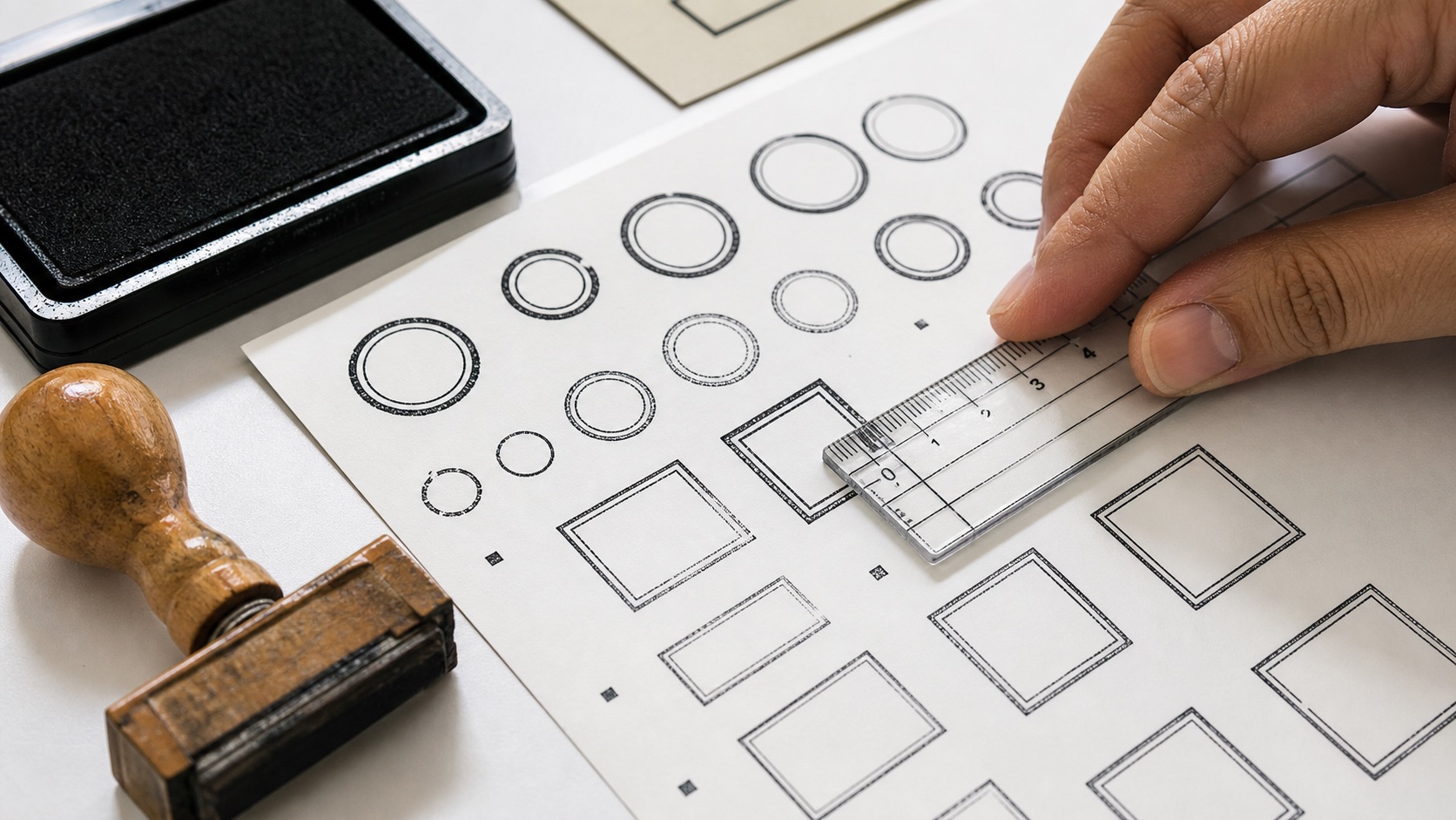
In a circular or oval stamp, the top and bottom may look spacious while the left and right sides feel compressed. Curved text changes orientation as it follows the path, and certain letter combinations occupy more visual space near the sides.
Review the entire arc, not just its center. Look for characters that nearly touch a ring, symbol, or separator. Increase the path radius only if it preserves edge clearance. If moving the text outward makes it too close to the border, reduce the font size slightly or shorten an approved supporting phrase.
The lower arc also deserves attention. Text that is technically upright may still feel harder to scan because the reader encounters it after the main name. Keep lower wording shorter and less prominent when possible. Do not force the same density into both arcs for the sake of symmetry.
When a long perimeter name needs substantial adjustment, compare a wider oval or straight-line layout. A shape change is often cleaner than repeated micro-adjustments to spacing.
Test the Design Against Real Output Conditions
Reviewing the editor at a large zoom level answers alignment questions, but not use questions. Place the exported stamp in a sample document at the planned size. Check it on both a light screen and an ordinary printout if both contexts matter.
Ask:
- Does the outer border remain continuous?
- Are the inner ring and outer ring still visibly separate?
- Can each word be read without zooming?
- Do small gaps remain open rather than filling in?
- Is the symbol distinct from the surrounding text?
- Does the stamp separate clearly from document lines or handwriting?
If the asset will be used at several sizes, approve a master and create deliberate delivery copies. Do not keep resizing the same raster file repeatedly. The resize stamp tool can prepare a copy for a defined target, but a very small use case may need a simplified design with fewer elements.
Cropping matters as well. Excess transparent space makes placement awkward, while an aggressive crop can make the border feel clipped. Use the crop stamp tool when a downloaded asset needs a cleaner canvas, then check that a narrow margin remains around the full outline.
Fix Spacing Problems by Removing Causes
When the design feels crowded, diagnose the source rather than shrinking everything.
If text touches the border: move the text path inward, reduce one approved phrase, or choose a larger shape. Do not accept near-contact simply because the editor still shows a tiny gap.
If the center feels dense: remove an inner ring, reduce the icon, or create more separation between the icon and central text.
If the stamp feels empty: make the important content slightly larger before adding decoration. Useful empty space is not a defect.
If stacked lines blur together: increase line spacing or reduce the weight of secondary text. Adding a divider can help, but only if it remains distinct at final size.
If a double border becomes one dark band: widen the gap, lighten one line, or return to a single border.
Each fix should preserve the reading order. A layout is not improved if it gains space by making the company name less prominent than a border or icon.
Frequently Asked Questions
How thick should a digital stamp border be?
There is no single correct pixel value because the result depends on output size and resolution. Start with a moderate line that supports the main text, then inspect the exported stamp at its intended size. The border should remain visible without becoming the dominant element.
Is a double border better than a single border?
Not automatically. A double border is useful when it creates a clear perimeter zone or matches an approved design. A single border usually leaves more room for text and is easier to keep clear at small sizes.
How much space should appear around a logo?
Enough that the logo does not merge with text, dividers, or an inner ring at final size. Judge the visible gap after reduction, not only in a magnified editor. Dense logos generally need more breathing room than simple symbols.
Should every empty area be balanced with decoration?
No. Empty space separates information and protects readability. Add a separator only when it clarifies where text begins, ends, or changes level.
Conclusion
Before approving the design, compare border weight with text weight, inspect edge clearance around the full shape, and confirm that related items form clear groups. Reduce the stamp to its practical size and check that small gaps stay open. Remove any line, ring, or symbol that consumes space without helping recognition.
A stamp maker makes fine adjustment possible, but clarity comes from a few large decisions: one obvious hierarchy, a border that supports rather than dominates, and enough space for every required element to remain distinct.