Stamp Maker Guide to Loyalty Card Stamps at Small Sizes
A loyalty card stamp has very little room to succeed. The impression must fit inside a small box, read quickly, and remain recognizable after repeated inking by different people. A stamp maker gives you control over the icon, border, spacing, and export, but the decisive test is the physical mark on the actual card stock.
Keep the design simpler than the main logo, protect open space inside the icon, and test several impressions at the smallest planned size. The card grid and staff routine matter too. A good stamp should land without covering neighboring boxes, requiring a special angle, or forcing the operator to guess how much pressure is enough.
Define the Card Workflow Before Drawing the Icon
Write down what one impression means. It may represent a purchase, visit, class, refill, or another event defined by the program. Keep that meaning in the program rules and staff instructions rather than trying to fit the entire condition inside the stamp.
Decide how many impressions the card needs and what happens when the grid is complete. This determines the number, size, and spacing of boxes. Also decide whether staff will stamp at a counter, carry the tool, or share one station. A small wooden stamp may suit a quiet desk, while a compact self-inking format may be easier for repeated counter use if the manufacturer offers the required size and detail.
Identify the card stock before design. Uncoated card often accepts common stamp inks differently from coated or laminated cards. Paper color affects contrast, and a printed background can compete with the mark. The exact ink and stock must be tested together.
Set the stamping area as a real physical measurement from the card layout. Do not use the full printed box as the maximum die size. The impression needs clearance for hand placement and normal variation. If each box is extremely tight, redesign the grid before shrinking the icon into an unreliable miniature.
Build a Small-Format Icon in the Stamp Maker
The icon should be identifiable from its outer shape before a viewer notices internal detail. Start with one original symbol that connects naturally to the business or program: a leaf, cup, star, fruit, tool, or simple geometric motif. Avoid copying a trademarked character or using a generic symbol that could be confused with another business.
Use the Stampdy stamp maker to place the icon at the planned aspect ratio. If text is essential, limit it to a short initial or compact approved word and test it separately. A business name that reads well on signage may turn into a dark bar inside a loyalty-card box.
Simplify in this order:
- Remove shading, gradients, and photographic texture.
- Merge tiny decorative fragments into larger intentional shapes.
- Open narrow gaps between neighboring elements.
- Enlarge important counters, such as holes inside letters or icons.
- Remove an outer border if it leaves too little room for the symbol.
Use one ink color in the production artwork. The paper can provide the second color. This makes the design easier to interpret as raised and recessed areas in a physical die.
Inspect both positive and negative space. A tiny gap that remains visible on a large monitor may fill with ink. A thin isolated stroke may disappear. The goal is not to reproduce every part of a brand asset; it is to create a compact companion mark that belongs to the same visual system.
Design the Grid Around Human Placement
The card layout should help the operator, not expose every millimeter of variation. Give each impression a defined center and enough empty space that a slightly offset mark still belongs to one box. Heavily outlined boxes can make the card feel crowded and may visually merge with the stamp.
Test circles, light corner marks, or an open grid depending on the card style. If the stamp includes its own border, the printed card may need only subtle placement guides. If the stamp is an unframed icon, a simple printed box can clarify where it belongs.
Keep important card copy away from the stamping area. Terms, contact information, completion instructions, and accessibility-relevant text should not sit behind fresh ink. Reserve a separate completion area if staff must add a date, initials, or redemption mark.
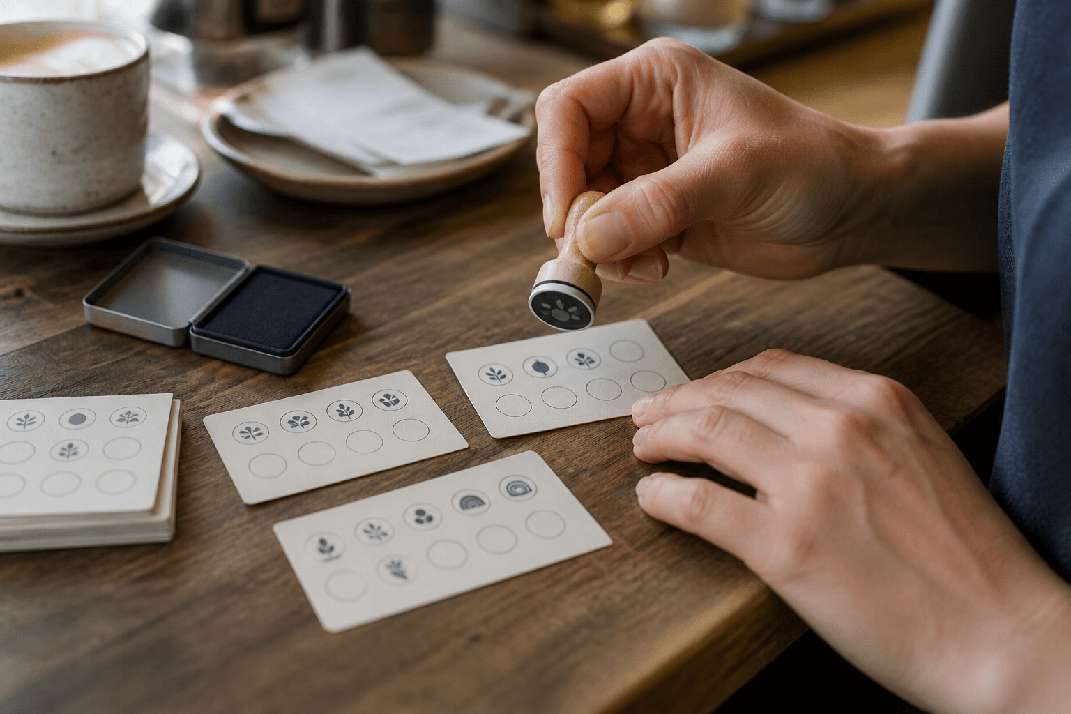
Print the card at final size on the intended stock. Cut it to its finished dimensions and handle it as staff will. A grid that seems generous on a full design sheet may feel cramped once the card is held between two fingers at a counter.
The border and spacing techniques in the stamp maker border spacing guide are useful here, but small cards need an especially strict hierarchy: icon first, grid second, supporting copy third.
Prove the Smallest Impression, Not the Largest Preview
Create a proof sheet with the icon at several nearby sizes. Do not scale from tiny to huge; test a narrow range around the maximum that fits the card. Leave enough space between proofs to inspect their actual edges.
Print the digital sheet first. Compare silhouette, open counters, line separation, and border clearance. Then ask the stamp manufacturer to assess the selected file for the chosen production method. Minimum strokes and gaps vary, so avoid turning one vendor's recommendation into a universal rule.
Once the physical stamp exists, make a series on the real card stock. Include normal impressions, slightly light ink loads, and the heaviest acceptable load. Reject a design that only reads on the single best example.
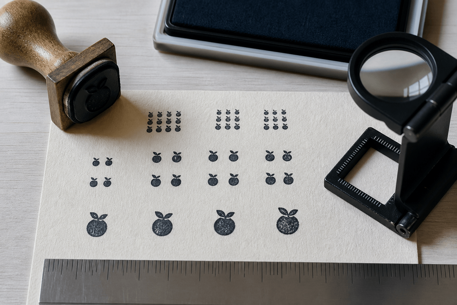
View the cards at arm's length as well as under magnification. The loupe helps diagnose why a gap closed, but the customer and staff need to recognize the mark without inspection equipment. If the icon becomes ambiguous, enlarge it, simplify it, or reduce the number of boxes.
Check the full card after every box has been stamped. Repetition changes visual density. A mark that looks charming once may become a heavy pattern after ten impressions. Adjust ink color, icon weight, or grid spacing based on the completed card, not only the first box.
Treat Distinctiveness as Recognition, Not Security
A custom icon can make the card feel specific to a program and help staff recognize the intended stamp. It should not be described as fraud-proof. A visible stamp impression can be photographed or reproduced, and a simple mark does not establish who applied it.
Use operational controls that match the value of the reward. Keep the tool at the service point, assign responsibility for it, and retire damaged or obsolete versions. If the program carries meaningful financial or account value, use the organization's normal digital or transaction records rather than relying on the paper stamp alone.
Avoid adding secret microtext or hidden detail that staff cannot inspect. Those features may make the stamp harder to produce without creating reliable verification. A straightforward original symbol, a controlled physical tool, and clear staff rules are easier to maintain.
When a card is redeemed, follow one visible completion action: collect it, mark a separate redemption field, punch it, or use the program's recorded process. Do not make the ordinary icon carry purchase, authorization, and redemption meanings at the same time.
Make the Counter Routine Easy to Repeat
Set up the station so the card, stamp, and ink pad have stable positions. A small backing mat can improve support and protect the counter. Keep fresh impressions away from receipts, sleeves, and other cards until the ink has dried according to its instructions.
Train staff with an approved card and a rejected card. Show the acceptable range of ink coverage and placement. The instruction can be short:
- check that the card belongs to the current program;
- ink the die evenly without flooding it;
- align the mount with the selected box;
- press vertically without rocking;
- lift straight up and let the impression dry;
- use the defined correction process instead of stamping over a mistake.
Overprinting a weak impression can create a double image and make the box harder to review. If a mark is clearly incomplete, follow one consistent correction rule, such as voiding that card and transferring approved progress under staff control. The rule should fit the business, reward value, and recordkeeping process.
Clean and store the stamp according to the manufacturer and ink instructions. Dried buildup changes small details first. Replace a worn pad or damaged die when routine proofs fall outside the approved range.
Diagnose Common Loyalty Card Stamp Problems
The icon fills into a blob. Reduce the ink load and clean the die. If repeated controlled proofs still fill, open the artwork's gaps or increase the physical size.
The mark lands across two boxes. Increase grid spacing, reduce the die or mount footprint, or add a physical alignment guide. Do not rely on staff to correct an unforgiving layout through concentration alone.
Fine details vanish after a week of use. Inspect for dried ink and wear. Compare a fresh proof with the approved reference. If maintenance does not restore it, the design may be too delicate for routine use.
The card smears when returned to a wallet. Confirm ink compatibility and drying behavior on the exact stock. A coating change may require a different approved ink or an uncoated stamping panel.
The complete card looks too dark. Reduce the icon's filled area, use a lighter approved ink with sufficient contrast, or increase the white space between boxes. Judge the repeated pattern as a composition.
Prepare Files for Card and Stamp Production
Keep the stamp artwork and card artwork as separate masters. The stamp file should contain the final one-color mark at a known scale. The card file should define the grid and placement clearance without duplicating the stamp impression as printed decoration.
Export the format requested by the stamp manufacturer and preserve a scalable master when the authorized source supports it. The print-ready stamp export guide explains how to match the delivery file to a production request without treating one format as universally correct.
Name the files with the program, version, and dimensions. Save an image of the approved physical impression and a completed sample card beside them. If the icon, grid, reward structure, card stock, ink, or manufacturer changes, repeat the connected tests rather than editing one file silently.
Frequently Asked Questions
How small can a loyalty card stamp be?
The practical minimum depends on the artwork, die process, ink, card stock, and acceptable variation. Start from the available box, simplify the icon, ask the manufacturer about feature limits, and approve the finished result through several physical impressions.
Should a loyalty card stamp use a logo or a simple icon?
Use the logo only if its essential shape survives at the required size. A simplified original icon is often easier to recognize in a small box. Keep the relationship through shape, color, or style rather than forcing the full brand lockup into the stamp.
Is a self-inking stamp better for loyalty cards?
It can be convenient for repeated counter use, but suitability depends on available size, detail, ink compatibility, and how the mount aligns with the grid. Compare it with a traditional mount using the actual card workflow.
Can I use glossy loyalty cards?
Only after testing a compatible ink and drying process. Glossy or laminated surfaces can behave differently from uncoated card. Consider leaving an uncoated stamping panel if the selected stock does not produce stable impressions.
Conclusion
A compact loyalty mark needs a bold silhouette, open internal space, forgiving grid, and repeatable counter routine. Use a stamp maker to simplify and size the approved artwork, then test the physical stamp across several impressions and a fully completed card.
Release the system only when the smallest icon remains recognizable, normal placement stays inside one box, the ink works on the chosen stock, and staff have a clear correction rule. Keep the master files, approved impression, and completed sample together so the next reprint begins from evidence rather than memory.