Seal Maker Guide to Wax Seal Stamp Design and Fine Detail
A seal maker can help organize the digital composition, but a successful wax seal stamp design is usually simpler than the artwork that inspired it. The finished seal must communicate through a small field of raised wax, changing highlights, and natural edge variation. Start with one recognizable subject, give every important shape room to breathe, and treat the digital design as a production brief rather than proof that the physical result will work.
This guide explains how to choose content, control detail, prepare useful variations, and approve a real wax impression. It applies to initials, botanical emblems, small business marks, wedding stationery, and packaging accents without assuming that one layout or minimum line width fits every die maker.
Decide What the Wax Seal Stamp Design Must Communicate
Write the purpose in one sentence before drawing. A seal used to close an invitation may need to express a pair of initials. A packaging accent may need one recognizable brand symbol. A maker's seal may need a compact motif that remains identifiable when the wax edge is irregular.
List the essential feature and everything optional. If the seal must show the initials “A” and “M,” those letterforms are essential; a ring, leaves, stars, and a date may be optional. If the subject is a flower, the overall silhouette may matter more than the exact number of veins in each petal.
This hierarchy prevents a familiar failure: shrinking a complete logo or invitation crest into a small circle and expecting every element to survive. A wax seal is its own application. It can belong to the same identity while using fewer parts.
Also decide whether the seal is decorative, operational, or both. A wax impression can add a tactile closure or visual cue, but it should not be presented as evidence of identity, authorization, or document integrity unless a separate process actually provides that evidence.
Choose One Strong Center Subject
The center is the first place the eye looks and often the area where relief is easiest to read. Use it for the element that carries recognition: an initial, a short monogram, a bold icon, or a simplified botanical form.
Avoid making several small symbols compete. A letter surrounded by a flower, date, location, and miniature slogan may look balanced at screen size while becoming an uncertain patch in wax. If two ideas are equally important, prepare two distinct concepts rather than combining them prematurely.
Initials need deliberate overlap. Test whether each letter remains individually recognizable where strokes cross. Thin calligraphic swashes can merge with a neighbor or disappear in changing light, so a restrained monogram often reads better than an elaborate one. Do not redraw a protected logo casually; start from authorized artwork and obtain approval for any simplification.
For pictorial marks, check the silhouette first. Fill the design as a single dark shape on screen. If the subject is still identifiable without interior detail, it has a strong foundation. Restore only the internal cuts that help recognition.
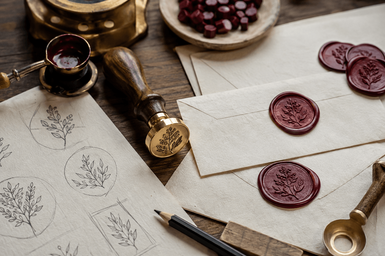
Simplify Fine Detail Without Losing Character
Fine detail is not inherently bad, but every line must justify its space. Wax relief is seen through shadow and highlight rather than flat ink contrast. The apparent clarity can change with wax temperature, pressure, release timing, die depth, surface angle, and lighting.
Review the design at its intended diameter, not only in a large editing view. Look for:
- tiny enclosed spaces that may appear closed;
- parallel lines that could become one visual band;
- sharp interior corners that do not affect recognition;
- isolated dots or hairlines with no supporting mass;
- texture that competes with the main contour.
Simplify in stages. First remove decorative noise. Next open the smallest counters and spaces. Then strengthen only the strokes that remain fragile. Recheck the overall balance after each change. Increasing every stroke equally can make the subject heavy and reduce the negative space you were trying to protect.
Keep a copy of the detailed source. The wax version should be a controlled adaptation, not a destructive replacement for artwork used elsewhere.
Use Borders Only When They Organize the Seal
A border can contain a loose motif, establish a clean perimeter, or separate center art from curved text. It is not mandatory. A free-edge botanical or single initial can feel more natural without a ring.
If you add a border, leave a visible channel between it and nearby artwork. When a letter touches the ring unintentionally, the contact can look like a production defect. When it touches deliberately, the junction should be substantial enough to read as part of the design.
Double borders need a reason. Two close rings consume space and create another narrow channel that must reproduce consistently. Compare a single ring, a wider single ring, and a borderless version at real size before choosing.
For curved wording, shorten before shrinking. A name plus location, date, and slogan may not fit comfortably around a small seal. Retain the phrase that matters to this use and move supporting information to the envelope, card, or package. The stamp border and spacing guide provides a useful framework for checking ring clearance and visual breathing room.
Build Controlled Variations in a Seal Maker
Use the Stampdy stamp maker to explore a one-color digital layout before sending a production brief. Set a circular working area, place the approved subject, and adjust size, alignment, type, color, and spacing while looking at the whole mark.
Create a small, intentional set of alternatives:
- a base version with the full essential subject;
- a simplified version with wider openings;
- a version with one different border treatment;
- an alternate size only if the intended application is not yet fixed.
Change one variable at a time. If the second option changes the initials, border, ornament, and diameter, reviewers cannot tell which change improved the design. Clear variation names such as open-counter, single-ring, and borderless are more useful than final-2 or newest.
The screen draft helps compare composition, but it does not simulate the exact relief, wax, or hand pressure of a finished tool. Export or capture a clear reference at the intended scale, then follow the die maker's current file and polarity requirements.
Compare Raised and Recessed Areas Deliberately
Ask the manufacturer how dark and light artwork maps to the engraved die. Do not assume that a visual inversion on screen is a production-ready file. The relationship between raised wax, recessed wax, and die engraving needs to be explicit in the handoff.
Broad raised wax shapes catch light differently from fine recessed channels. A large flat field may show small surface variations; a dense network of narrow lines may lose hierarchy. Decide which features should stand proud and which should sit below the main surface, then prepare a simple visual reference of the intended result.
If you are adapting artwork from an ink stamp, review the positive and reverse stamp artwork guide. The physical processes differ, but its method—compare polarity as separate designs, protect open spaces, and proof at actual size—remains useful.
Approve the Design With Physical Wax Proofs
The decisive test is a real impression from the intended die. Ask for a production proof when available, or plan a controlled sample session after the tool arrives. Use the actual wax type and the paper or package surface expected in normal use.
Make several impressions rather than selecting the neatest one. Include normal variation in wax quantity, pressure, and placement. Review the seals first at ordinary viewing distance and then under closer light.
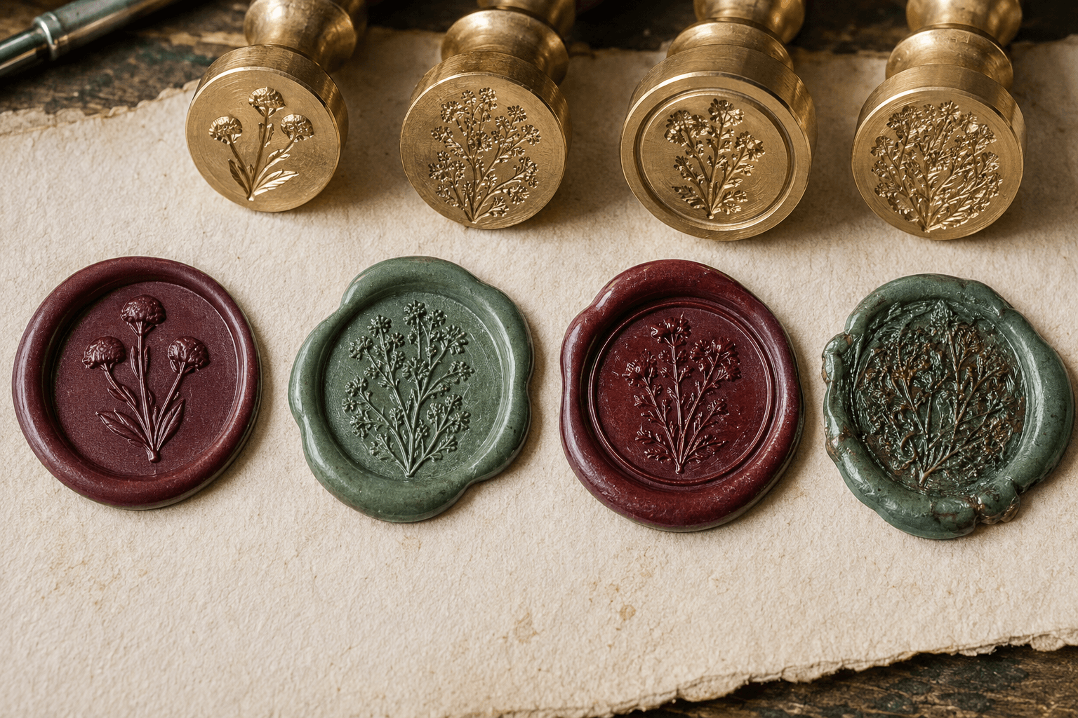
Check these questions:
- Is the main subject recognizable immediately?
- Can required initials be distinguished without rotating the piece repeatedly?
- Do open spaces stay open across several impressions?
- Does the border feel intentional when the wax edge varies?
- Does the result still work on both light and dark intended backgrounds?
- Is the seal suitable for the envelope, tag, or package thickness?
Do not judge only from a tightly cropped macro photo. Magnification is useful for diagnosing incomplete channels or trapped wax, but the seal must work at the distance where recipients will actually see it.
Diagnose Common Wax Seal Design Failures
The center looks like a single lump. Remove interior lines that do not define identity, open the largest counters, and test a bolder silhouette. Increasing the seal diameter may help, but only if the application has room.
The initials merge. Separate overlapping strokes, reduce flourishes, or choose letterforms with more distinct structures. Test the monogram as a black silhouette before returning to relief.
The outer ring is uneven. First determine whether the issue comes from the artwork, die, wax quantity, tool angle, or release technique. A thicker digital ring cannot correct every process problem. If the ring is not important, compare a borderless design.
Fine flowers disappear. Keep the few stems and petals that establish the species or style. Replace clusters of tiny buds with larger grouped shapes rather than tracing every detail.
The result feels generic. Return to one characteristic proportion: the angle of a leaf, the width of a letter, or the asymmetry of a branch. Character often comes from a controlled silhouette, not more decoration.
The seal looks good alone but crowds the stationery. Test placement with a paper cutout at real size. Reduce the die diameter or simplify the surrounding print layout instead of forcing the seal into a gap.
Prepare a Clear Production Handoff
Give the maker one approved design per size, plus a reference image showing the intended raised and recessed relationship. Include the final impression diameter and the real application: envelope flap, belly band, gift tag, box, or other surface.
Ask the supplier to confirm:
- accepted source and preview formats;
- artwork polarity and engraving interpretation;
- recommended treatment for the smallest openings;
- expected proof or approval step;
- handle and die dimensions;
- care instructions for the finished tool.
Preserve the editable source, the approved production file, and a photograph of an accepted wax impression. This small record makes a later reorder or size change much less ambiguous.
Wax Seal Stamp Design Approval Checklist
Before releasing the artwork, confirm that:
- the design has one clear purpose and one dominant subject;
- essential initials or symbols are approved;
- optional detail has been removed when it weakens clarity;
- borders and curved text have adequate space;
- the layout has been viewed and printed at intended size;
- raised and recessed areas are explained to the maker;
- the exact wax and receiving surface are included in testing;
- multiple physical impressions remain recognizable;
- the approved source, proof, and version name are archived together.
Frequently Asked Questions
Can I use my full business logo in a wax seal stamp design?
You can begin with authorized logo artwork, but a complete logo may contain more text and detail than a small wax seal can communicate. Create an application-specific version that preserves the most recognizable feature, and have the change approved before production.
Should a wax seal have a circular border?
No. A ring can organize the design, but it also uses space and adds another feature that must reproduce. Compare ringed and borderless versions at actual size and choose the one that makes the center subject clearer.
How small can wax seal details be?
There is no reliable universal minimum. Practical limits depend on die material, engraving method, depth, wax, diameter, and technique. Ask the manufacturer for guidance, then approve the exact design through physical proofs.
Is a digital preview enough to approve the seal?
No. It is useful for composition and communication, but it cannot reproduce the full behavior of engraved metal and wax. Use a physical impression for final approval whenever the details or application matter.
Conclusion
Approve a wax seal stamp design only when its essential subject remains clear across several ordinary physical impressions. Use the seal maker to keep the center simple, open fragile spaces, compare purposeful borders, and document how the artwork maps to the die.
The practical next step is to prepare a base design and one simplified alternative in the seal maker, print both at actual size, and send the stronger option to the manufacturer with an explicit proof request.