Stamp Maker Guide to Positive and Reverse Stamp Artwork
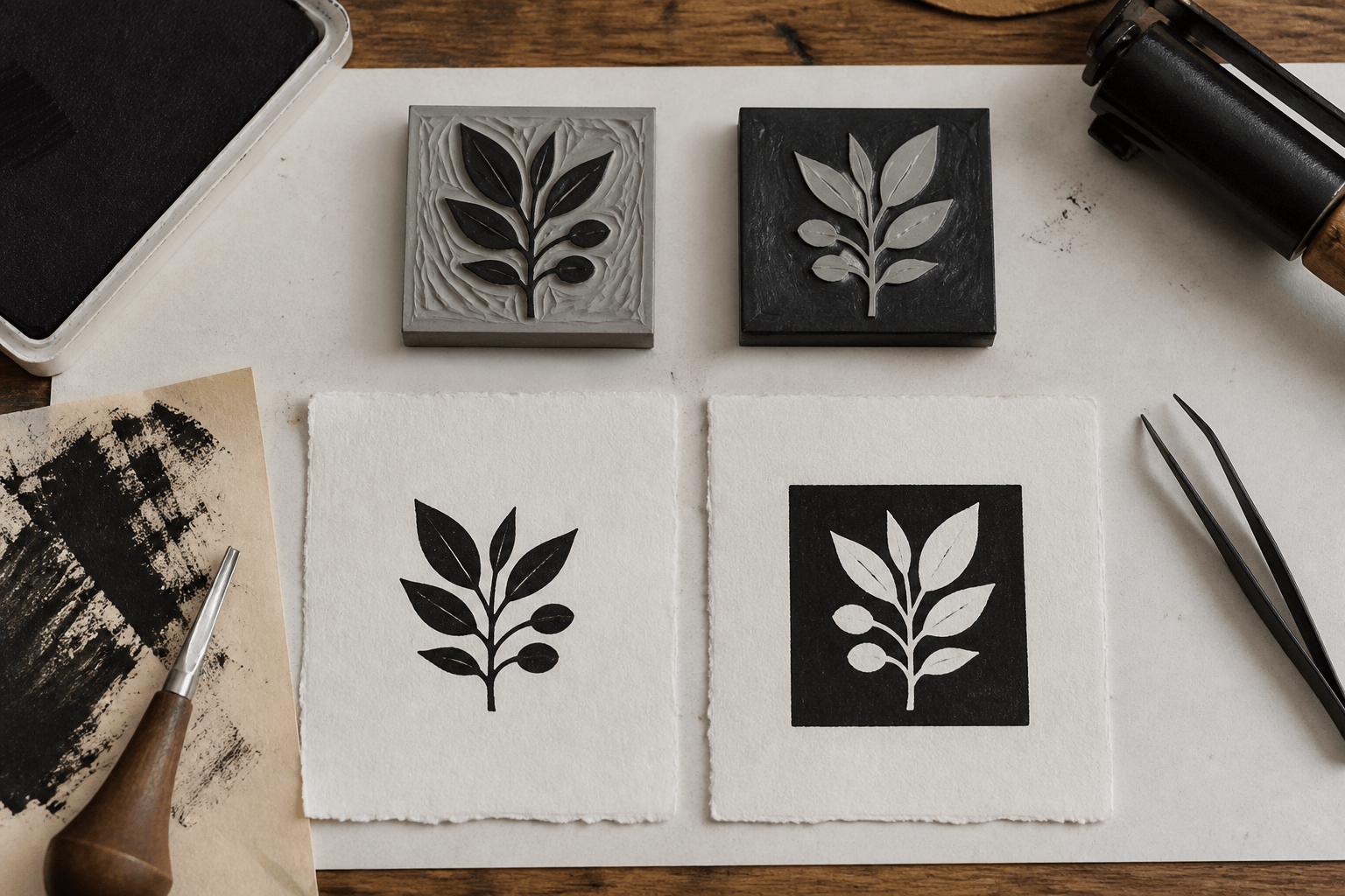
Positive stamp artwork prints the main symbol or letters as inked shapes on the paper. Reverse artwork places the subject in uninked paper inside a larger inked field. Both can look strong in a stamp maker, but they behave differently as physical impressions. Positive art usually transfers less ink and leaves more paper open. Reverse art depends on an even solid field and enough recessed space to keep the subject clear.
Choose between them by testing the artwork at its real size, estimating total ink coverage, and proofing the finished die on the intended surface. A reverse mark is not automatically more premium, and a positive mark is not automatically easier. The right choice is the version whose essential shapes remain recognizable through normal production variation.
Define Positive and Reverse Artwork Before Comparing Them
In a positive design, the visible subject is the printed material. A dark line, letter, leaf, or border in the source becomes the intended ink impression. The unprinted page forms the background around and within those shapes.
In a reverse design, a larger surrounding block prints while the subject is knocked out. The paper shows through to form white letters or a white icon. Depending on the manufacturing workflow, the areas represented as ink in the approved file normally correspond to the parts of the die that contact ink and paper, but confirm file polarity with the manufacturer before production.
The two versions should not be compared only by inverting colors. A direct inversion often creates too much solid area, traps narrow white gaps, or changes the visual weight of the subject. Treat each as a separate layout using the same essential identity.
Define which features cannot change. For a simple botanical icon, that may be the number and direction of leaves. For a wordmark, it is the exact spelling and letter construction. Decorative texture, outer panels, and secondary lines can change if they are not identity-critical.
When Positive Stamp Artwork Is the Better Starting Point
Positive artwork is a practical default when the mark contains fine line work, small text, or an irregular silhouette. Because most of the paper remains unprinted, modest variation in large empty areas is not visible. The operator inks only the raised subject rather than a broad surrounding panel.
This approach works well for names, address lines, outline illustrations, signature-style marks, and symbols that are recognizable from their strokes. It can also feel lighter when repeated across a page, package, or card.
Positive art still has failure points. A thin isolated line may not contact the paper. Tight gaps between dark shapes can fill and merge. A delicate border may break on a textured stock. Adding more stroke weight can help, but it can also close the counters inside letters.
Start from the essential silhouette and enlarge fragile strokes only as much as the production method requires. If every line must be heavily thickened to survive, consider simplifying the subject rather than accepting a swollen version of the original.
When Reverse Stamp Artwork Supports the Design
Reverse artwork can create a compact badge, label, or block with strong visual presence. It may suit short bold lettering, a simple symbol inside a square or circle, or a mark intended to appear as a dark field on light unprinted stock.
Its main demand is coverage. A large raised field must receive ink evenly and contact the surface across its full area. Texture, a flexible package, or uneven hand pressure can produce pale islands and streaks. Those variations may be acceptable when the desired look is visibly handmade, but the knocked-out subject must remain complete.
White gaps in reverse artwork need enough width to resist ink spread. Small counters, narrow channels, and tiny punctuation can fill, changing the subject. A reverse wordmark may therefore need larger type, shorter wording, and more open spacing than its positive counterpart.
Use reverse art intentionally. Do not add a dark rectangle merely to make the design seem substantial. The field should improve recognition or provide a useful badge shape that earns its greater ink coverage.
Build Two Independent Versions in the Stamp Maker
Create a clean positive version in the Stampdy stamp maker. Place the approved text or image, remove unsupported texture, and set the intended outer dimensions. Keep a copy before developing the reverse alternative.
For the reverse version, add a simple surrounding shape and recreate the subject as open space. Do not just apply a visual filter and assume the production file is correct. Inspect every enclosed area and confirm that the resulting polarity is clear to the manufacturer.
Use the same comparison frame for both versions:
- identical finished dimensions;
- the same essential symbol or wording;
- the same intended substrate and ink;
- equal clearance from the outer edge;
- no extra ornament added to favor one version.
Compare them at actual size, not at different zoom levels. The positive version should not be judged from a thin screen preview while the reverse version is shown as a dramatic enlarged block.
If you begin with authorized vector artwork, the SVG to stamp tool can help inspect layers and prepare a one-color version. Preserve the original separately, and review the converted result for merged paths, missing counters, and unintended background shapes.
Compare Ink Coverage and White-Space Risk
Estimate how much of the die will transfer ink. A positive line mark may cover a small portion of its bounding box. A reversed icon in a dark square may cover most of it. More coverage increases the importance of even inking, flat support, and vertical pressure.
Then inspect the smallest open spaces. In positive art, look between neighboring dark strokes and inside printed letters. In reverse art, look at every white channel that defines the subject. Mark any gap whose loss would change identity or wording.
Do not set a universal minimum line or gap from a generic article. Feature limits depend on the die material, production process, finished size, ink, mount, and substrate. Ask the manufacturer for current guidance, then prove the exact result.
Consider the surface color and texture. Reverse artwork needs the paper itself to form the subject. A mottled kraft stock will show that texture inside the knocked-out icon. This can be attractive, but it may reduce clarity compared with a smooth light sheet. On a dark surface, a dark reverse field may lose contrast entirely unless a suitable light ink system has been tested.
Make a Physical Proof Sheet at Real Size
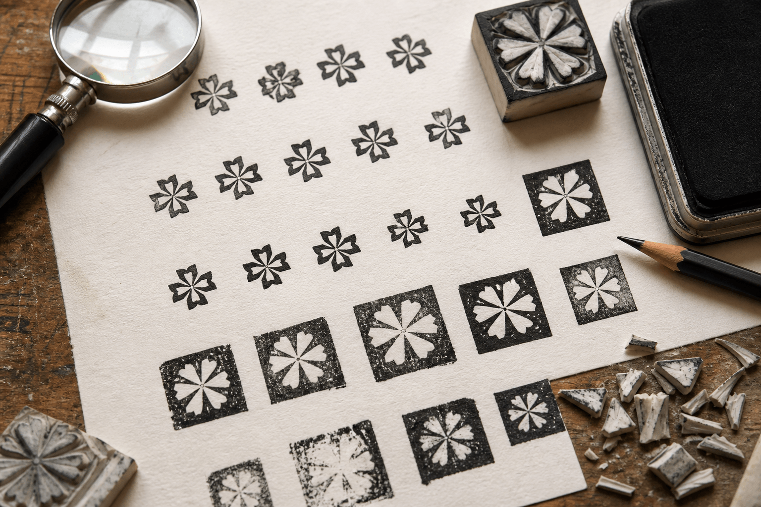
Prepare a sheet containing positive and reverse versions at the intended size plus one slightly simplified alternative for each. Keep the alternatives meaningful: a wider white gap, fewer internal lines, or a smaller solid field. Do not create a dozen nearly identical variations that make approval harder.
Print the file at 100 percent scale for an early review. Then evaluate samples from the actual stamp production method. Make several impressions on each intended material using normal ink and pressure. Include light and heavy acceptable ink loads to expose the failure range.
Judge the proof without magnification first:
- Is the subject immediately recognizable?
- Does every required character read?
- Does the mark have the intended visual weight?
- Does normal variation look controlled rather than broken?
- Is the surrounding space clean enough for its placement?
Use magnification only to diagnose the cause. A loupe can reveal ink bridges, missing contact, or debris, but it cannot make a weak small impression useful at normal viewing size.
Keep the rejected proofs with notes. They show why a wider channel or smaller ink field was chosen and prevent the same fragile variant from returning during a later redesign.
Consider a Hybrid Design Without Adding Clutter
Some marks benefit from a controlled mix: positive text paired with a small reverse icon panel, or a positive symbol inside a moderately filled badge. The hybrid can separate information levels without turning the entire stamp into a solid block.
Give each polarity its own clear zone. Avoid placing positive hairlines directly against the edge of a reverse panel. The boundary may collect ink and visually swallow the thin feature. Use enough separation that each part reads independently.
Limit the hybrid to a practical reason. A reverse panel might highlight a two-letter identifier while the full business name remains positive. A small filled circle may anchor an icon while the date or status stays as open text. If both treatments say the same thing, choose the simpler one.
Proof the hybrid as a whole. A successful reverse icon and successful positive word tested separately can still feel unbalanced when combined. Total ink distribution can also make one side of a large die print more heavily than the other if pressure is uneven.
Diagnose Failures by Artwork Polarity
Positive lines are broken. Check inking, debris, surface support, and pressure. If the same strokes fail repeatedly, thicken or simplify them with approval.
Positive gaps close. Reduce excess ink and clean the die. If controlled impressions still merge, increase spacing or reduce neighboring stroke weight.
The reverse field is patchy. Test a firmer flat backing, more even inking, and a smaller solid area. The substrate may be too rough for the desired continuous field.
White reverse letters fill with ink. Open counters and channels, enlarge the wording, or switch that text to positive artwork. Do not repair the proof digitally and pretend the physical die produced it.
The reverse mark dominates the page. Reduce the field, choose a lighter approved ink with sufficient contrast, or return to a positive version. Visual weight is a design decision, not a production defect.
The two polarities look like different brands. Return to the non-negotiable shape features. Simplification may change detail, but the key proportions and identifying structure should remain connected.
Prepare the Approved Artwork for Handoff
Choose one production master per size and label its polarity clearly. A filename such as leaf-mark-positive-30mm-approved is more useful than logo-final-3. Include a proof image showing how the file should print, but do not let a raster preview replace the manufacturer-requested production format.
Ask the manufacturer to confirm:
- whether dark artwork represents the printing surface in its workflow;
- finished impression dimensions;
- minimum practical strokes and recessed gaps;
- expected performance of large solid fields;
- file format and scale requirements;
- whether a production proof is available.
After receiving the stamp, use the stamp image quality checklist to compare content, borders, negative space, margins, and actual-size output. Keep the approved physical proof with the master file.
Frequently Asked Questions
Is positive artwork always easier to stamp?
No. It often transfers less total ink, but very thin positive lines can break and tight gaps can fill. The actual difficulty depends on the design, size, die, ink, surface, and technique.
Does reverse artwork need more ink?
Usually it has a larger printing area than the equivalent positive line design, so even coverage becomes more important. Compare the actual inked area and proof the field rather than assuming every reverse mark behaves the same way.
Can I invert my logo to make reverse stamp artwork?
Use an inversion only as a starting view. Rebuild spacing, counters, and the surrounding field for physical production. Confirm that the reversed subject preserves the authorized identity and that the manufacturer interprets the file polarity correctly.
Which version works better on kraft paper?
The answer depends on kraft texture, color, ink, size, and desired appearance. Positive artwork may leave more paper open, while a reverse field may display more texture. Test both on the exact stock and approve the version whose important shapes remain clear.
Conclusion
Choose positive artwork when open paper, line clarity, and lighter coverage support the mark. Choose reverse artwork when a solid badge genuinely improves recognition and its white subject can remain open. Use a stamp maker to build each version independently at the same size, then compare physical proofs rather than polished screen previews.
Approve the version that preserves required content across normal ink, pressure, and material variation. Record its polarity, scale, production file, and acceptable impression so future changes begin from a controlled reference.