Stamp Maker Layout Guide for Long Company Names
A stamp maker can fit a long company name without turning every word into tiny type. The key is to stop treating the name as one unbreakable line. Separate the required wording into levels, give the identifying words the strongest position, and let secondary details support them. This approach works for round, oval, and rectangular stamps because it starts with information priority rather than decoration.
The practical goal is not to make every character equally prominent. It is to make the stamp recognizable at a glance and readable when someone actually places it in a document. A long legal name, branch label, registration line, department, or location can all fit when each element has a specific job.
Start With the Exact Wording Before Opening a Stamp Maker
Copy the approved wording into a plain text note first. Do not improvise spelling, punctuation, abbreviations, or capitalization while designing. A visually attractive stamp with the wrong legal suffix or branch name is still the wrong asset.
Divide the text into three possible levels:
- Primary identity: the company, organization, or brand name that must be recognized first.
- Qualifier: a branch, department, region, service type, or legal suffix that distinguishes this stamp from another.
- Supporting line: a registration reference, city, short status, or other approved detail that matters but should not dominate.
Not every stamp needs all three. If a supporting line does not help the reader understand or route the document, leave it out. Removing an unnecessary line often improves legibility more than changing the font.
Now count the words that truly have to appear. A name such as “North River Architectural Planning and Engineering Services” should not automatically receive one continuous line. “North River” may be the recognizable identity, while “Architectural Planning and Engineering Services” can become a smaller descriptor. That is an editorial decision made before it becomes a layout decision.
Give the Long Name a Clear Reading Order
People should not have to rotate a document repeatedly or guess where a company name begins. Establish one obvious entry point. In a rectangular stamp, that is usually the largest centered line. In a round stamp, it may be the upper arc or a short center line.
Use contrast deliberately. The primary identity can be larger, heavier, or more isolated. A qualifier can be smaller but should still remain readable. The supporting line can occupy the quietest position, provided it does not become so small that it turns into texture.
This does not mean using many fonts. One type family with two weights or sizes is normally easier to control than several unrelated styles. Hierarchy should come from scale, placement, spacing, and line breaks—not from decorating every phrase differently.
If the full legal name must stay together, emphasize the most distinctive words with position rather than different styling. For example, place the entire name around a circular border, then use a centered branch label as the secondary line. The eye reads the perimeter as the formal identity and the center as the operational distinction.
Choose the Shape That Serves the Text
Stamp shape affects how much wording can fit naturally. Pick the geometry after reviewing the text, not because one shape looks more official.
Round layouts distribute a long name around the edge
A circle gives a long company name a continuous perimeter. It works well when the name is the main formal identifier and a short branch, year, or symbol belongs in the center. The tradeoff is that curved text needs generous tracking and enough contrast between the outer ring and the center.
Avoid packing a second long sentence into the lower arc. Two dense arcs compete for attention and can create a dark band at small sizes. If the lower text is necessary, keep it shorter than the upper arc or use a compact qualifier.
Oval layouts add horizontal room
An oval offers more width while preserving the perimeter structure of a seal. It can suit a long name that contains several medium-length words. Watch the tight curves on the left and right: characters can appear crowded there even when the top and bottom look comfortable.
Rectangular layouts make line breaks predictable
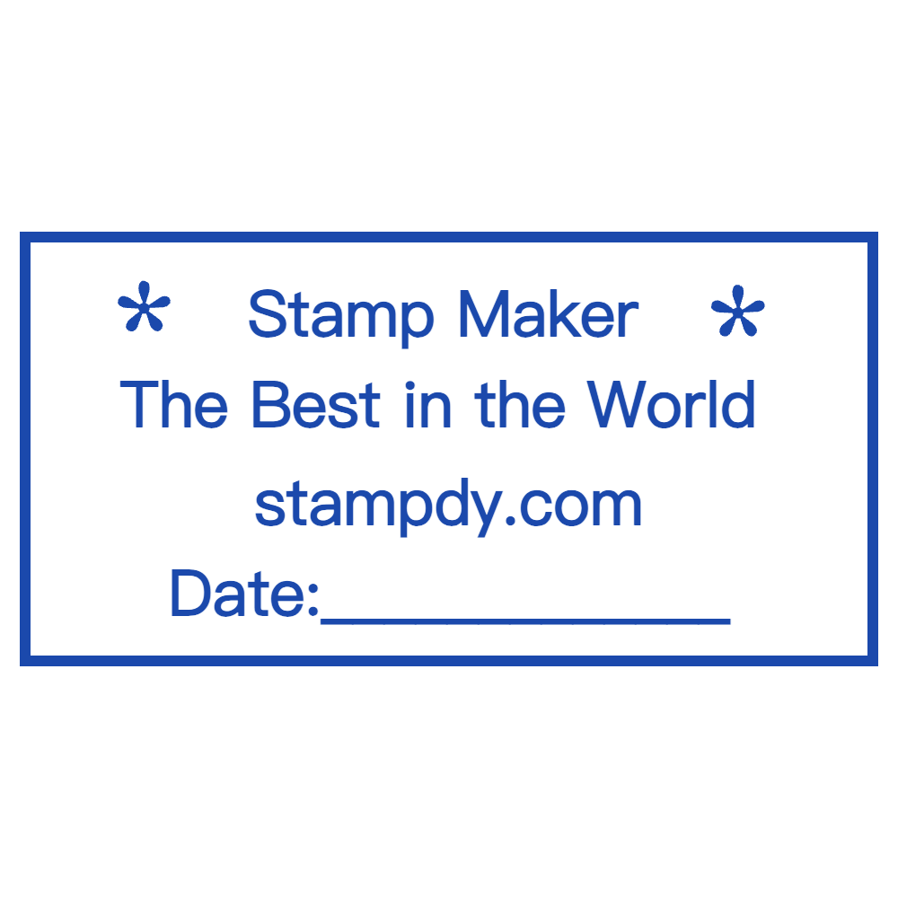
A rectangle is often the most efficient choice for operational stamps. It supports two or three straight lines, left or centered alignment, and clear separation between identity and status. It also makes revision easier when a department or branch changes.
The best shape is the one that lets the words breathe at the intended output size. Test at least two shapes before committing. A design that looks elegant at editor scale may behave very differently when inserted into a PDF or printed on an office sheet.
Break Lines by Meaning, Not by Equal Length
Automatic line wrapping follows available width, but it does not understand a company name. Choose line breaks where the language naturally pauses. Keep a distinctive two-word brand together when possible. Do not strand a legal suffix on a prominent line unless it is meant to receive that emphasis.
For a long straight layout, try this sequence:
- Put the recognizable identity on line one.
- Put the business descriptor or formal continuation on line two.
- Put the branch or location on line three only if it is required.
The three lines do not need equal width. A shorter top line above a longer descriptor can still feel balanced when both are centered. What matters is the visual center, not a mathematically identical character count.
For curved text, break at a word boundary and compare the visual weight of the upper and lower arcs. A short lower arc may need wider spacing, while the longer upper arc may need slightly tighter spacing. Make small adjustments and review the whole stamp after each one.
Use Spacing Before Shrinking the Type
When text almost fits, designers often reduce the font size first. That should be a later move. Try several lower-risk adjustments:
- Remove accidental double spaces and unnecessary punctuation.
- Reduce the gap between a text path and its border, but keep a visible safety margin.
- Tighten letter spacing modestly rather than compressing the characters themselves.
- Rebalance line breaks so one line does not carry most of the wording.
- Shorten only an approved descriptor, never invent an abbreviation.
Compressed letterforms may fit, but they can lose their shape when the stamp is reduced. Very tight spacing also closes the counters inside letters such as “a,” “e,” and “o.” The result can look acceptable on screen and muddy in a document.
Use the border as a boundary, not a text container. Characters should not touch the ring or frame. Leave enough quiet space that the words remain visually separate from the edge.
Build the Layout in a Controlled Sequence
Open the stamp maker only after the wording and hierarchy are settled. Choose a template close to the intended geometry or start from a blank design. A template is a structure, not a command to preserve every default element.
Work in this order:
- Set the outer shape and approximate proportions.
- Add the primary company name and establish its path or main line.
- Add the qualifier and supporting line one at a time.
- Adjust font size, weight, spacing, and alignment.
- Add a logo or symbol only if it remains clear and does not force the text outward.
- Set the color after the hierarchy works in a single tone.
Changing all elements at once makes it hard to see which decision caused a problem. A controlled sequence also helps when a reviewer asks for a wording change: you can adjust the text without rebuilding the whole layout.

Review at the Size the Stamp Will Actually Be Used
Editor zoom is useful for alignment, but it can hide practical failures. Export or preview the design near its intended size. If it will appear in a PDF, place it in a sample page beside normal document text. If it will be printed, print one ordinary sheet rather than judging only a magnified screen view.
Check five things:
- Can you identify the company name before reading the smaller details?
- Are all required words intact and spelled correctly?
- Do curved letters remain distinct at the left and right sides?
- Is there visible separation between text, symbols, and borders?
- Does the stamp still work in grayscale if the document loses color?
Small-size review is also the moment to remove detail. If a thin divider, tiny star, or secondary border disappears, either strengthen it or delete it. A faint decorative element does not become useful because it was present in the editor.
If the stamp needs a different delivery size, create that version from the approved master. The stamp image resize tool can help prepare another copy, but resizing cannot repair a hierarchy that was unclear in the original design.
Avoid Four Common Long-Name Layout Failures
Everything has the same emphasis
Equal size and weight may seem neutral, but they leave the reader without a starting point. Establish a primary identity and let the other text support it.
The name is forced into one line
An extremely wide or tiny line is harder to use than a thoughtful two-line layout. Break the name by meaning or move it to a perimeter path.
Decoration takes the best space
A large icon, thick inner ring, or oversized stars can consume the area required by the words. Keep only elements that help recognition or structure.
The designer fixes the preview instead of the output
A stamp can appear spacious at 300 percent zoom and fail at normal size. Judge the final delivery context, not the most flattering editor view. The stamp image quality checklist provides a broader pre-use review once the layout itself is approved.
Frequently Asked Questions
Should a long company name always use a round stamp?
No. A round perimeter can hold substantial text, but a rectangular two- or three-line layout may be clearer. Choose based on wording, required hierarchy, and use size rather than convention alone.
Can I abbreviate words to make the stamp fit?
Only use an abbreviation that has been approved for that organization and purpose. Do not shorten legal names, departments, or locations simply to solve a visual problem. Try a different shape, line break, or hierarchy first.
How many text sizes should one stamp use?
Two clear levels are often enough: a primary identity and supporting information. A third size can work for a short registration or location line, but each additional level makes small-size review more important.
Should the logo or the company name be larger?
That depends on what must be recognized and verified. If the wording carries the formal identity, protect its readability first. If a simple logo is the primary brand cue, it can occupy the center while the complete name remains legible around it.
Conclusion
Before saving the master, confirm the exact approved wording, an obvious reading order, meaningful line breaks, adequate border clearance, and readable output at practical size. Keep the recognizable identity prominent and treat qualifiers as supporting information. Then export the format needed for the next workflow and retain a clearly named master for revisions.
A stamp maker gives you control over shape, text, logo, layout, and output. The best long-name result comes from using that control selectively: fewer competing elements, clearer hierarchy, and enough space for every required word to remain a word rather than a dark line.