Stamp Maker Workflow: Extract a Stamp From an Image Cleanly
A stamp maker can rebuild a clean digital asset from a scan or photo, but the result depends more on the source and review process than on a single background-removal setting. The aim is not to make an old impression look artificially perfect. It is to separate the useful mark from the paper while preserving letters, borders, dates, and small symbols that identify the stamp.
This workflow explains how to choose a usable source, isolate the impression, refine it without erasing detail, and check the exported image in the document where it will actually be used. It is intended for ordinary business artwork and record-preparation tasks. If the original stamp carries legal authority or controlled approval meaning, confirm that you are permitted to digitize and reuse it before editing the image.
Start With a Source the Stamp Maker Can Read
A clean extraction begins before the file reaches the tool. Choose the source with the most complete impression, even if another copy looks darker at first glance. A heavy mark can often be refined, but a missing letter or broken date cannot be recovered without guessing.
For a paper source, scan it flat or photograph it from directly above. Side lighting creates a gradient across the page, which makes one edge of the stamp look stronger than the other. Avoid flash reflections on coated paper. If the document is wrinkled, place it under a clean transparent sheet only when doing so will not damage the original. The goal is an evenly lit image with the entire stamp visible and enough surrounding paper to distinguish the mark from nearby text.
Resolution matters when the design contains small type. A source that looks acceptable as a thumbnail may fall apart when the stamp maker tries to separate narrow strokes from paper texture. Inspect the file at a larger size. Check the smallest letters, the inner edge of circular borders, and counters inside characters such as A, B, O, P, and R. If those details are absent in the source, find a better impression rather than increasing sharpness until noise resembles ink.
Also check whether the stamp overlaps handwriting, printed text, a table rule, or another mark. Extraction can isolate color and shape, but it cannot reliably decide which overlapping stroke belongs to which source. When possible, work from an impression placed on blank paper. When that is not possible, plan to review the overlap manually and accept that some cleanup may be limited.
Step 1: Upload and Select the Actual Impression
Open the Stampdy stamp extraction tool and add the source image. The first useful decision is the selection area. Include the complete outer border and every meaningful character, but exclude unrelated page content where possible. A tighter selection gives the tool a clearer range of pixels to evaluate and makes later inspection easier.
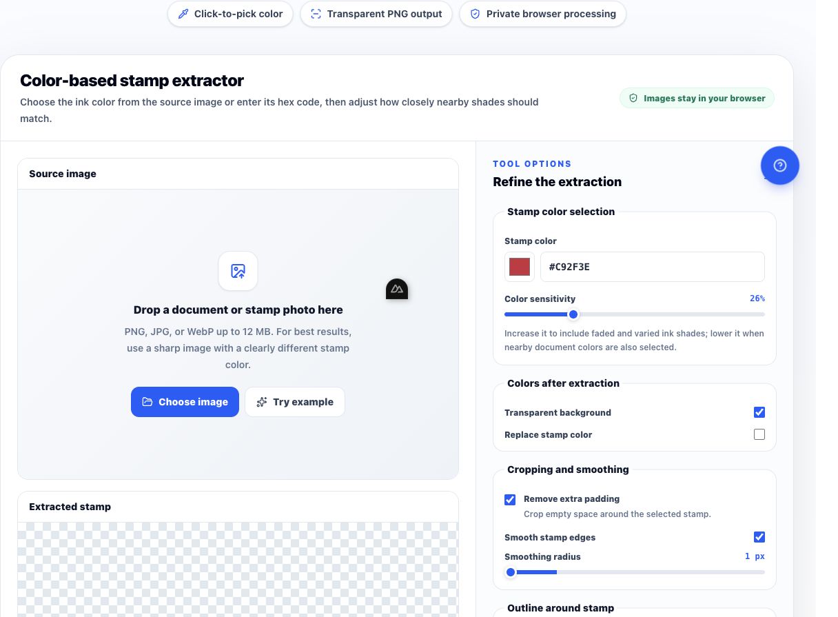
Do not crop so tightly that the border touches the selection edge. Leave a small margin around the impression. That margin gives you a visual reference for the paper color and prevents the outer ring from being clipped. It also makes uneven alignment easier to notice. If the stamp is rotated, select it first and decide later whether rotation is necessary; combining several adjustments at once makes it harder to identify which change damaged a detail.
Before refining, compare the selected area with the original document. List the elements that must survive: for example, the organization name, a date line, a registration number, the outer ring, and a central icon. This short inventory becomes your acceptance test. Without it, it is easy to approve a visually cleaner image that has quietly lost an important stroke.
If the source contains several impressions, extract them separately. Different ink density and paper conditions usually require different settings. A single broad selection may produce a compromise that is too aggressive for one mark and too weak for another.
Step 2: Refine Contrast Without Erasing Fine Detail
Refinement should separate ink from background, not redesign the mark. Increase the effect gradually and watch the smallest required feature. If the background remains as a gray box, the setting is too cautious. If thin letters close up, break apart, or disappear, it is too aggressive.
Use three visual checkpoints. First, inspect the outer border for continuity. A worn physical impression may contain natural gaps, so the objective is not necessarily a perfect ring; it is a border that still reads as the same mark. Second, inspect small text. Look for missing crossbars, joined letters, and filled counters. Third, inspect the center. Logos and symbols often contain negative space that can be mistaken for background.
Contrast and sensitivity controls can interact. Change one control at a time, then compare the result with the source. Large jumps encourage overcorrection. Small changes make it easier to stop when the paper is gone but the stamp character remains.
Color also affects the decision. A pale blue or red impression may be meaningful even though its grayscale contrast is weak. Judge the visible mark, not only the darkness of the pixels. If the tool allows the extracted result to retain or adopt a color, choose that output only after the shape is correct. Color cannot repair missing geometry.
Keep the source open beside the preview. The source answers “what was there,” while the preview answers “what will be exported.” Switching between them is more reliable than editing from memory.
Stamp Maker Quality Checks Before Export
The most useful stamp maker check is a side-by-side comparison at two sizes. At a large size, inspect edge quality and lettering. At the approximate size used on a PDF or form, check whether the mark is readable and balanced. An artifact that is obvious at 400 percent may be irrelevant in normal use, while a missing short word may only become apparent when the design is viewed as a whole.
Review these details in order:
- Identity: Do the name, number, date, and symbol match the source?
- Shape: Are circular or rectangular borders complete enough to read correctly?
- Negative space: Are holes inside letters and icons still open?
- Edge character: Does the result preserve intentional texture without carrying paper noise?
- Margin: Is there enough transparent space to place the image without clipping, but not so much that alignment becomes awkward?
Do not “repair” ambiguous letters by drawing what you think they should say. Return to another source or ask the asset owner to confirm the wording. A clean but guessed mark is less trustworthy than a visibly worn yet accurate extraction.
For controlled business stamps, keep the unedited source with the exported version. Give both files clear names and record who approved the digital asset. Those steps are document-control practices, not claims that the image itself proves authorization.
Prepare the Extracted Image for Real Documents
Once the impression is isolated, the next task is placement. The extracted result should have a transparent background so it can sit over a PDF without a white rectangle covering form lines or text.
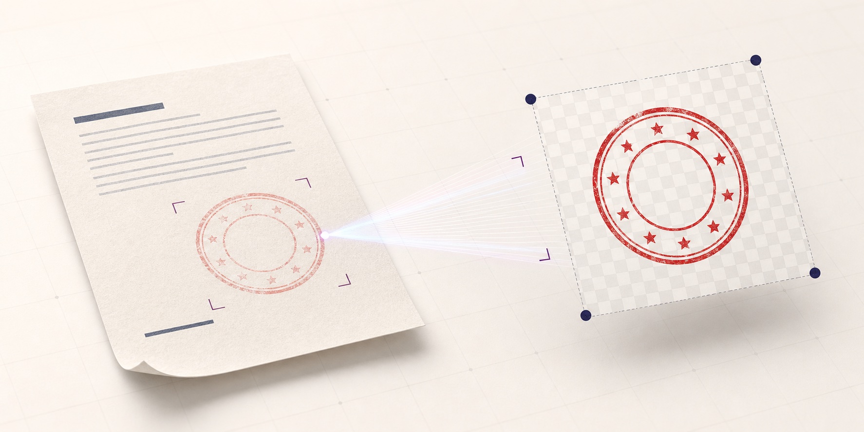
If the canvas contains too much empty space, use the stamp cropping tool to tighten it carefully. Preserve a small transparent margin on all sides. This makes drag placement easier and prevents border pixels from touching the edge of the file.
Test the image on a copy of the intended document. Place it at the actual target size, not at the large preview size used during cleanup. Check whether the border competes with nearby table rules, whether the smallest text remains readable, and whether the color has enough contrast against the page. If the same asset will be used on several templates, test at least the smallest expected placement.
When the extracted source is unsuitable, rebuilding may be the safer option. A confirmed name, date, and logo can be recreated with the Stampdy stamp maker when the asset owner wants a clean new design rather than a faithful extraction. Treat rebuilding and restoration as different tasks: restoration preserves the source; rebuilding creates a replacement under approved specifications.
Common Extraction Problems and the Right Response
The background is still visible. Tighten the selection, confirm the lighting is even, and increase refinement in small increments. If one side remains gray while the other is already losing ink, the source likely has uneven lighting. A new scan will usually be more reliable than stronger processing.
Thin letters disappear. Reduce the strength of the cleanup and inspect the original resolution. Do not compensate by sharpening until paper fibers become false strokes. If the lettering is missing in the source, obtain another impression.
The outer ring looks jagged. Check the result at normal placement size before changing it. Minor edge texture can reflect the original rubber impression and may not affect use. If the jagged edge comes from a low-resolution screenshot, return to a scan or larger photo.
Printed document text remains inside the stamp. A color difference may allow separation, but overlapping strokes require judgment. Do not erase sections automatically when the printed text crosses a letter in the stamp. Use a cleaner source or limit the extracted asset to a non-authoritative visual reference.
The transparent file looks too faint on the PDF. Compare the exported color with the document background and check opacity in the destination tool. Avoid darkening until letters merge. A slightly stronger color may help, but it should not change the shape or imply a different original impression.
The result is correct but difficult to align. Inspect the transparent margins and crop them evenly. Unequal blank space makes the visible mark feel off-center even when the image box is aligned.
Frequently Asked Questions
Can I extract a stamp from a phone photo?
Yes, if the photo is sharp, evenly lit, taken from directly above, and shows the complete impression. A scan is usually easier to evaluate because it avoids perspective distortion. If you use a phone, crop out irrelevant content only after confirming that the full border and all small text are present.
Should an extracted stamp look perfectly smooth?
Not necessarily. A restored image should preserve meaningful features of the source. Natural ink texture or small border gaps may be acceptable when they do not reduce readability. Excessive smoothing can erase fine type and make the result less faithful.
What file should I keep after extraction?
A transparent PNG is useful for many document workflows because it can sit over page content without a white background. Keep the original source as well, and use clear filenames so reviewers can distinguish the scan, the extracted asset, and any later approved revision.
Is extracting a stamp the same as authorizing its use?
No. Image preparation and authorization are separate. Confirm ownership, permitted uses, approval rules, and document policy with the responsible person before placing a controlled stamp on business records.
Conclusion
A reliable stamp maker workflow protects meaning before appearance. Start with a complete source, select the impression with a small margin, refine one control at a time, compare the result at large and working sizes, and test it on the destination document. If any required text or symbol is ambiguous, stop and obtain a better source instead of reconstructing it from assumption. That discipline produces a reusable image without confusing visual cleanup with approval or authenticity.