Online Rubber Stamp Creator: Two-Color Registration Guide
An online rubber stamp creator can help you prepare the artwork for a two-color print, but two ink colors do not automatically land in the right places. For a small run of cards, a practical approach is to design two separate motifs, have a stamp made for each, and give the paper and stamp blocks repeatable positions. The alignment between those impressions is called registration.
This guide covers two separate hand stamps used in successive passes on paper. It does not describe a multicolor pad inside one self-inking stamp, or an automated print production system. The aim is a design you can position consistently with a simple bench setup, followed by a proof that shows whether the result is acceptable for your project.
Plan the composition in an online rubber stamp creator
Start with the finished card, not with the largest artwork your screen can display. Decide which part belongs to the first color and which belongs to the second. A blue leaf beside a terracotta star is an easier first project than two outlines that must sit exactly on top of each other. A visible gap allows a little movement without changing the meaning of the design.
Draw a rough boundary for each motif on a paper dummy. Include any text, folds, trimmed edges, or space needed for handwriting. Decide whether the design is meant to appear centered on the card or aligned with another printed element. Those are different references: a centered stamp can still look wrong beside a logo placed toward one edge.
The Stampdy stamp maker provides an editor for arranging a stamp design. Prepare the artwork for each physical stamp as a distinct design. Keep a separate reference showing how both impressions should look together. This is a manual preparation workflow; the editor should not be treated as an automatic color-separation or registration system.
Choose a composition that still reads when viewed casually at its actual size. If the viewer must inspect the exact meeting point of two tiny lines, the layout demands more precision than a loose decorative pairing. Resolve that decision before ordering the stamps.
Keep the two artwork files on a shared reference
Each manufacturer needs to know what to make, and you need to know how the two pieces fit. Give the files unambiguous names such as motif-A and motif-B, accompanied by one composite proof. Record the desired printed width and height of each motif, the card size, and the intended relationship between them.
Do not assume equal file dimensions mean equal visible motifs. One image may contain a large transparent border, while the other is tightly cropped. If both are placed into identical boxes in a document, their visible artwork can end up at different scales. Measure or inspect the actual inked area rather than just the image boundary.
The stamp cropping tool can help remove unwanted surrounding space from an existing image. Decide whether cropping is appropriate before establishing the shared positions. Cropping one file after the proof is agreed changes its reference box and can disturb placement in another application.
Ask the stamp maker which file format and orientation they require. Keep a readable reference for yourself, and let the manufacturer specify who handles mirroring for the physical printing surface. Sending one mirrored file and one readable file without explanation invites a preventable error. Never infer production settings from the appearance of a preview alone.
Establish a repeatable place for the paper and each block
A simple corner jig can locate a card: two straight stops fixed at a right angle on a firm backing, with the card seated against them. Use scrap material for a prototype and make sure the stops do not cover the printed area. The card must lie flat, without a curled corner lifting the part you intend to stamp.
The jig locates the paper, but that is only half the problem. You also need a repeatable position for the stamp block. A pencil outline of the block can be a starting reference. A separate guide that locates the block more positively may work better, provided it does not obstruct contact with the paper. Test the arrangement with the actual stamp, including its handle and mount.
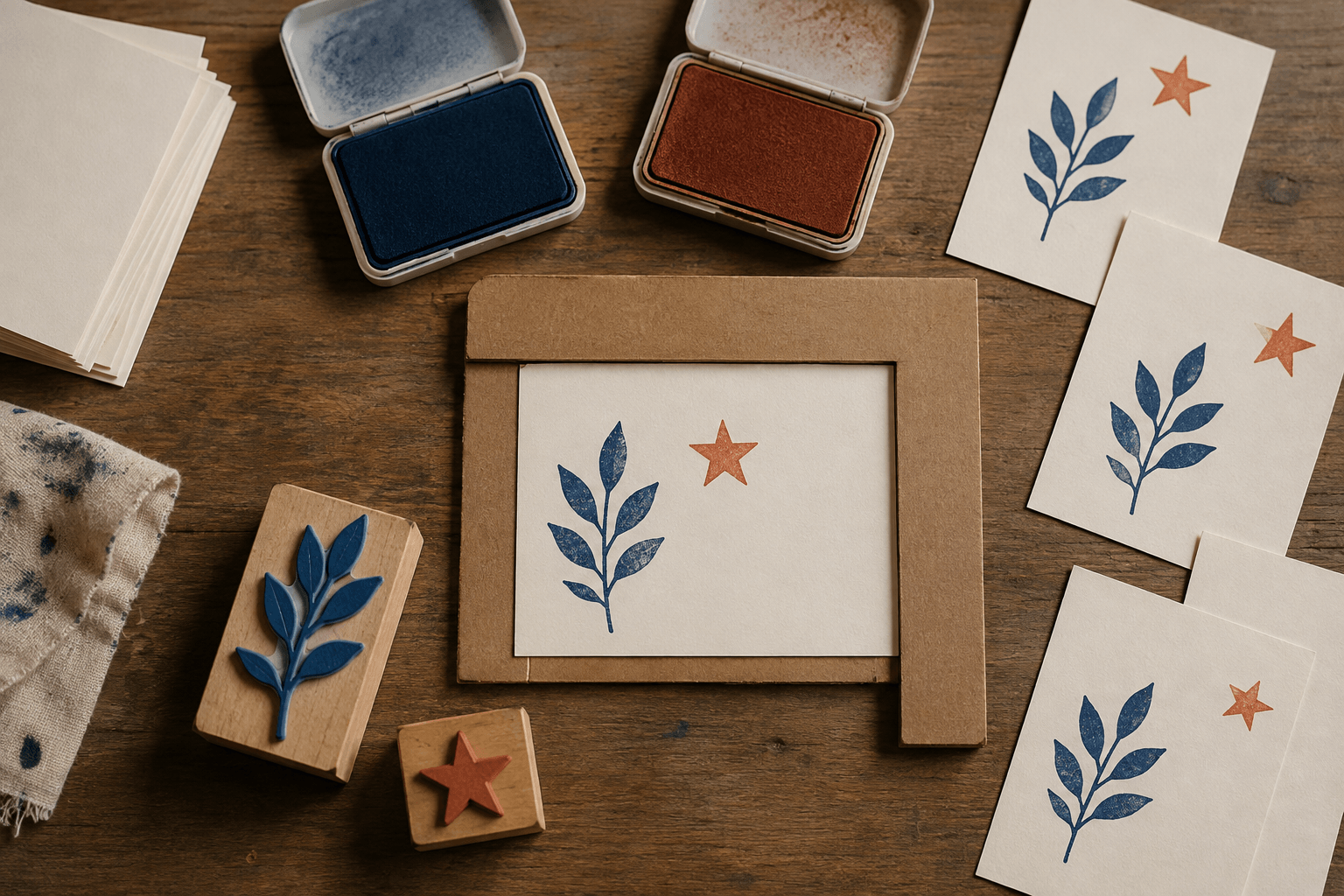
AI-generated illustration of a two-stamp bench setup; the jig is an example, not a tested production fixture.
Work out each block position independently. The engraved motif may not be centered identically on both mounts, even when the wooden blocks look similar. Make a trial impression, mark the block's orientation, and adjust the guide to the printed result. Referencing the visible ink is more useful than trusting the edge of an unfamiliar handle.
Keep a clear route for removing the card. If lifting it requires dragging wet ink under the guide, the setup creates its own smudges. It should also be possible to reseat the card for the second pass without guessing which edge was used first.
Make a proof before committing to a whole stack
Prepare a few spare cards from the paper you plan to use. Mark their backs so you can tell trials apart. Test the first impression, then the second, and then the pair. Separate impressions show whether a flaw belongs to one stamp; the composite reveals their relationship.
Choose the order through a small trial. If the motifs are separate, the practical issue may be how easily you can handle the card. If they overlap, the appearance of the overlapping inks also matters. Do not assume that two colors seen together on a screen predict the result of two physical inks on your paper.
Follow the ink supplier's instructions for the relevant surface and drying conditions. Check a spare before stacking or handling the printed face. This guide gives no universal waiting time: an unsuitable ink-and-paper pairing cannot be fixed by a registration jig, and an apparently dry surface may still transfer under pressure.
Write down the version, orientation, color order, and paper used for the accepted proof. Place that proof near the work area. It is a reference for the result you chose, not a promise that every later impression will match without checking.
Read the pattern of an error before moving the guides
A consistent displacement across several cards points you toward a fixed relationship: a misplaced guide, a block reference, or a changed artwork scale. A displacement that varies from card to card suggests movement during seating or stamping. These are working hypotheses to investigate, not a diagnosis from appearance alone.
A doubled edge may come from the block shifting during contact. Repositioning the second-color stop will not necessarily solve it. Look at the single-color proofs and try a more stable movement. Similarly, if the image is patchy while its position is correct, examine contact and inking before redesigning the composition.
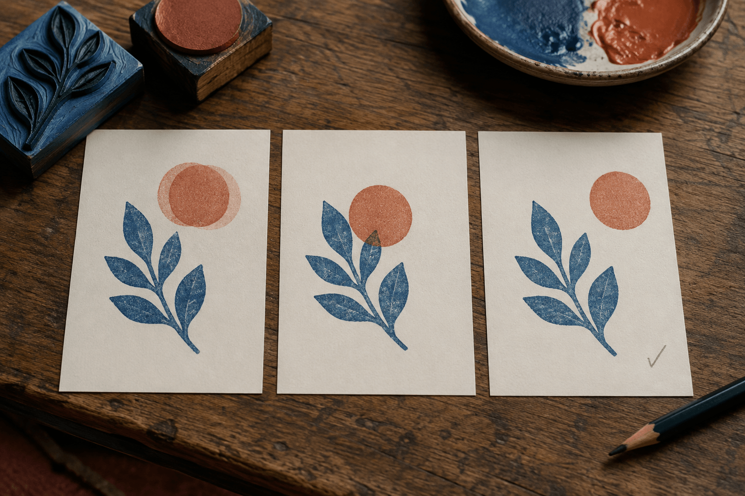
AI-generated comparison of illustrative defects, not measured print-test results.
Change one part of the setup at a time. Moving the stop, changing pressure, and adding more ink together may produce a better card, but you will not know which change mattered. Save the earlier proof so you can compare the same feature rather than relying on memory.
If two nearby shapes repeatedly look crowded, reconsider their designed gap. A layout that tolerates a modest positioning difference can be more suitable for hand stamping than one that needs continuous correction. That is a design choice, not an instruction to accept an unreadable print.
Keep digital alignment separate from physical alignment
A rotated image file and a tilted hand stamp create superficially similar results through different mechanisms. If the source artwork is unintentionally tilted, correct the source and issue a new reference before manufacture. If the stamp itself is placed at an angle, inspect the block orientation and guide instead.
For an existing raster image, the stamp rotation tool lets you adjust its angle and export a PNG. Review the resulting image boundary as well as the motif: rotation can change the surrounding canvas. The tool does not know the physical position of a manufactured stamp on its mount.
Once the physical stamps have been made, changing a digital file does not change their printing surfaces. Keep the file version associated with the actual blocks. Otherwise a perfectly sensible digital proof can become a misleading reference for an older pair of stamps.
If a project requires two colors to meet along a fine shared edge, discuss the production approach with the printer or stamp maker. The manual method described here is best evaluated through a real trial, not assumed suitable from the number of colors alone.
Frequently Asked Questions
Can I use one stamp with two ink pads instead?
That is a different technique. Applying two colors to one printing surface requires controlling where each ink lands and avoiding unwanted mixing. This guide uses two separate stamps because each impression can be positioned and evaluated independently. Choose the method before preparing production artwork, since the required pieces differ.
Should I add registration marks to the stamp artwork?
Only if you intend those marks to print and have planned how to remove or hide them. A registration mark on a physical printing surface is part of the impression. For a finished small card, references on the jig or outside the final object may be more appropriate. Confirm any production marks with the maker before including them.
What if my cards are not cut to exactly the same shape?
A corner stop references the edges it touches. If those edges vary, the motif's position relative to other edges can vary too. Check a sample of the actual blanks and choose a consistent reference. Where variation is visible, adjust the design or use a more suitable blank before making a large batch.
Conclusion
Use an online rubber stamp creator to prepare two clear motifs and a shared reference, then prove their relationship with the actual stamps and paper. Before starting the run, keep the accepted sample beside the jig, identify both block orientations, and check that the card can be seated and removed cleanly. If those steps still require guesswork, revise the setup or simplify the composition before printing the stack.