Online Rubber Stamp Creator Guide to Fabric Stamp Design
An online rubber stamp creator can help arrange the artwork, but a reliable fabric stamp design begins with the cloth, not the screen. Cotton weave, seams, padding, ink behavior, and hand pressure can all change an impression that looked crisp in a digital preview. Use a bold one-color subject, test the exact fabric and ink combination, and approve a range of normal impressions rather than one perfect sample.
This guide focuses on small cotton bags, textile labels, fabric patches, and similar maker projects. It explains how to adapt artwork, prepare a test matrix, control placement, and preserve a reusable production file without claiming that one ink or technique works on every textile.
Define the Fabric, Placement, and Job First
Start with the finished item. Record the fiber content supplied by the manufacturer, the weave or surface texture, the item color, the usable flat area, and whether a seam or lining sits beneath the stamp position. A loose muslin pouch and a heavy canvas tote may need different artwork treatment even when both are described as cotton.
Then define the mark's job. A front-of-bag brand symbol needs instant recognition at a distance. A small care or batch label needs readable information at close range. A decorative repeat can tolerate variation that would make a product identifier unacceptable.
Choose one primary use per stamp. Trying to make the same block serve a large tote front, a narrow sewn label, and a tiny hang tag can force compromises everywhere. If the applications differ greatly, prepare related size variants from the same approved source.
Do not stamp over seams, folds, zippers, or thick internal joins unless the irregular result is intentional and tested. The contact surface should be as flat and consistently supported as the design requires.
Simplify Artwork for Woven Surfaces
Fabric interrupts an impression with visible fibers and small height changes. Begin with a strong silhouette and larger open spaces. Fine outlines, tiny counters, and narrow gaps that survive on smooth paper may become uncertain on cloth.
Review the source in one color. Remove gradients, shadows, photographic texture, and color-dependent separation. If two adjacent parts are distinguished only by different colors, redraw their boundaries so the one-color version still makes sense.
For a logo, identify the smallest set of features that preserves recognition. That might be a leaf outline, a distinctive letter shape, or the overall proportion of an emblem. Keep the authorized full logo unchanged elsewhere and treat the fabric version as a controlled application asset.
Text should be short. A compact business name may work; an address, slogan, and date around a small emblem often will not. Open letter spacing carefully, especially around narrow joins and enclosed counters. Print the artwork at intended size and view it without zoom.
The detailed logo simplification guide offers additional criteria for deciding which visual features deserve priority.
Plan Contrast Without Assuming One Ink Works Everywhere
Choose the artwork and material together. A dark impression on natural cotton is easy to preview, but the same design may lose contrast on navy fabric. A light textile ink may behave differently from a dark one and may require a different application or curing process.
Use an ink specifically intended for the fiber and the item's expected use, following the ink manufacturer's current instructions. Washing, heat setting, drying time, opacity, and safety suitability depend on the exact product and application. Do not infer those properties from color alone.
Create a test table that names the fabric, color, ink, stamp version, and handling method. If the item may be washed, test according to the relevant material and ink instructions before promising durability. A visual proof made immediately after stamping does not establish long-term performance.
For goods that will contact food, skin, children, or regulated environments, confirm material and process requirements with the appropriate supplier or qualified reviewer. The design file itself cannot answer those questions.
Build the Design With an Online Rubber Stamp Creator
Use the Stampdy stamp maker to arrange the approved one-color elements. Set the target dimensions, place the simplified symbol or wording, and adjust size, alignment, spacing, and layout while keeping the intended textile area in mind.
Prepare three useful files rather than many cosmetic options:
- the preferred design at target size;
- a simplified version with wider gaps and fewer small details;
- a smaller or larger size only when the item range requires it.
Export a clear digital reference and keep the editable source. Confirm the production format and polarity with the stamp maker before ordering a physical block. If the mark includes a broad solid field, also compare a positive-line alternative; a large field and a fine outline place different demands on inking and pressure.
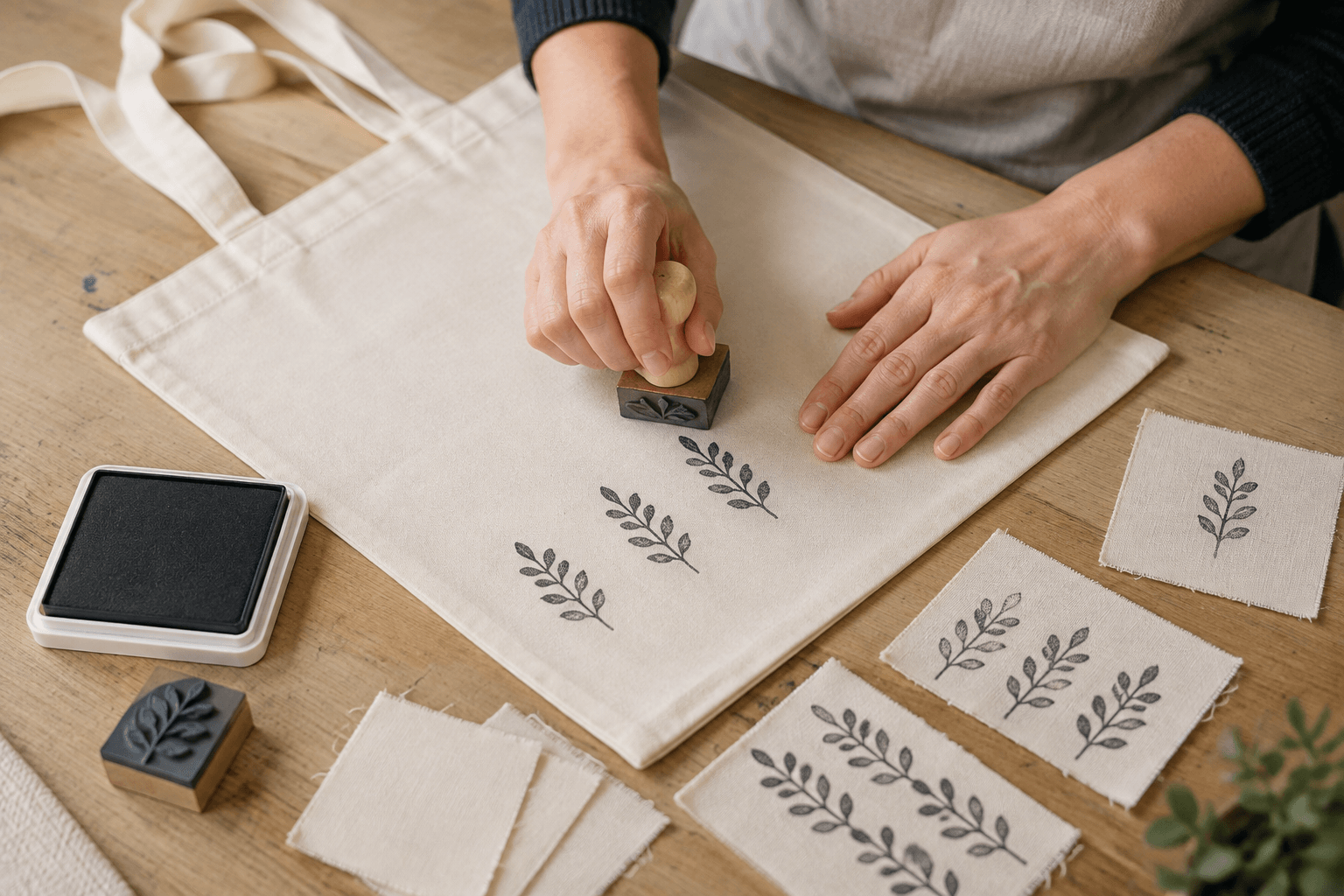
Make a Swatch Test Before Stamping Finished Items
Obtain offcuts or concealed test areas from the actual production fabric. Generic craft cloth can help practice the motion, but it cannot approve a different weave, finish, or color.
Build a small swatch matrix. Across rows, vary only one artwork or size choice. Down columns, vary one controlled process condition such as ink load or backing firmness. Make multiple impressions in each cell so ordinary hand variation becomes visible.
Label the back of each swatch or keep a separate map. Include:
- fabric source and color;
- ink product and batch when relevant;
- stamp file and physical block version;
- date and operator;
- backing surface;
- any drying or setting treatment used.
Let the samples finish according to the ink instructions before making the final judgment. Review the front and back for bleed-through when that matters to the item. If the fabric will be folded, sewn, or washed later, include those steps in the approval sequence.
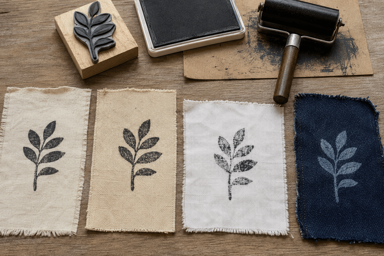
Control Support, Ink Load, and Pressing Motion
Place a clean, flat backing beneath the fabric. The backing should support the weave without creating its own ridges. If ink could pass through, protect the reverse layer of a bag or garment with an appropriate insert.
Keep the fabric under light, even tension so it does not shift, but do not stretch it into a shape it will not hold in use. Position the stamp vertically, lower it without sliding, apply even pressure across the block, and lift straight up.
More pressure is not always the repair for a pale impression. The cause may be uneven inking, a surface interruption, an oversized solid area, a flexible mount, or an unsuitable ink-and-fabric pairing. Diagnose before changing the artwork.
Likewise, more ink can close counters and create halos around a design. Practice a repeatable loading method on waste swatches. The acceptable method is the one that produces a recognizable result across normal attempts, not only under unusually careful conditions.
Design a Placement Guide for Repeated Items
For a one-off craft piece, visual alignment may be enough. For a run of bags or labels, create a simple jig or placement guide that references stable item edges. The guide should locate the stamp without covering the area the operator needs to see and without transferring old ink to a fresh item.
Test the guide against normal item variation. Cotton bags may not all lie identically, and sewn labels may have slight edge differences. Define an acceptable placement zone rather than pretending every impression will land on a mathematically exact point.
If the design repeats as a pattern, establish spacing from the visible motif rather than the block edge alone. The rubber may not be centered on its mount. Make a marked test impression, measure the actual offset, and use that information in the guide.
Keep orientation obvious. Add a mark to the top of the handle or mount if the design could be pressed upside down. This is especially useful for abstract symbols and monograms that are hard to read from the rubber side.
Diagnose Fabric Stamp Problems by Their Pattern
The impression is pale everywhere. Check whether the stamp received enough ink, whether the ink suits the fabric, and whether the backing supports the full area. Compare a fresh controlled swatch before altering the file.
One side is consistently missing. Inspect the mount, table, backing, seam position, and pressing angle. Rotate the swatch and stamp separately to determine whether the failure follows the tool or the work surface.
Small openings fill. Reduce excess ink, clean the block as directed, and compare the simplified artwork. If the same gaps remain closed under controlled conditions, widen or remove them in the approved source.
Edges look doubled. Prevent the fabric from shifting, lower the tool vertically, and avoid rocking or sliding. A placement jig can stabilize the approach without forcing extra pressure.
The design reads on muslin but not canvas. Treat this as evidence that the substrate matters. Increase the size, strengthen the silhouette, simplify the detail, or choose a different marking method for the coarse material.
The light impression disappears on dark cloth. Confirm that the selected textile ink is intended to provide the needed opacity and handling on that fabric. Do not solve an ink limitation only by thickening the artwork.
Keep the Digital and Physical Versions Connected
Name the approved files with the application and size, such as leaf-tote-front-60mm-approved. Record which physical block was made from each file. Photograph an acceptable impression beside a ruler and keep the matching swatch.
When the artwork changes, issue a new version rather than overwriting the approved master. Retire the old physical block or label it clearly so it does not return during a busy production run.
Use the stamp image quality checklist as a general review reference, then adapt the checks to cloth: include fiber interruption, bleed-through, wash or handling requirements, placement tolerance, and acceptable handmade variation.
Fabric Stamp Release Checklist
Before using the stamp on finished goods, confirm that:
- the exact fabric, color, and placement are defined;
- the design has one clear function and a strong silhouette;
- required text reads at actual size;
- the ink is intended for the material and use;
- multiple swatches have been tested with a repeatable method;
- drying, setting, handling, and washing checks are complete where relevant;
- backing and bleed-through protection are specified;
- a placement guide has been tested for repeated items;
- the approved file, block version, and reference swatch match.
Frequently Asked Questions
Can a regular rubber stamp be used on fabric?
The physical stamp may be usable, but the ink, fabric, desired durability, and handling process must be compatible. Follow the relevant ink and material instructions and test the exact combination before marking finished items.
What kind of artwork works best for cotton bags?
Bold one-color artwork with a recognizable silhouette and generous open space is a practical starting point. The final choice depends on weave, size, ink, backing, and the level of variation acceptable for the project.
Should I make the stamp larger for coarse fabric?
A larger design can give details more room, but size alone may not fix a weak silhouette or unsuitable ink. Compare a simplified version and a size variation on the actual coarse fabric before ordering or releasing production.
How do I keep repeated fabric stamps aligned?
Use stable item edges to create a simple placement jig, verify the actual offset between the rubber and its mount, and define a realistic acceptable zone. Test the guide across several blank items before starting the full run.
Conclusion
Release a fabric stamp design only after the essential mark remains clear on several swatches of the exact material. Use the online rubber stamp creator to prepare controlled artwork variations, then design for the weave, select an appropriate ink system, support the cloth, and use a repeatable placement method.
Your next step is concrete: prepare the preferred one-color design and one simplified alternative, make a documented swatch matrix, and approve the version that performs reliably under normal workshop conditions.