Stamp Generator Online Guide to Building a Stamp Proof Sheet
A stamp generator online can prepare controlled variations for a stamp proof sheet, turning subjective design comments into visible choices. Instead of approving a large screen preview, you compare designs at their intended physical size, place them on the real application, and record which version survives actual stamping. The goal is not to display every idea. It is to answer a short list of production decisions with evidence reviewers can understand.
This guide shows how to build that sheet, control variables, print it correctly, add material tests, and preserve a clean approval record. It works for business stamps, logo stamps, packaging marks, status stamps, and other one-color designs.
Define the Decisions Before Building the Stamp Proof Sheet
Write down what remains uncertain. Typical decisions include finished size, border weight, spacing around a logo, line simplification, positive versus reverse artwork, or the amount of text that can remain readable.
Limit one proof sheet to a coherent question. A sheet about diameter and line weight is easy to compare. A sheet that also changes color, wording, typeface, icon, shape, and surface creates too many explanations. Reviewers may choose a favorite without understanding why it performs better.
Separate content approval from production approval. Confirm spelling, names, dates, registration details, and authorized symbols before fine-tuning geometry. A beautifully spaced proof with incorrect wording is still unusable.
Record the intended application at the top of your working notes: envelope, invoice, cotton bag, kraft box, card, or PDF. The same mark can require a different size or density when the placement changes.
Establish a Locked Base Version
Create one base design containing the approved content. Set its overall shape and target size, then duplicate it for controlled tests. Every variation should be traceable to that base.
Keep these elements locked unless they are the subject of the sheet:
- exact wording and spelling;
- symbol identity and orientation;
- overall shape;
- intended ink color or one-color polarity;
- required hierarchy;
- target substrate and placement.
Give the base a clear code, such as A0. Variations can then use short codes: A1 for a wider border gap, A2 for simplified leaves, or B1 for a second physical size. The codes belong in review notes; they do not need to appear inside the public-facing artwork.
If the source is still changing rapidly, pause the proof sheet. Testing unstable content produces attractive but obsolete evidence.
Build Variations With a Stamp Generator Online
Use a stamp generator online to create the base layout and a narrow set of meaningful alternatives. Adjust size, font, alignment, color, and spacing only where each option supports the stated decision.
A useful matrix might contain three columns for size and three rows for border treatment. Another might keep size fixed while comparing the original icon, a simplified icon, and an open-counter version at two line weights.
Avoid a giant wall of combinations. More options do not create more certainty when people cannot inspect them carefully. Begin with the likely production range and include one conservative alternative that protects more open space.
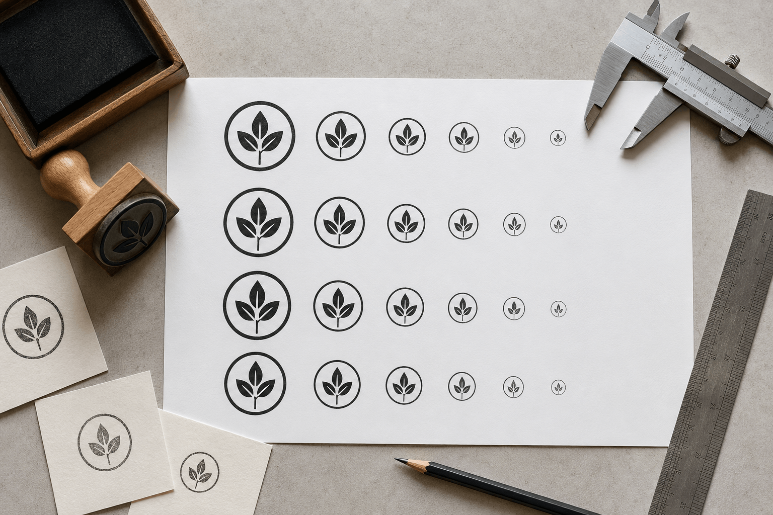
Use consistent spacing between proofs so neighboring marks do not influence perceived weight. Keep all designs upright and place the variation codes outside the artwork boundary. If the sheet will be shared digitally, include a scale reference, but still require a true-size print for physical decisions.
Print at Actual Size and Verify the Printer Output
Export the proof in a format that preserves the intended page dimensions. Print at 100 percent or “actual size,” disabling fit-to-page scaling. Then measure a reference dimension on the sheet. Printer settings, application defaults, and driver behavior can otherwise change the result silently.
Do not assume a PDF or image displayed on screen is physically accurate. Monitors have different pixel densities and zoom levels. A design that looks comfortably open at 300 percent zoom may be crowded at a 25-millimeter impression.
View the printed sheet at ordinary reading distance. Check recognition, hierarchy, and required text before using magnification. Then inspect fragile details more closely to understand why an option succeeds or fails.
If a size needs adjustment, the stamp resize tool can help prepare a controlled image variant. Preserve aspect ratio unless a deliberate redesign has been approved, and recheck line weight after scaling.
Use Cutouts and Overlays on the Real Application
Cut around the leading paper proofs or place them on transparent tracing sheets. Position each option where the stamp will appear: on an envelope flap, product label, document margin, small card, or package panel.
This reveals problems the isolated sheet cannot show. A round mark may collide with a fold. A wide rectangular status stamp may obscure form fields. A logo stamp may be visually correct but too dominant for a small hang tag.
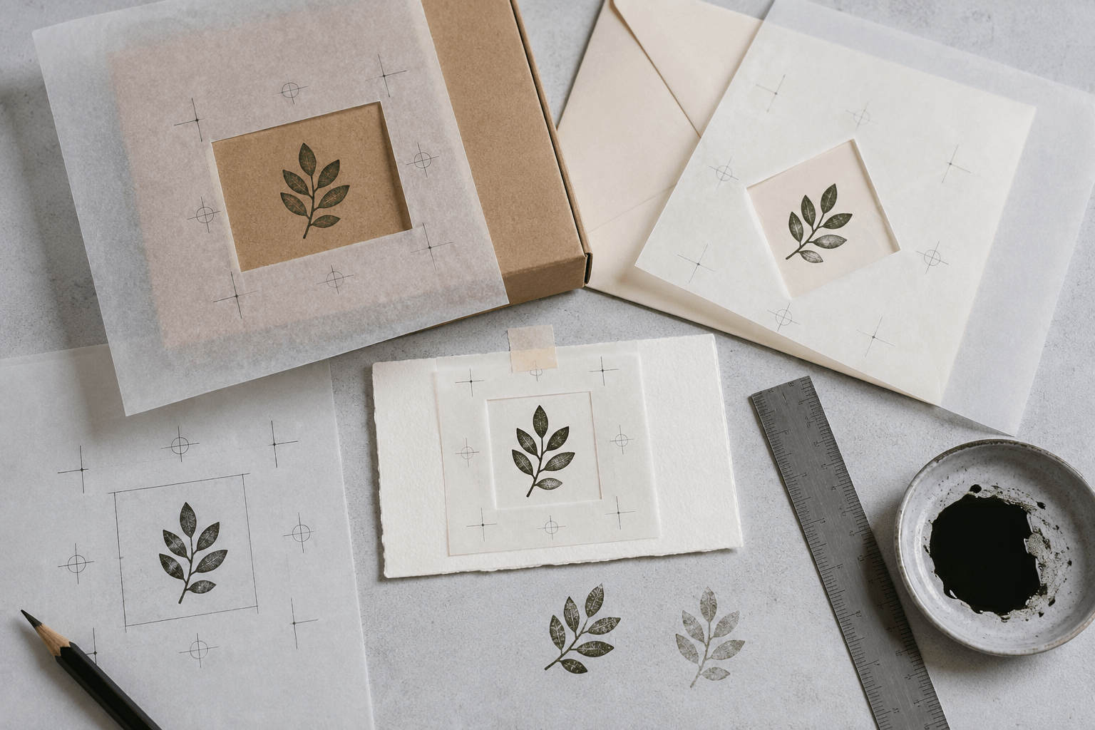
Review the full object, not only the mark. Ask whether the placement has sufficient clear space, whether nearby text competes, and whether normal placement variation would cause a collision. Mark an acceptable zone when an operator will apply the stamp by hand.
Photograph the chosen overlay in context. That image becomes a useful placement reference, but it does not replace a physical ink proof.
Add Real Impressions to the Proof Process
Once a die or test stamp is available, repeat the matrix on the intended substrate. Make several impressions per option using normal ink and pressure. Include realistic variation rather than selecting only the cleanest result.
Organize the impression sheet so the artwork code, substrate, ink, and date can be traced. If multiple operators are involved, record that too. The purpose is not to rank people; it is to see whether the design remains usable in the actual process.
Compare digital and physical results. A missing line in every impression suggests a design, die, inking, or support issue that needs diagnosis. A defect that appears only once may be normal handling variation. Do not redraw artwork until you know which pattern you are seeing.
For polarity choices, use the positive and reverse artwork guide to structure coverage and negative-space checks.
Score Proofs With Practical Acceptance Criteria
Write the acceptance criteria before the final review. Keep them observable. A short scorecard can ask:
- Is every required character readable at normal distance?
- Is the primary symbol recognizable without explanation?
- Do important counters and gaps remain open?
- Does the border print continuously enough for the intended style?
- Does the mark fit the application with safe surrounding space?
- Does it remain usable across several normal impressions?
Not every criterion needs a numeric score. Pass, revise, or reject can be clearer than artificial precision. Add one sentence explaining any failure so the next designer knows what to change.
Choose the version that meets the job, not necessarily the most detailed or dramatic option. If two versions pass, prefer the simpler production asset unless the added detail carries approved meaning.
Diagnose What the Proof Sheet Reveals
All small versions become muddy. Increase the finished size, simplify internal detail, shorten wording, or change the application layout. Do not keep shrinking the same artwork.
The heavy border dominates. Reduce its weight or increase the channel between border and subject. Compare the whole mark at ordinary distance, not only the ring in isolation.
The thin border breaks in physical proofs. Check inking, die condition, support, and pressure. If the failure repeats under controlled conditions, strengthen or remove the border with approval.
Text is readable on screen but not on paper. Use a larger or more open type treatment, reduce the amount of text, or choose a larger stamp. Screen zoom is not an acceptance method.
One substrate works and another fails. Issue separate approved variants or choose a different marking method for the difficult surface. A universal file is not valuable if it performs poorly in one critical use.
Reviewers choose different options for different reasons. Return to the decision statement and acceptance criteria. Separate brand preference from production performance, then assign the final decision to the appropriate owner.
Preserve the Approval Record
Archive the editable source, exported production file, original proof sheet, accepted physical impression, and decision note together. The decision note should state the approved code, finished size, substrate, ink or process, date, and approver.
Use filenames that describe status rather than chronology alone. shipping-mark-A2-40mm-approved is clearer than logo-final-latest. If a later revision is needed, preserve the earlier approval and issue a new code.
Do not treat a scan of an approved impression as the production master unless the workflow specifically requires a raster reproduction and its quality has been checked. The source artwork and the evidence of how it printed serve different purposes.
Stamp Proof Sheet Checklist
Before approval, confirm that:
- the sheet answers a defined production question;
- wording and authorized symbols are already correct;
- only one or two variables change in a comparison;
- every option has a unique code;
- proofs are printed at actual size and measured;
- leading options are placed on the real application;
- physical impressions use the intended substrate and process;
- multiple normal impressions meet observable criteria;
- the selected version and rejected reasons are recorded;
- the approved source, output, and proof remain linked.
Frequently Asked Questions
How many versions should a stamp proof sheet include?
Include only enough versions to answer the stated decision. A small controlled matrix is usually easier to evaluate than dozens of mixed concepts. Add another round only when the first test reveals a specific unresolved issue.
Can I approve a stamp from a screen proof?
A screen proof can approve spelling, hierarchy, and general composition, but it does not establish physical size or impression quality. Print at actual size and use real substrate tests before production approval where the result matters.
Should every variation use a different line weight?
No. Change line weight only when it is part of the question. If you are comparing finished sizes, keep the artwork treatment consistent first; then create a separate line-weight test if needed.
What should I do with rejected proofs?
Keep the most informative rejected versions with brief reasons. They prevent failed details from being reintroduced and show why the approved version was selected. You do not need to preserve every trivial experiment.
Conclusion
Approve a stamp proof sheet when it leads to one traceable production asset that works at actual size, fits its real placement, and remains clear across normal physical impressions. Use the stamp generator online for controlled variations, make the criteria visible, and record why the chosen version passed.
The next step is to define one unresolved decision, generate a compact variation matrix, print it at 100 percent scale, and test the strongest two options on the intended material before release.