24 New Round Templates in the Stampdy Seal Maker
Stampdy has added 24 round templates to the English Design seals collection. Open the seal maker and you can start with palm trees for a travel desk, a patterned badge for a riding club, or a plain-spoken APPROVED mark for a proof. Each is an editable design. The 38 mm and 40 mm layouts differ by only two millimeters, yet the space they give to a name, a picture, or a second line varies considerably.
If you already know what the finished stamp should say, keep that wording beside you as you browse the Design seals collection. One good way to choose is to cover the lettering in a preview. What you can still recognize tells you what the stamp will communicate before anyone stops to read it.
Three pictures that suggest three different jobs
The travel layout has two palm trees, water, a small boat and an open patch of sky. LIBERIA runs around the top and TRAVEL COMPANY follows the lower curve. This arrangement would suit the back of a walking-tour card. Put the place on top and the operator below. The boat and shoreline can carry the idea of a trip without asking the reader to fit a description of the tour around the rim.
The flower design takes a different approach. A pair of solid leaves sits in the middle, with “Flower” just above. A braided outer border frames a much narrower band of text. A florist could put a short shop name near the leaves and use the band for a town. The two leaves have enough visual weight to stand alone on a plant-care card. The sample registration details around the edge are editable, so a shop with no use for them can give that space to its own words.
The Moto Cross association seal is the densest of these three. It has striped edging, stars and an emblem built from looping shapes. Its two short captions leave the outer bands visible. Think of a club membership card with a large badge on one side and the member's details on the other. At that scale the wheel-like center has room to show. On a small envelope flap, try the travel or leaf arrangement first if you want someone to recognize the subject at a glance.

When the middle of the seal needs to say something
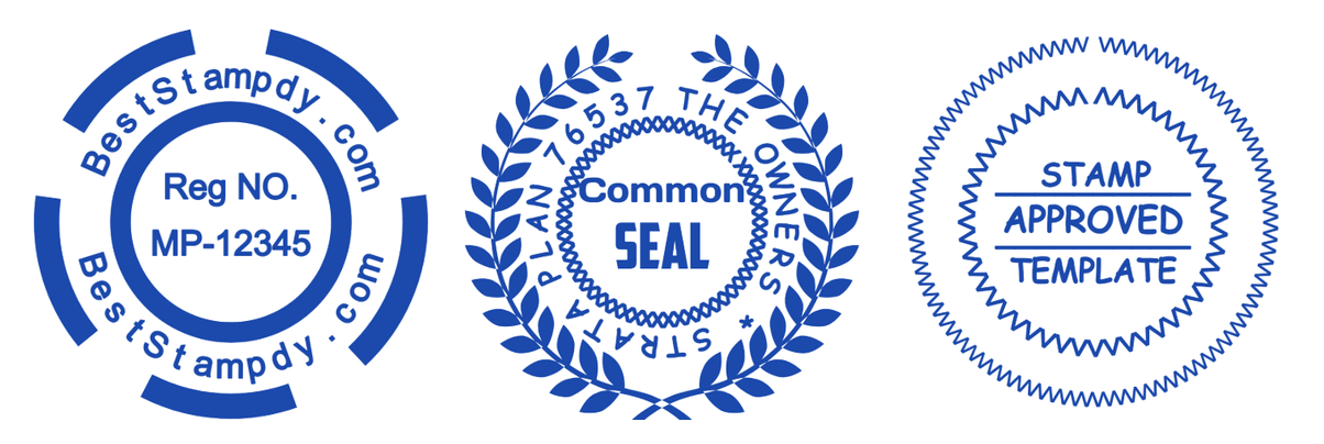
Three of the new layouts make a useful comparison for office work. One puts “Reg NO.” and “MP-12345” on two straight lines in a nearly empty center. Heavy segments on the outer ring give it a distinctive shape. Another places “Common SEAL” inside a wreath and gives a longer owners' association name a ring of its own. A third uses a double zigzag edge and puts APPROVED in the largest lettering between horizontal rules.
Imagine a studio marking a set of packaging proofs. On one sheet it needs a reference that can be read aloud over the phone. A short code in the middle of the first design lets the reader read it straight across. On another sheet the question is whether the artwork has been reviewed. The zigzag layout answers that question from the same place on the page, across the middle of the mark. A code and a decision serve different purposes even when they use exactly the same amount of paper.
The wreath layout makes sense when the issuing group matters most. Try the group name on the outside, then use the middle for a short purpose such as COPY. Keep a long committee name out of the small space inside the wreath. If the office needs a handwritten date or initials, leave space beside the stamp on the sheet. The rules in the APPROVED artwork are part of its design and already sit close to the printed word.
Choosing a seal maker layout for long names
The batch includes several ways of fitting a name. The DRAGON COMPANY design leaves almost all the center to a detailed dragon and carries its short name overhead. The gear design uses several separate curved text elements around the ring. Another layout, for a travel agency, puts an address around a crest and leaves the center caption to “FUTURE.” Look at how many distinct labels you would have to replace before you choose one for a long business name.
For example, try setting “North Cove Community Print Workshop” on a single arc. Read it from the first capital to the last letter without turning the page. If the end of “Workshop” is creeping down the far side, a second line might serve you better. “North Cove” across the top and “Community Print Workshop” below can preserve the complete name. See where the two phrases meet at each side. A large gap on the left and a collision on the right usually call for repositioning the arcs before changing the type size.
A different problem appears with repeated text. In the globe design with THE and OF across its middle, the example name, web address and registration text each appear more than once in the template. Treat each occurrence as a separate edit. Go around the perimeter from twelve o'clock and read every run of type, including the lower arc. That extra lap can catch an old number in an otherwise finished stamp.
What to change first in the editor
Open a design in the manual stamp editor and put in the longest real line first. A shop that trades as “Pine & Alder” might need the fuller “Pine & Alder Botanical Studio” on a delivery note. Those two names make different demands on the same curve. Work with the one that will actually appear on paper, including its ampersand and spaces. It is easier to move the center emblem around finished wording than to discover the last three letters will not fit.
Some apparent borders in these designs are text. In the APPROVED example, rows of carets and repeated lowercase v's make the pointed edges. The owners' seal also has a repeated character around its center. When you select a layer full of identical characters, look at the corresponding ring before clearing the field. You may be editing the ornament you chose the template for. If you remove it by mistake, use Undo before proceeding to the next layer.
Replace the sample details that someone might mistake for yours. In this batch those include dates, a license number, a tax identifier, a telephone number and addresses. A blank field is often more useful than a string of invented digits, especially on a proof that could end up in circulation. The snowflake layout, for instance, can keep its strong COLD FIRE center treatment while you change the two small identifier lines underneath. The snowflake and the lettering already give the reader plenty to look at.
Where will the finished impression go?
A stamp for a tour card has to coexist with the writing on the card. On a rough paper mock-up, draw the spot where the visitor will write a date or stick a ticket. Place the travel stamp nearby and read the place name with the card held in one hand. If the design cuts into that working area, move it before adjusting its artwork. Making the letters smaller solves the wrong problem when there is unused space on the other side.
A club badge poses another question. A member may want the striped emblem to dominate the front of the card, while the person at the door needs to read the club name quickly. View the printed proof from both positions. The useful change might be to shorten a caption to the club's everyday name and put its full name in ordinary text elsewhere on the card. That gives the crest room without losing information from the document.
For a physical stamp order, proof the intended impression size with the maker. The 38 mm travel template and the 40 mm flower template describe starting dimensions in the editor. A printer's fit-to-page setting can change what lands on the sheet. Measure the printed circle, then look closely at the smallest open spaces in the braid, stripes or curved letters. The guide to making a stamp proof sheet is useful when comparing two sizes on one page.
Frequently Asked Questions
Where are the 24 new templates in the picker?
Open Select Template, choose Design seals and leave the round shape available. This batch belongs to the English catalog, which the editor also uses for most interface languages. The Russian-language catalog has its own selection. The batch includes both 38 mm and 40 mm designs under the same category, including the clinic and travel examples.
Which starting point suits an address or reference number?
For a short code, try the design with MP-12345 in the middle. For a place and street on separate parts of a circle, inspect the travel-agency crest with “Bravery street 12” along its lower edge. Type your longest actual line before spending time on color. Two addresses with the same number of characters can occupy quite different widths.
Can I use one of these layouts in AI reference mode?
Yes. Choose a template reference in the AI stamp tool when you want an image variation based on the layout. For a correction such as one digit in an identifier, open the editable template and change that text field directly. The manual route also lets you keep the ornament in exactly the position you approved.
Conclusion
Choose one of the new seal maker templates with the actual object on your desk. A palm-tree impression belongs on a different kind of card from a prominent APPROVED mark, even if both fit the same circle. Replace the longest line and every sample identifier, then place one proof where the stamp will be used. If the first thing you can read there is the thing the recipient needs, you have a design worth finishing.